Tech Articles
by Rahul Bharadwaj Mysore Venkatesh
My R-Package

Introduction -
The goal of ‘covidcolsa’ is to make available the Coivd-19 data and statistics for Colombia and South Africa easy to access through R Shiny App that can be run by simple functions using the package. It consists of the counts of tests, cases, recoveries, and deaths summarized and compared between the two regions. R Package Link
Installation -
You can install the covidcolsa with:
# install.package("devtools")
devtools::install_github("etc5523-2020/r-package-assessment-rahul-bharadwaj")
Select the number option 3: None for the prompt. Once installed, copy past the following code:
library(covidcolsa)
covid_colsa
DailyCOL
DailyZAF
The data in the package are originally derived from Guidotti, E., Ardia, D., (2020),
“COVID-19 Data Hub”, Journal of Open Source Software 5(51):2376, doi: 10.21105/joss.02376,
through the R package COVID19 and filtered for the country Colombia and South Africa.
There are 3 main datasets in the package -
covid_colsa- Total counts of Covid-19 stats in Colombia and South Africa.DailyCOL- Daily counts of Covid-19 stats in Colombia.DailyZAF- Daily counts of Covid-19 stats in South Africa.
There are 3 functions in the package that are used to make the code simpler in the Shiny App -
launch_app()- Automatically launches the Shiny App.country_select_input(id, choices)- This function is used to make custom input selections for different regions as a substitute for shiny function selectInput.dailyplot(DailyCOL or DailyZAF)- This function plots daily counts of tests, confirmed cases, recoveries, and deaths for the datasetsDailyCOLandDailyZAFmade available in the same package.
The functions are limited to use within the package for simple operations/functionality. It serves as a starting point for further exploration of COVID19 data.
An example for use : COVID19::covid19(country = c("India", "Australia"))
Any country can be subset for total counts. The daily count tables were created from these total count table and many such subsets can be created with appropriate logic in your code. This was my first step in creating a small package to easily share and display my work online.
Ancora Imparo! (Italian for I’m still learning!)
Covid Stats

Introduction -
Covid-19 has dropped a bombshell out of the blue and caught the world unaware. It has negatively impacted the lives of millions and proved fatal to thousands of others. With over 25 million cases and 800K deaths around the globe as of Sep 2020, this has been a serious issue of concern for the Governments of all the countries. Amidst the pandemic, this is the story of how Colombia was affected by it. This blog story helps us understand the Covid-19 situation in Colombia and South Africa.
Data Description -
Colombia -
The data used for this blog story is obtained from: Guidotti, E., Ardia, D., (2020), “COVID-19 Data Hub”, Journal of Open Source Software 5(51):2376, doi: 10.21105/joss.02376, through the R package “COVID19” and filtered for the country Colombia.
The following table consists of the columns of interest and their values.
Data Table
The above table is interactive and can be used to get an overview of the data. Specifics like when the testings started, when the first case was confirmed, how many recovered, and how many had died can be determined by exploring the table. Click on ‘Next’ to explore.
Colombia had started testing for Covid during March 2020 when the cases started rising throughout the world. Testing in Colombia seems to have started on 05 March 2020. The first confirmed case was on 06 Mar 2020. The first fatality due to Covid was on 16 Mar 2020.
Data Story 1: How the pandemic affected Colombia
- Let us have a look at the time-lines for tests, confirmed, recovered, and deaths.
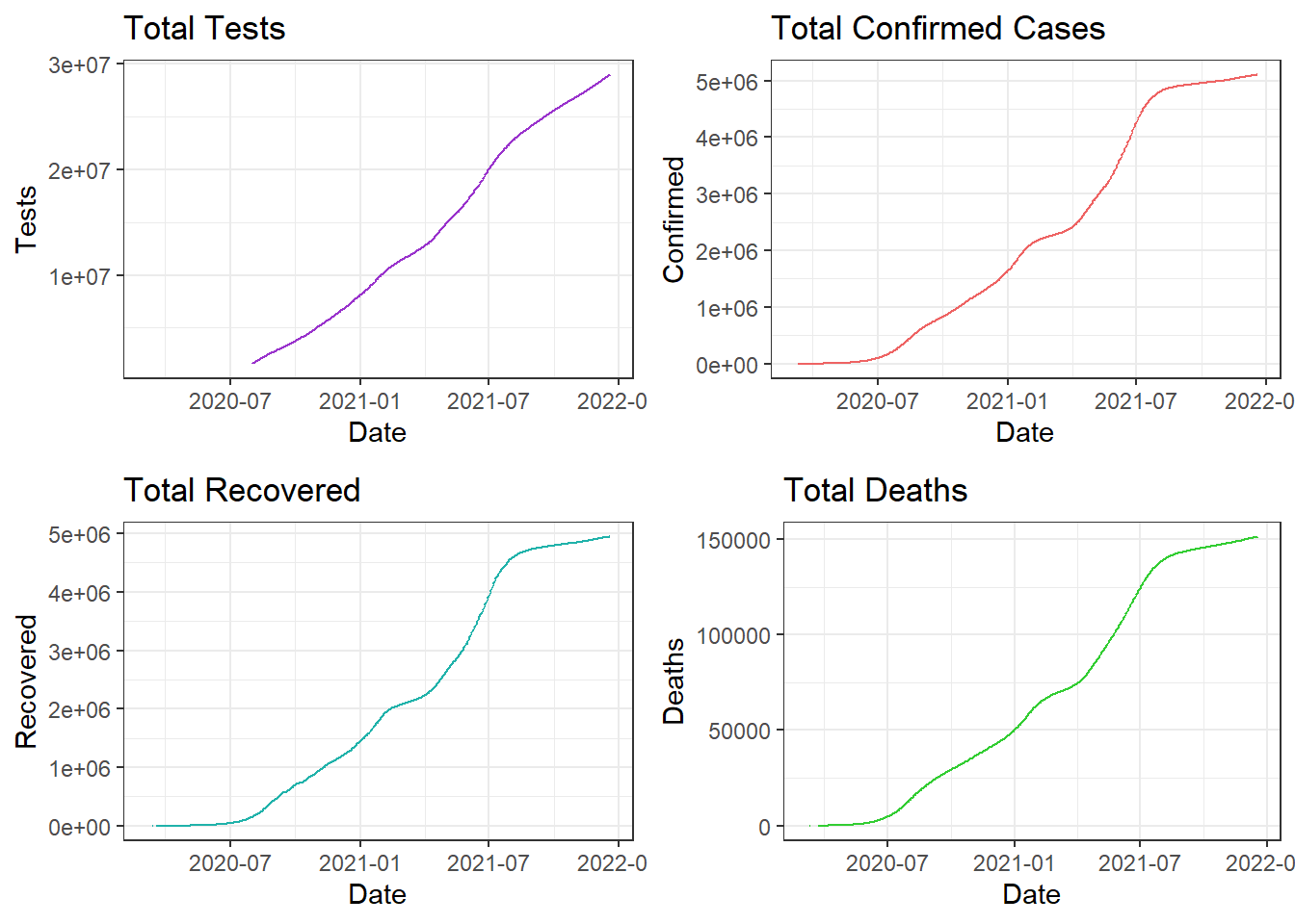
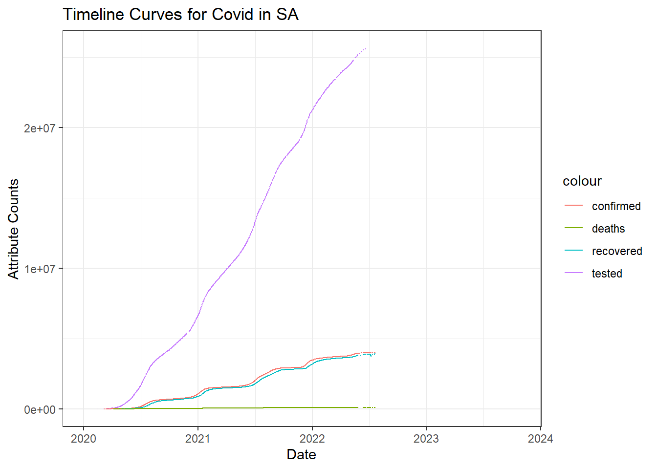
Covid Timeline in Colombia
As inferred from the interactive table, tests have begun before the first case was confirmed in March. This might indicate that the pandemic was rising elsewhere and had not spread to Colombia yet.
There is a close relation with the number of people recovered with the confirmed cases. This indicates most of the people recovered approximately within 2-3 weeks after infection. The curve is being flattened after it peaked in August.
We can observe that the recovery time-line is not continuous in the beginning around March and the confirmed time-line has some discontinuity towards the end. This shows that these numbers were stagnant and not recorded until the count increased.
It will be a good idea to view each attribute separately to get a better picture since deaths are very low in numbers and aren’t distinctly visible.
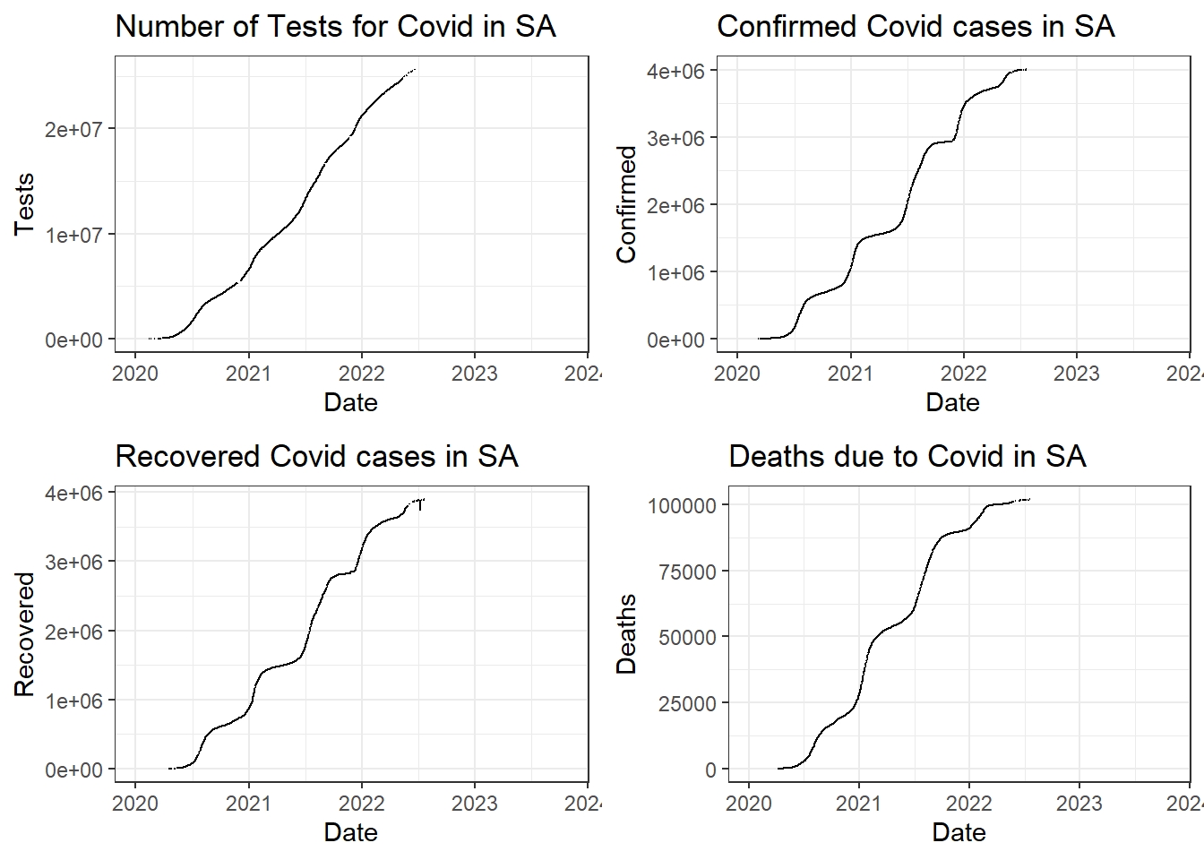
Comparing Tests, Cases, Recoveries, and Deaths
The above plot confirms our inference about discontinuity in line for recovery and confirmed time-lines in the beginning and towards the end respectively.
The curve seems to be flattening off late in Colombia with the confirmed cases and deaths flattening off late.
Totals for each attribute in Colombia:
- Total Tests - 2.8955292^{7}
- Total Confirmed - 5107323
- Total Recovered - 4946900
- Total Deaths - 151310
Data Story 2- How the pandemic evolved daily in Colombia
- A useful way to summarize data is by daily basis. We have only totals recorded in the data and we create a table of daily counts using the lag() function. This helps us analyze how Covid counts changed on daily basis rather than totals.
Daily Data
The above table shows the daily evolution of number of counts for each attribute.
Daily Average Values for each attribute in Colombia:
- Average Tests per Day - 5.4147^{4}
- Average Cases Confirmed per Day - 7882
- Average Recoveries per Day - 7705
- Average Deaths per Day - 237
Daily Timeline Curves
We can observe from the above plot that there has been a drastic decrease in confirmed cases during the end of August and those that were infected then, have recovered within 2-3 weeks.
Cases have almost decreased towards zero after September 2020. The rising curve is less steeper than the decline curve. This goes to show that Colombia controlled the spread of the pandemic in a great way!
Separating the graphs gives a better picture of how each attribute counts evolved daily.
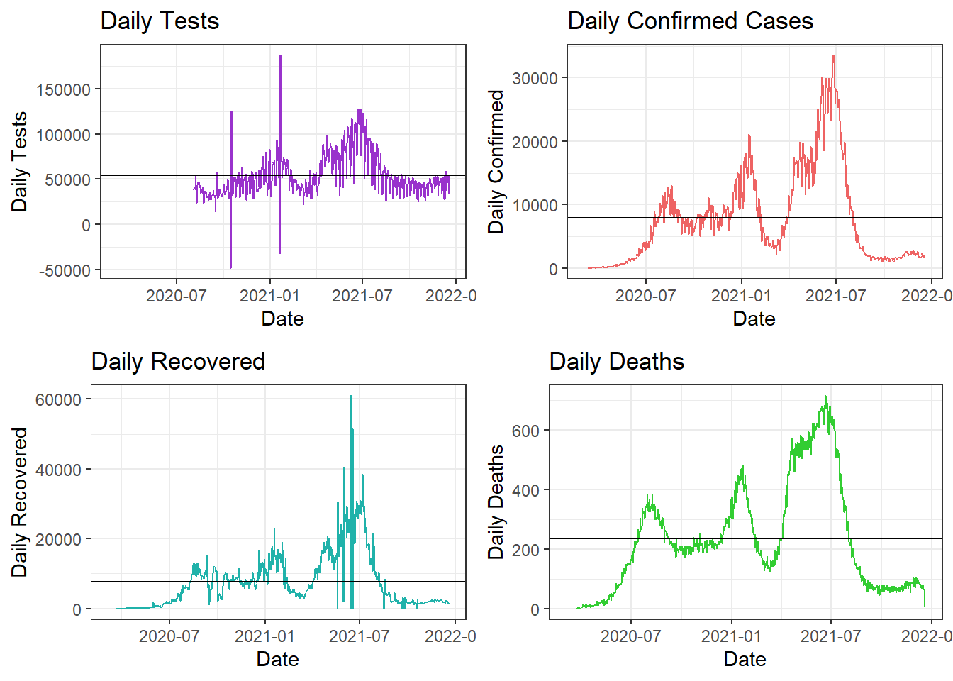
Comparing Daily Tests, Cases, Recoveries, and Deaths
In the above plot, the x-axes represent the Months/Time-line and the y-axes represent the daily counts for that attribute. The black horizontal line represents the average daily counts till date.
Covid was at its peak during August in Colombia after seeing a rise from June onward. We can observe that the situation was brought under control and the cases drastically decreased towards the beginning of September.
Tests are still being conducted but the test counts are lowering since the confirmed cases and deaths are decreasing. The first wave of the pandemic is controlled with cases and death counts decreased to less than the daily average values. The number of recoveries has increased over daily average value, which again, is a good sign.
Bonus Story -
- As an addition to these trends, let’s have a look at the trends of restrictions in Colombia. This will help us verify our insights as restrictions are usually directly proportional to confirmed cases.
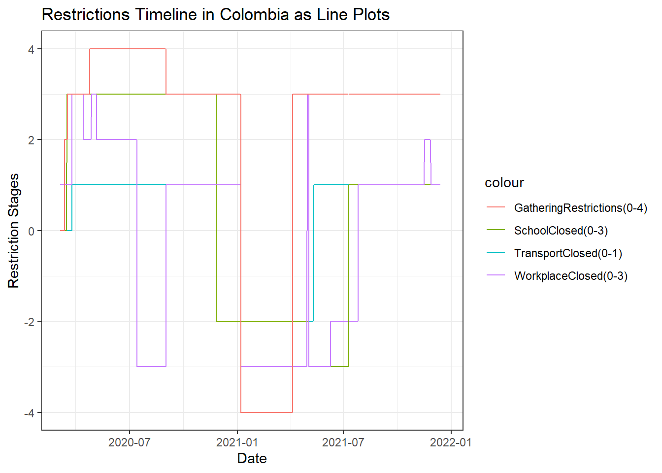
Restrictions in Colombia
The above line plot displays how restrictions were changed throughout the course of the pandemic. The x-axis displays Date while the y-axis displays the restriction stage for each attribute line. The different colors represent the different restrictions for the particular attribute which includes Social Gatherings, School, Workplace, and Transport operations in Colombia.
Social gatherings: have been restricted to stage 2 as the pandemic evolved and increased from March. From April, we see a stage 3 restriction for gatherings which went to stage 4 during May and remained as such till September where it has come back to stage 3. This verifies our conclusion that the pandemic has been contolled off late.
Schools and Transport: have remained closed from March and haven’t opened yet.
Workplaces: were closed at stage 1 in March. This restriction was raised to stage 3 during April. May, most of June and beginning of July sees a lift of restrictions to stage 2. This shows that working is essential for a country to run and they remianed with lesser restrictions compared to other attributes. August sees a raise to stage 3 and in September, the restrictions are lifted to as low as stage 1. This again indicates the control of the pandemic.
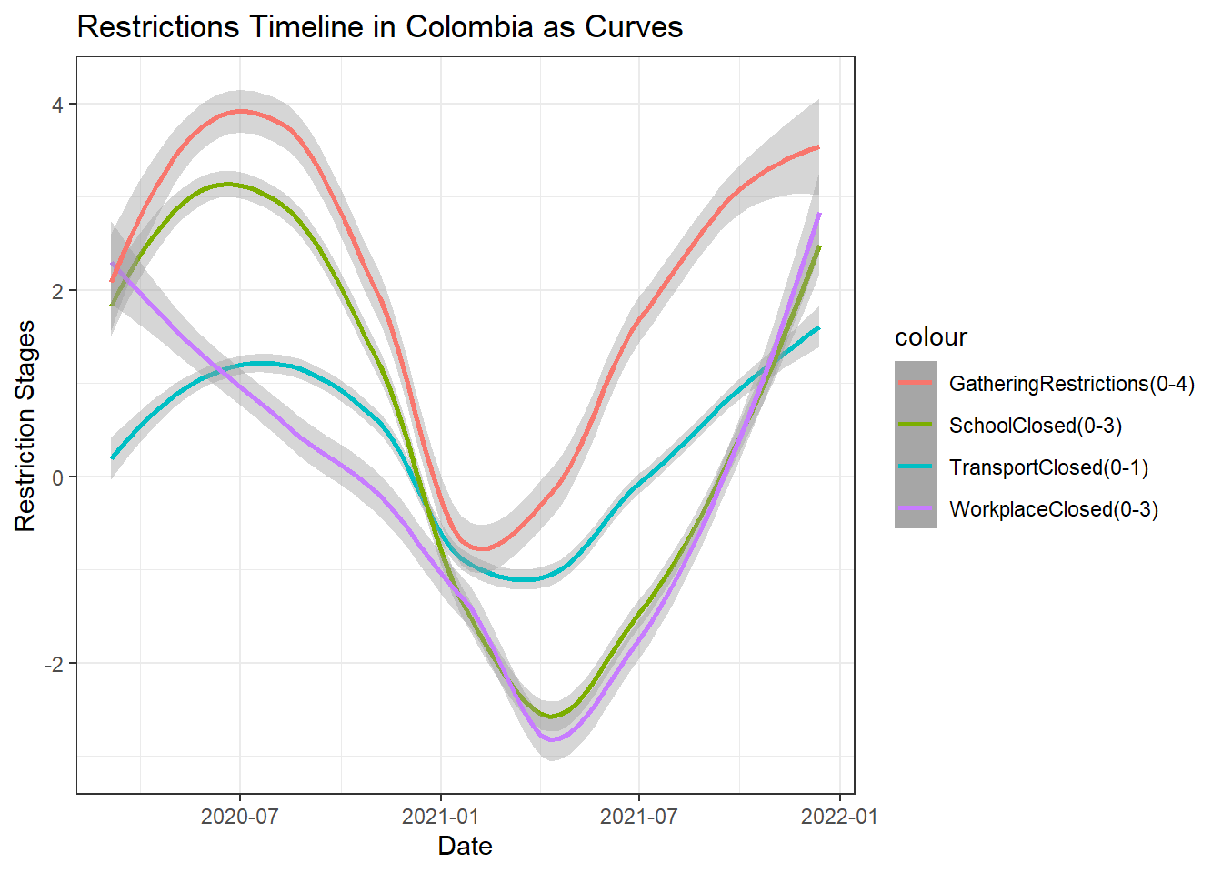
Restrictions in Colombia as Smooth Curves
The above plot shows a smooth trend of the restrictions for different attributes in Colombia. We can see that none of the restrictions are completely lifted yet. Workplace restrictions has seen the maximum variation in trend for the reasons stated previously. Gathering restrictions seem to have lowered off late.
In conclusion, Colombia was hit with the pandemic during early March and slowly started increasing after June. It peaked during August 2020 with almost around 17000 cases and 350 deaths on any single day. This situation was brought under control and the counts have drastically decreased towards the beginning of September 2020. Colombia needs to continue this to eradicate the pandemic as soon as possible.
South Africa -
- The following table consists of the columns of interest and their values.
- The above table is interactive and can be used to get an overview of the data. Specifics like when the testings started, when the first case was confirmed, how many recovered, and how many had died can be determined by exploring the table. Click on ‘Next’ to explore all 225 rows.
Data Story 3 -
- Let us have a look at the timelines for tests, confirmed, recovered, and deaths due to COVID.
Covid Timeline in South Africa
As inferred from the interactive table, tests have begun far before the first case was confirmed. This might indicate that the pandemic was rising elsewhere and had not spread to SA yet and they were taking precautions.
We can see a close relation with the number of people recovered with the confirmed cases. This indicates most of the people recovered approximately within 2 weeks after infection.
It will be a good idea to view each attribute separately to get a better picture.
Comparing Tests, Cases, Recoveries, and Deaths
Totals for each attribute in SA:
- Total Tests - 2.5637671^{7}
- Total Confirmed - 4002981
- Total Recovered - 3894847
- Total Deaths - 101955
A useful way to summarize data is by daily basis. The following table explores the same.
- The following tables show Summary Statistics of the above columns.
- Mean Summaries:
- Minimum Summaries:
- Maximum Summaries:
Conclusions & Observations -
South Africa had started testing for Covid during March 2020 when the cases started rising throughout the world. Testing in South Africa seems to have started on 11 Feb 2020. The first confirmed case was on 05 Mar 2020. The first fatality due to Covid was on 22 Mar 2020.
The number of recoveries increase almost equally with the number of cases confirmed. This means there was only a small proportion of fatalities compared to number of recoveries.
We can see that on an average, there were 21728 tests conducted out of which 3685 cases were confirmed. Also, there were 3237 recoveries and 84 deaths on an average, on a daily basis in SA.
There was a minimum of 76 tests conducted, 3 cases confirmed, and 0 recoveries and deaths in SA on any given day.
SA saw the worst phase of the pandemic when there were 13944 confirmed cases and 572 deaths on any given day.
References -
Data Source - Guidotti, E., Ardia, D., (2020), “COVID-19 Data Hub”, Journal of Open Source Software 5(51):2376, doi: 10.21105/joss.02376
Data Tables - https://rstudio.github.io/DT/
Reactable - https://glin.github.io/reactable/reference/reactable.html
Wickham et al., (2019). Welcome to the tidyverse. Journal of Open Source Software, 4(43), 1686, https://doi.org/10.21105/joss.01686
Kirill Müller (2017). here: A Simpler Way to Find Your Files. R package version 0.1. https://CRAN.R-project.org/package=here
Greg Lin (2020). reactable: Interactive Data Tables Based on ‘React Table’. https://glin.github.io/reactable/, https://github.com/glin/reactable.
Yihui Xie, Joe Cheng and Xianying Tan (2020). DT: A Wrapper of the JavaScript Library ‘DataTables’. R package version 0.15. https://CRAN.R-project.org/package=DT
Alboukadel Kassambara (2020). ggpubr: ‘ggplot2’ Based Publication Ready Plots. R package version 0.4.0. https://CRAN.R-project.org/package=ggpubr
Hao Zhu (2019). kableExtra: Construct Complex Table with ‘kable’ and Pipe Syntax. R package version 1.1.0. https://CRAN.R-project.org/package=kableExtra
Retail Forecasting Project
This is an Individual Assignment by Rahul Bharadwaj and deals with concepts in Applied Forecasting and Statistical methods in R programming. The topic is “Retail-Forecasting-Project” for the retail sales of clothes, footwear, and personal accessories in Tasmania.
Clothing, Footwear, and Personal Accessories Retail for the region Tasmania:
set.seed(31322239)
myseries <- aus_retail %>%
  filter(
    `Series ID` == sample(aus_retail$`Series ID`,1),
    Month < yearmonth("2018 Jan")
  ) %>%
  mutate(Month = yearmonth(Month)) %>%
  as_tsibble(key = c(State, Industry, `Series ID`), index = Month)
1. A discussion of the statistical features of the original data.
- The
autopplot()function helps us get an overview of the long term trend in the Turnover throughout the time series from 1982 to 2017. We can see a general increasing trend throughout the time series for Clothing, Footwear and personal accessory retailing.
autoplot(myseries) +
  labs(title = "Turnover Graph of Original Data")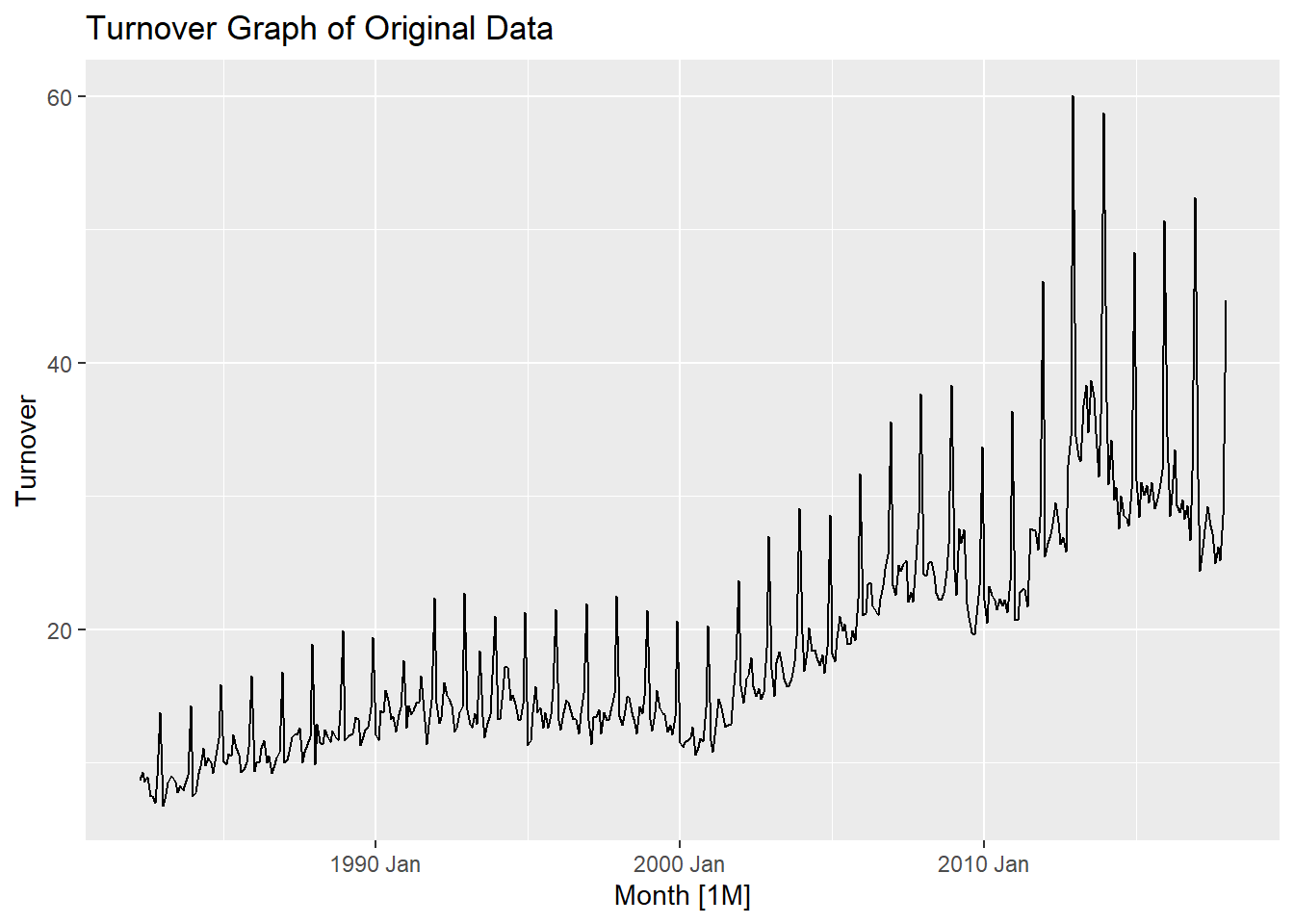
- Particularly after 2000, there has been a steeper increase in the trend which shows a higher rate of retail purchase from 2000-2017. We can also observe seasonality in this graph which shows that shopping is not consistent throughout the year. To explore seasonality in detail, we plot using
gg_season()function.
gg_season(myseries) +
  labs(title = "Monthly Turnover Graph over each year")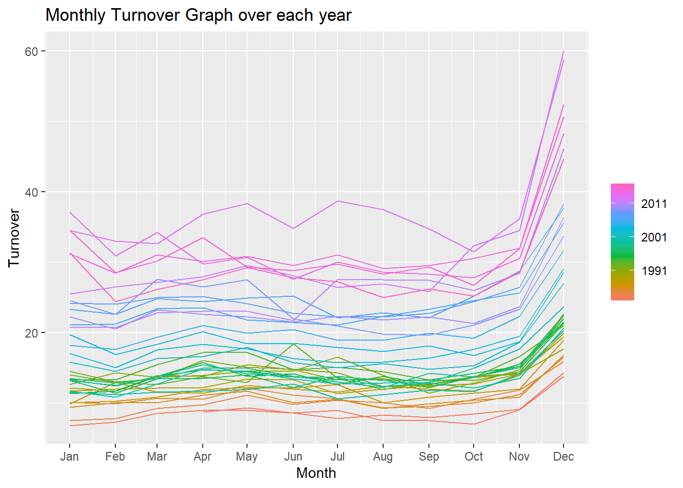
The above figure shows a seasonality of retail shopping throughout the different months of the year for all the years. We can observe a general increase in shopping towards the end of the year for Christmas. The seasonal graph shows a somewhat consistent shopping throughout the year other than towards the end.
We can observe the increasing trend in this graph as well. There are some peaks and plunges during June for the different years observed. This can be further investigated for more information.
gg_subseries(myseries) +
  labs(title = "Monthly Turnover for all years")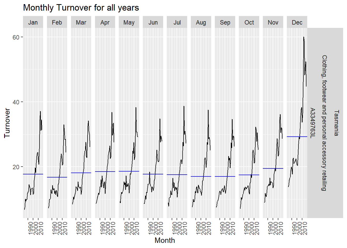
The above plot displays the change in retail shopping behavior for each month throughout the time series. We can observe a general increasing trend in shopping behavior throughout the time series.
Particularly the month of December as observed previously has a steep increase the year 2000. This again hints at increased shopping after the year 2000. We can observe a small decrease in the December subplot after 2010 but this still is way higher compared to other months of the year.
We can conclude that the average turnover for November and December are highest every year for reatil shopping and that there has been a general upward trend in shopping after the year 2000 from these plots.
2. Explanation of transformations and differencing used.
Producing a plot of an STL decomposition of the transformed data and Explaining what is learned.
Finding an appropriate Box-Cox transformation for the data.
Lambda value is as follows and the following plot shows a Box-Cox transformed plot for Turnover.
myseries %>% features(Turnover, features = guerrero) %>% pull(lambda_guerrero) -> lambda

myseries_boxcox <- myseries %>% mutate(Turnover = (box_cox(Turnover, lambda)))

myseries_boxcox %>%
  model(STL(Turnover)) %>%
  components() %>%
  autoplot() +
    labs(title = "STL decomposition: Retail for the region Tasmania")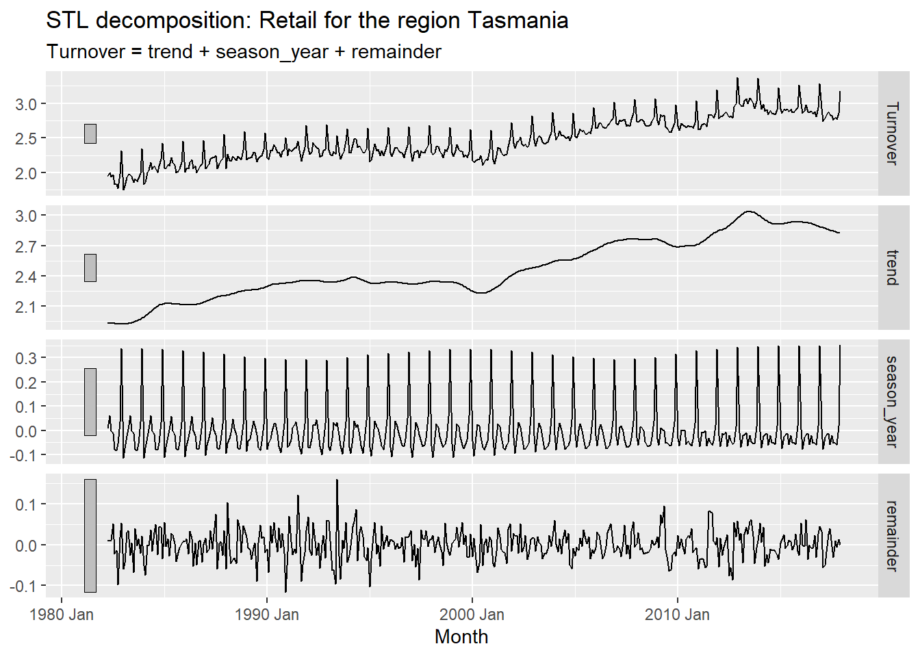
The above plot has four components. They are:
Turnover - This plot shows the Box-Cox transformed Turnover which is the same as the plot before. This plot is further split in to there components namely, trend, seasonality, and remainder.
Trend - This graph shows the long term trend of the data. It gives an overview of whether the data is increasing or decreasing across all years. This trend is evidently observed in the top plot.
Seasonality - This graph shows the seasonal ups and downs that can be observed within the short term duration within an year. We can observe how this seasonality is changing over the years. The seasonal patterns has remained almost similar but starts to change a little from Jan 2000 onward. We have a different seasonal pattern in the latest observation compared to the oldest data.
Remainder - This graph shows the remaining parts of the data that may or may not show any particular patterns or cycles. This component doesn’t show show any particular patterns and least affects the top plot.
myseries_boxcox %>%
  autoplot() +
  geom_smooth(method = 'lm') +
labs(y = "Box-Cox transformed Turnover", title = "Turnover graph after Box-Cox Transformation")![]()
Unit Root Test to determine stationarity.
myseries_boxcox %>%
  features(Turnover, unitroot_kpss)
## # A tibble: 1 x 5
## State Industry `Series ID` kpss_stat kpss_pvalue
## <chr> <chr> <chr> <dbl> <dbl>
## 1 Tasmania Clothing, footwear and personal ac~ A3349763L 6.44 0.01- The value is large for the statistic and p-value is 0.01 which shows it is not stationary.
We determine the p-value for the differenced data now.
myseries_boxcox %>%
  mutate(diff_t = difference(Turnover)) %>%
  features(diff_t, unitroot_kpss)
## # A tibble: 1 x 5
## State Industry `Series ID` kpss_stat kpss_pvalue
## <chr> <chr> <chr> <dbl> <dbl>
## 1 Tasmania Clothing, footwear and personal ac~ A3349763L 0.0174 0.1- The differenced data has p-value 0.1 and is thus said to be stationary.
myseries_total <- myseries_boxcox %>%
  summarise(Turnover = sum(Turnover))
myseries_total %>%
  mutate(log_turnover = log(Turnover)) %>%
  features(log_turnover, unitroot_nsdiffs)
## # A tibble: 1 x 1
## nsdiffs
## <int>
## 1 1This shows that 1 seasonal differencing is required.
Differencing
myseries_boxcox %>% gg_tsdisplay(Turnover, plot_type = "partial") +
  labs(title = "Dataset before Differencing")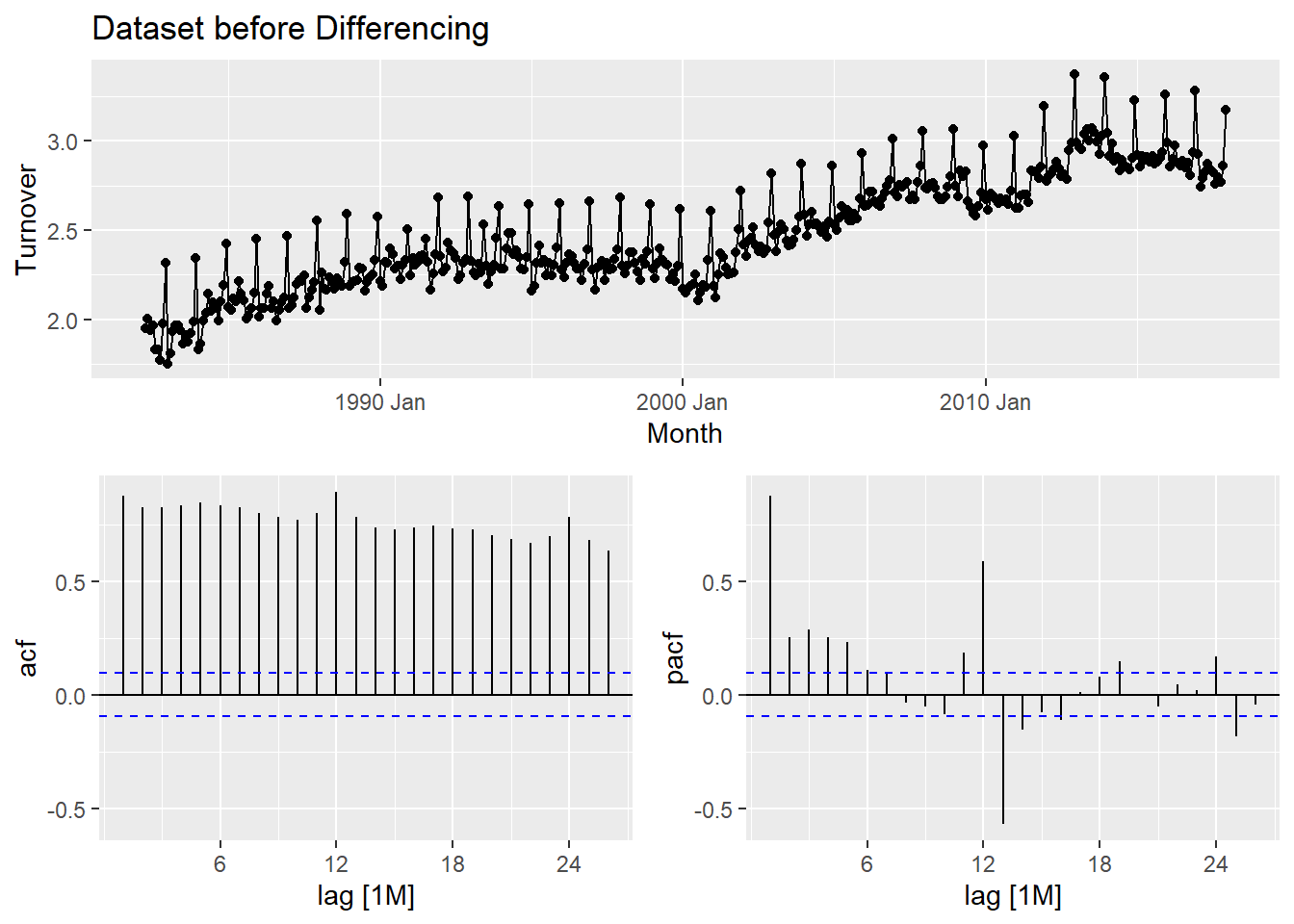
After applying the differencing:
myseries_boxcox %>% gg_tsdisplay(difference((Turnover), lag = 12), plot_type = "partial") +
  labs(title = "Dataset after Differencing")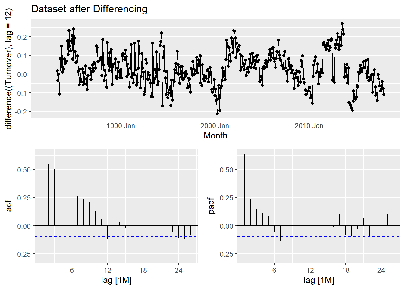
3. A description of the methodology used to create a short-list of appropriate ARIMA models and ETS models.
Methodology: The process of selecting a shortlist of ARIMA model involves careful observation of the previous graph with acf and pacf vaues. We need to select one of the two from our observation as to which one is simpler. In this case, the pacf is much simpler compared to acf as there are more significant values in acf. We go ahead and make observations in pacf and use them in our modelling.
Shortlist of ARIMA models:
Template: f(y) ~ ARIMA(p,d,q)(P,D,Q)[m]
boxcox(y) ~ ARIMA (p, d=0, q)(P, D=1, Q)[m]
boxcox(y) ~ ARIMA (p = 1, d = 0, q = 0)(P = 2, D = 1, Q = 0)[12] + c
boxcox(y) ~ ARIMA (p = 7, d = 0, q = 0)(P = 2, D = 1, Q = 0)[12] + c
- From the pacf graph, we observe that at lag 7, there is significant values. Our choice is less than the lag value of 12 itself and this is ideal. Let’s go ahead and model our two shortlisted Arima Models and compare it with an equivalent auto ARIMA Model. We use the automatic ETS modeling to choose an ETS model for our data.
fit <- myseries_boxcox %>%
  model(
    arima100210c = ARIMA((Turnover) ~ 1 + pdq(1, 0, 0) + PDQ(2, 1, 0)),
    arima700210c = ARIMA((Turnover) ~ 1 + pdq(7, 0, 0) + PDQ(2, 1, 0)),
    autoarima = ARIMA(Turnover ~ pdq(d=0) + PDQ(D=1), trace = TRUE),
    autoets = ETS(Turnover)
  )
## Model specification Selection metric
## ARIMA(2,0,2)(1,1,1)[12]+c -653976.318355
## ARIMA(0,0,0)(0,1,0)[12]+c -653563.112032
## ARIMA(1,0,0)(1,1,0)[12]+c -653842.032374
## ARIMA(0,0,1)(0,1,1)[12]+c -653722.372428
## Search iteration complete: Current best fit is 2 0 2 1 1 1 1
## ARIMA(2,0,2)(0,1,1)[12]+c -653961.308888
## ARIMA(2,0,2)(1,1,0)[12]+c -653894.798878
## ARIMA(1,0,2)(1,1,1)[12]+c -653971.995608
## ARIMA(2,0,1)(1,1,1)[12]+c -653968.085241
## ARIMA(2,0,2)(1,1,1)[12] -653975.910295
## ARIMA(2,0,2)(0,1,0)[12]+c -653826.043543
## ARIMA(1,0,2)(0,1,1)[12]+c -653960.696738
## ARIMA(2,0,1)(0,1,1)[12]+c -653955.796132
## ARIMA(2,0,2)(0,1,1)[12] -653961.220122
## ARIMA(2,0,3)(0,1,1)[12]+c -653959.230564
## ARIMA(3,0,2)(0,1,1)[12]+c -653958.019079
## ARIMA(2,0,2)(0,1,2)[12]+c -653962.401879
## ARIMA(1,0,2)(1,1,0)[12]+c -653891.007987
## ARIMA(2,0,1)(1,1,0)[12]+c -653893.149582
## ARIMA(2,0,2)(1,1,0)[12] -653895.411456
## ARIMA(2,0,3)(1,1,0)[12]+c -653892.859753
## ARIMA(3,0,2)(1,1,0)[12]+c -653895.980754
## ARIMA(1,0,1)(1,1,1)[12]+c -653973.198057
## ARIMA(1,0,2)(1,1,1)[12] -653971.845077
## ARIMA(1,0,3)(1,1,1)[12]+c -653970.281793
## ARIMA(2,0,1)(1,1,1)[12] -653967.425233
## ARIMA(3,0,1)(1,1,1)[12]+c -653965.504027
## ARIMA(1,0,2)(1,1,2)[12]+c -653976.587489
## Search iteration complete: Current best fit is 1 0 2 1 1 2 1
## ARIMA(1,0,2)(0,1,2)[12]+c -653960.898002
## ARIMA(0,0,2)(1,1,2)[12]+c -653795.590511
## ARIMA(1,0,1)(1,1,2)[12]+c -653977.128218
## Search iteration complete: Current best fit is 1 0 1 1 1 2 1
## ARIMA(1,0,1)(0,1,2)[12]+c -653961.844994
## ARIMA(0,0,1)(1,1,2)[12]+c -653729.448535
## ARIMA(1,0,0)(1,1,2)[12]+c -653906.699317
## ARIMA(1,0,1)(1,1,2)[12] -653976.493902
## ARIMA(2,0,1)(1,1,2)[12]+c -653975.589864
## ARIMA(1,0,1)(2,1,2)[12]+c -653991.247460
## Search iteration complete: Current best fit is 1 0 1 2 1 2 1
## ARIMA(1,0,1)(2,1,1)[12]+c -653985.047145
## ARIMA(0,0,1)(2,1,2)[12]+c -653754.203989
## ARIMA(1,0,0)(2,1,2)[12]+c -653924.211739
## ARIMA(1,0,1)(2,1,2)[12] -653990.404261
## ARIMA(0,0,1)(2,1,1)[12]+c -653741.151807
## ARIMA(1,0,0)(2,1,1)[12]+c -653911.038933
## ARIMA(1,0,1)(2,1,1)[12] -653985.094715
## ARIMA(1,0,2)(2,1,1)[12]+c -653983.741237
## ARIMA(2,0,1)(2,1,1)[12]+c -653982.661491
## ARIMA(0,0,0)(2,1,2)[12]+c -653596.498560
## ARIMA(0,0,1)(2,1,2)[12] -653699.721794
## ARIMA(0,0,2)(2,1,2)[12]+c -653819.934711
## ARIMA(1,0,0)(2,1,2)[12] -653901.387802
## ARIMA(2,0,0)(2,1,2)[12]+c -653961.748680
##
## --- Re-estimating best models without approximation ---
##
## ARIMA(1,0,1)(2,1,2)[12]+c Inf
## ARIMA(1,0,1)(2,1,2)[12] Inf
## ARIMA(1,0,1)(2,1,1)[12] Inf
## ARIMA(1,0,1)(2,1,1)[12]+c -1247.900767glance(fit)## # A tibble: 4 x 14
## State Industry `Series ID` .model sigma2 log_lik AIC AICc BIC
## <chr> <chr> <chr> <chr> <dbl> <dbl> <dbl> <dbl> <dbl>
## 1 Tasmania Clothing, fo~ A3349763L arima~ 0.00379 571. -1131. -1131. -1111.
## 2 Tasmania Clothing, fo~ A3349763L arima~ 0.00316 611. -1199. -1198. -1155.
## 3 Tasmania Clothing, fo~ A3349763L autoa~ 0.00278 631. -1248. -1248. -1220.
## 4 Tasmania Clothing, fo~ A3349763L autoe~ 0.00283 -32.8 102. 103. 175.
## # ... with 5 more variables: ar_roots <list>, ma_roots <list>, MSE <dbl>,
## # AMSE <dbl>, MAE <dbl>The lower the AIC value, the better the model. In our case, the auto ARIMA model ahs the lowest AIC value and thus, we select the automatically generated ARIMA model.
Creating Test Data with last 24 months:
set.seed(31322239)
testdata <- aus_retail %>%
  filter(
    `Series ID` == sample(aus_retail$`Series ID`,1),
    Month >= yearmonth("2016 Jan")
  ) %>%
  mutate(Month = yearmonth(Month)) %>%
  as_tsibble(key = c(State, Industry, `Series ID`), index = Month)

test <- testdata %>% mutate(Turnover = (box_cox(Turnover, lambda)))

fittest <- test %>%
  model(
    arima = ARIMA(Turnover ~ pdq(d=0) + PDQ(D=1), trace = TRUE),
    ets = ETS(Turnover)
  )
## Model specification Selection metric
## ARIMA(2,0,2)(1,1,1)[12]+c Inf
## ARIMA(0,0,0)(0,1,0)[12]+c -64.753418
## ARIMA(1,0,0)(1,1,0)[12]+c -68.151478
## ARIMA(0,0,1)(0,1,1)[12]+c -65.570925
## Search iteration complete: Current best fit is 1 0 0 1 1 0 1
## ARIMA(1,0,0)(0,1,0)[12]+c -71.056460
## Search iteration complete: Current best fit is 1 0 0 0 1 0 1
## ARIMA(1,0,0)(0,1,0)[12] -71.277692
## Search iteration complete: Current best fit is 1 0 0 0 1 0 0
## ARIMA(0,0,0)(0,1,0)[12] -57.949631
## ARIMA(1,0,1)(0,1,0)[12] -70.640801
## ARIMA(2,0,0)(0,1,0)[12] -69.722193
## ARIMA(1,0,0)(0,1,1)[12] -69.058928
## ARIMA(1,0,0)(1,1,0)[12] -69.049956
## ARIMA(0,0,1)(0,1,0)[12] -64.629902
## ARIMA(1,0,1)(0,1,0)[12]+c -68.694820
## ARIMA(2,0,0)(0,1,0)[12]+c -68.555772
## ARIMA(2,0,1)(0,1,0)[12] -67.987794
## ARIMA(0,0,0)(0,1,1)[12] -55.651838
## ARIMA(1,0,0)(0,1,1)[12]+c -68.151489
## ARIMA(1,0,1)(0,1,1)[12] -67.886494
## ARIMA(2,0,0)(0,1,1)[12] -67.196575
## ARIMA(0,0,0)(1,1,0)[12] -55.651838
## ARIMA(1,0,1)(1,1,0)[12] -67.869716
## ARIMA(2,0,0)(1,1,0)[12] -67.180697
## ARIMA(1,0,0)(1,1,1)[12] Infglance(fittest)## # A tibble: 2 x 14
## State Industry `Series ID` .model sigma2 log_lik AIC AICc BIC ar_roots
## <chr> <chr> <chr> <chr> <dbl> <dbl> <dbl> <dbl> <dbl> <list>
## 1 Tasma~ Clothing~ A3349763L arima 2.53e-3 37.9 -71.8 -71.3 -69.5 <cpl [1~
## 2 Tasma~ Clothing~ A3349763L ets 2.23e-4 57.6 -85.2 -61.2 -61.5 <NULL>
## # ... with 4 more variables: ma_roots <list>, MSE <dbl>, AMSE <dbl>, MAE <dbl>4. Choose one ARIMA model and one ETS model based on this analysis and show parameter estimates, residual diagnostics, forecasts and prediction intervals for both models. Diagnostic checking for both models should include ACF graphs as well as the Ljung-Box test.
Chosen ARIMA & ETS Models: Automatically generated ARIMA & ETS Models.
ARIMA Model: parameter estimates, residual diagnostics, and forecasts
fit %>%
  select(autoarima) %>% tidy()
## # A tibble: 6 x 6
## .model term estimate std.error statistic p.value
## <chr> <chr> <dbl> <dbl> <dbl> <dbl>
## 1 autoarima ar1 0.970 0.0145 66.7 1.11e-224
## 2 autoarima ma1 -0.555 0.0461 -12.0 7.46e- 29
## 3 autoarima sar1 0.0934 0.0663 1.41 1.59e- 1
## 4 autoarima sar2 -0.0428 0.0611 -0.702 4.83e- 1
## 5 autoarima sma1 -0.848 0.0476 -17.8 2.83e- 53
## 6 autoarima constant 0.000742 0.000191 3.89 1.18e- 4fit %>%
select(autoarima) %>% gg_tsresiduals() +
labs(title = "Residuals, ACF, and Count for ARIMA Model")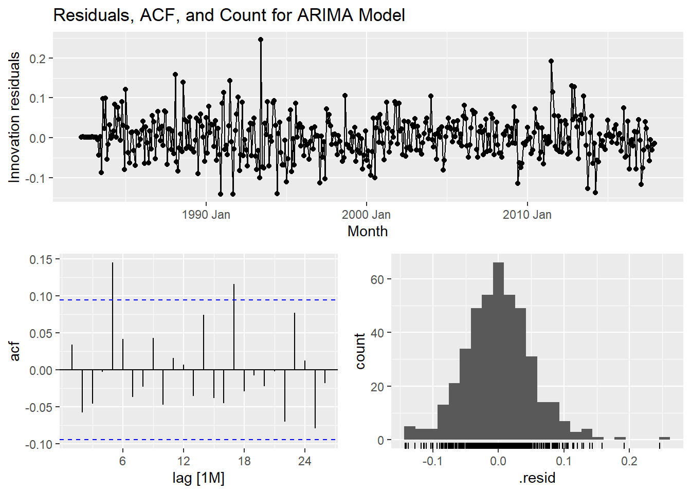
fit %>%
  select(autoarima) %>%
  forecast(h = "2 years") %>% rmarkdown::paged_table()
ETS Model: parameter estimates, residual diagnostics, and forecasts
fit %>%
  select(autoets) %>% tidy()
## # A tibble: 18 x 3
## .model term estimate
## <chr> <chr> <dbl>
## 1 autoets alpha 0.389
## 2 autoets beta 0.00249
## 3 autoets gamma 0.105
## 4 autoets phi 0.980
## 5 autoets l[0] 1.90
## 6 autoets b[0] 0.00677
## 7 autoets s[0] -0.0298
## 8 autoets s[-1] -0.0948
## 9 autoets s[-2] -0.103
## 10 autoets s[-3] 0.338
## 11 autoets s[-4] 0.0383
## 12 autoets s[-5] -0.0411
## 13 autoets s[-6] -0.0701
## 14 autoets s[-7] -0.0492
## 15 autoets s[-8] -0.0208
## 16 autoets s[-9] -0.00690
## 17 autoets s[-10] 0.0431
## 18 autoets s[-11] -0.00407fit %>%
select(autoets) %>% gg_tsresiduals() +
labs(title = "Residuals, ACF, and Count for ETS Model")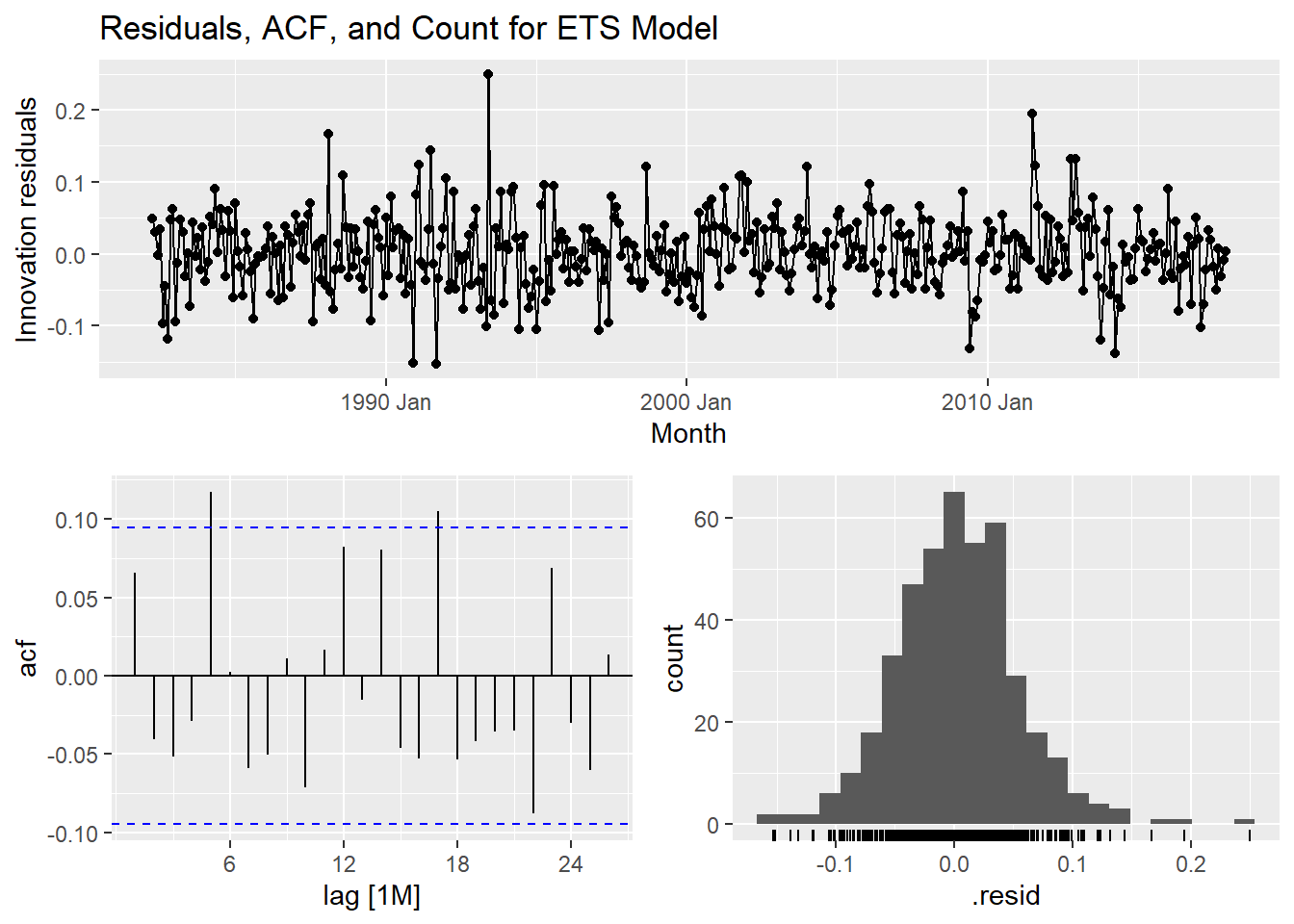
fit %>%
  select(autoets) %>%
  forecast(h = "2 years") %>% rmarkdown::paged_table()
Ljung-Box Test:
augment(fit) %>% features(.innov, ljung_box, lag=12, dof=1)## # A tibble: 4 x 6
## State Industry `Series ID` .model lb_stat lb_pvalue
## <chr> <chr> <chr> <chr> <dbl> <dbl>
## 1 Tasmania Clothing, footwear and person~ A3349763L arima10~ 70.7 9.12e-11
## 2 Tasmania Clothing, footwear and person~ A3349763L arima70~ 5.15 9.23e- 1
## 3 Tasmania Clothing, footwear and person~ A3349763L autoari~ 15.5 1.60e- 1
## 4 Tasmania Clothing, footwear and person~ A3349763L autoets 18.1 7.87e- 25. Comparison of the results from each of your preferred models. Which method do you think gives the better forecasts? Explain with reference to the test-set.
With reference to test data:
fittest %>%
  select(arima, ets) %>%
  forecast(h = "2 years") %>% autoplot(myseries_total) +
  labs(title = "Auto ARIMA & ETS Forecasts for the test data in next 2 years")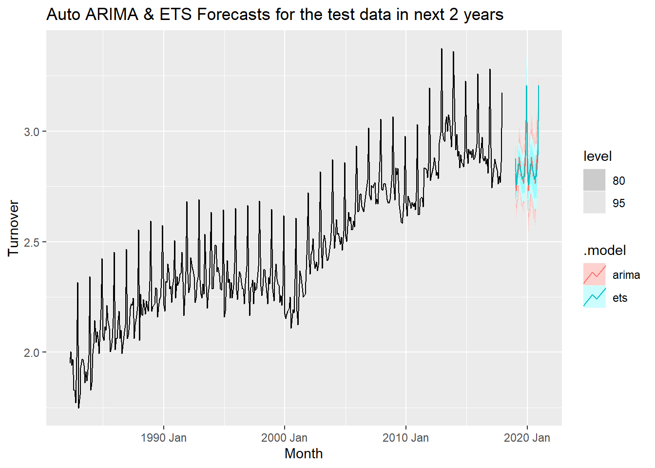
With reference to the test data considered 24 months prior to last observed data, the ETS model seems more accurate with narrower prediction intervals. The overall observations for both models are very similar and it it is hard to choose the best model.
6. Apply your two chosen models to the full data set and produce out-of-sample point forecasts and 80% prediction intervals for each model for two years past the end of the data provided.
The following table shows a point estimate for each model over 2 years with 80% predication intervals.
fitdata <- fit %>%
  select(autoarima, autoets) %>%
  forecast(h = 24)

hilo(fitdata, level = 80)%>%  unpack_hilo(cols = "80%") %>% rmarkdown::paged_table()
7. Obtain up-to-date data from the ABS website (Cat. 8501.0, Table 11), and compare your forecasts with the actual numbers.
set.seed(31322239)
fc <- fit %>%
  forecast(h = "2 years")

update <- aus_retail %>%
  filter(
    `Series ID` == sample(aus_retail$`Series ID`,1),
    Month > yearmonth("2018 Jan")
  ) %>%
  mutate(Month = yearmonth(Month)) %>%
  as_tsibble(key = c(State, Industry, `Series ID`), index = Month) %>%
  select(Month, Turnover) %>%
  as_tsibble(index=Month) %>%
  filter(Month >= min(fc$Month))

updatedata <- update %>% mutate(Turnover = (box_cox(Turnover, lambda)))

fc %>% accuracy(updatedata)
## # A tibble: 4 x 10
## .model .type ME RMSE MAE MPE MAPE MASE RMSSE ACF1
## <chr> <chr> <dbl> <dbl> <dbl> <dbl> <dbl> <dbl> <dbl> <dbl>
## 1 arima100210c Test -0.0519 0.0614 0.0520 -1.82 1.82 NaN NaN -0.311
## 2 arima700210c Test -0.00110 0.0339 0.0303 -0.0395 1.06 NaN NaN -0.256
## 3 autoarima Test -0.0102 0.0315 0.0296 -0.361 1.04 NaN NaN -0.0680
## 4 autoets Test 0.0212 0.0380 0.0283 0.735 0.989 NaN NaN 0.0654fc %>%
autoplot(myseries_boxcox %>% filter(year(Month) > 2018), alpha = .45) +
geom_line(data=updatedata, aes(x=Month, y=Turnover), col='red')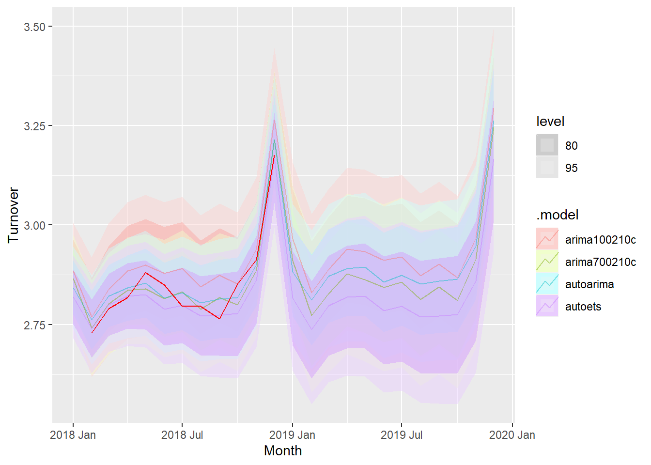
We have selected the remaining one year’s worth of data from Jan 2018 to Dec 2018 to check how the forecast fairs against the actual value.
The forecast values for all the ARIMA and ETS models are very close to the actual value in the data set. We can thus conclude that the modeling is pretty accurate.
8. A discussion of benefits and limitations of the models for your data.
Benefits:
Well fitted models with great accuracy.
Models have considered the patterns of the historical data in an efficient manner which is reflected in the forecast.
Limitations:
Model hasn’t considered the unlikely changes like a pandemic which hit in 2020.
The retail turnover would have an impact in 2020 which is unlikley to be predicted by our model.
Conclusion:
We have created an accurate forecasting model keeping in mind that the patterns in the future are the saem as the historical data. Under normal circumstances apart from a pandemic situation, our model fits well and indicates the retail turnover in Tasmania in a highly accurate manner.
Copyright © 2024 Rahul Bharadwaj Mysore Venkatesh
rahulbharadwaj97@gmail.com