Data Analysis
by Rahul Bharadwaj Mysore Venkatesh

“All work and no play makes Jack a dull boy” is a proverb. It means that without time off from work, a person becomes both bored and boring. What’s life without fun? One needs some time to get creative and have fun with what they do and take some time off work. But what if you could enjoy and also learn in the process? Now that’s the kind of win-win situations we want to create in our lives. So I decided on analyzing data related to my favorite topics and hobbies. I had a lot of fun creating these visualizations and I hope you have fun skimming through them!
Select one of the tabs below to explore.
Cricket Data

Introduction -
The first thing I could think of for a topic to analyze data in my semester 1 at Monash was sports! Having played professional sport for most of my childhood, I couldn’t have started off with a better topic. Also, working with something that is relatable helps us gain interest in a new venture as this creates some amount of familiarity. It is good to try new things! But it is always better with a little familiarity that creates a less scary environment for a new beginning!
This report aims at deducing the quality of batsmen in cricket from around the globe. The data used for this purpose is downloaded from the R package “cricketdata” from the following link - Cricket Data Source. Data on all international cricket matches is provided by ESPNCricinfo. This package provides some scraper functions to download the data into tibbles ready for analysis. This data is trimmed to suit our needs and consists of only 5 variables and 500 observations.
We first load all the necessary packages.
We can install cricket data from github with:
#install.packages("devtools")
devtools::install_github("ropenscilabs/cricketdata")- We are looking at only a subset of this data using the following lines of code:
cric_bat_data <- fetch_cricinfo("ODI", "Men", "Batting", "Career")

Data <- cric_bat_data %>% select("Player",
                                 "Innings",
                                 "Runs",
                                 "BallsFaced",
                                 "Hundreds")

write.csv(Data, file = "Cricket.csv")
The variables used for the analysis are “Player”, “Innings”, “Runs”, “BallsFaced”, and “Hundreds”. The factors used to compare and decide on the quality of a certain player are deduced from a simple variable like the number of Hundreds scored or from the Average of a player that can be derived from the runs scored and innings played by a certain player. The Factors considered for deciding the quality of a player are -
- Average - Runs scored per match
- Strike Rate - Runs scored per ball
- Hundreds - Number of 100s scored in career
The reasoning behind this is that any player scoring consistently in every match and scoring more runs per ball compared to others, is a quality player. The number of hundreds scored is also a good indicator of the quality of the player.
The concise data is read from the csv file as follows -
| Player | Innings | Runs | BallsFaced | Hundreds |
|---|---|---|---|---|
| SR Tendulkar | 452 | 18426 | 21367 | 49 |
| KC Sangakkara | 380 | 14234 | 18048 | 25 |
| RT Ponting | 365 | 13704 | 17046 | 30 |
| ST Jayasuriya | 433 | 13430 | 14725 | 28 |
| DPMD Jayawardene | 418 | 12650 | 16020 | 19 |
With this background, we can start an exploratory data analysis with the data that has been read from a csv file.
Exploratory Data Analysis -
The average and strike rate of each player is calculated and made into new columns as follows-
calc_cric_data <- cric_data %>% mutate(Average = cric_data$Runs/cric_data$Innings) %>% mutate(StrikeRate = cric_data$Runs/cric_data$BallsFaced*100) %>% drop_na()| Player | Hundreds | Average | StrikeRate |
|---|---|---|---|
| SR Tendulkar | 49 | 40.76549 | 86.23578 |
| KC Sangakkara | 25 | 37.45789 | 78.86746 |
| RT Ponting | 30 | 37.54521 | 80.39423 |
| ST Jayasuriya | 28 | 31.01617 | 91.20543 |
| DPMD Jayawardene | 19 | 30.26316 | 78.96380 |
Let us consider players with an average of above 40, strike rate of above 100, and more than 15 centuries recorded for the purpose of analysis and plot a Bar Graph.
top_avg <- calc_cric_data %>% dplyr::filter(Average>40)
top_sr <- calc_cric_data %>%  dplyr::filter(StrikeRate>100)
top_century <- calc_cric_data %>%  dplyr::filter(Hundreds>15)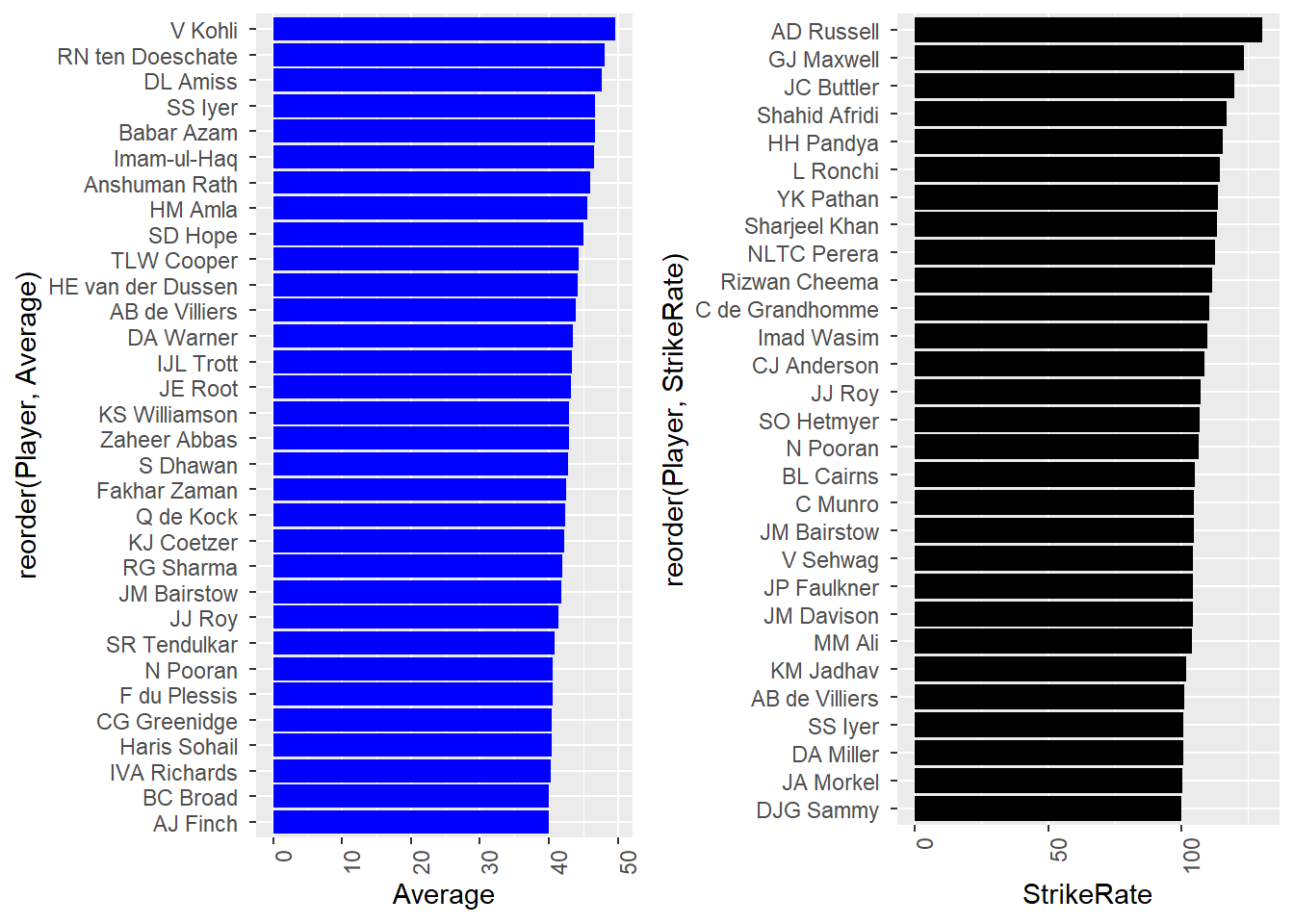
Comparing Averages and Strike Rates of top players
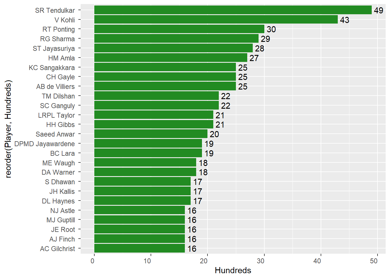
Hundreds scored by players
We are looking at Averages, Strike Rates, and Centuries of players in the ODI format as it is a mix of all skills needed by a batsman in this format. The data from Test or T20 formats might hold data that wouldn’t give an overall picture of the qaulity of a player.
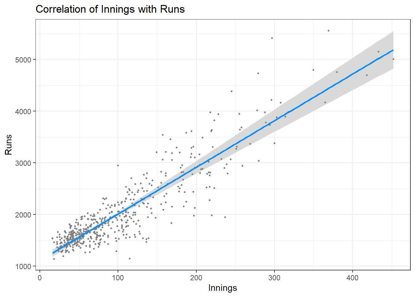
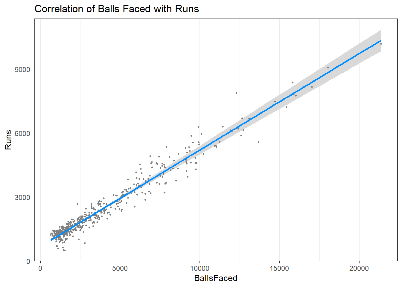
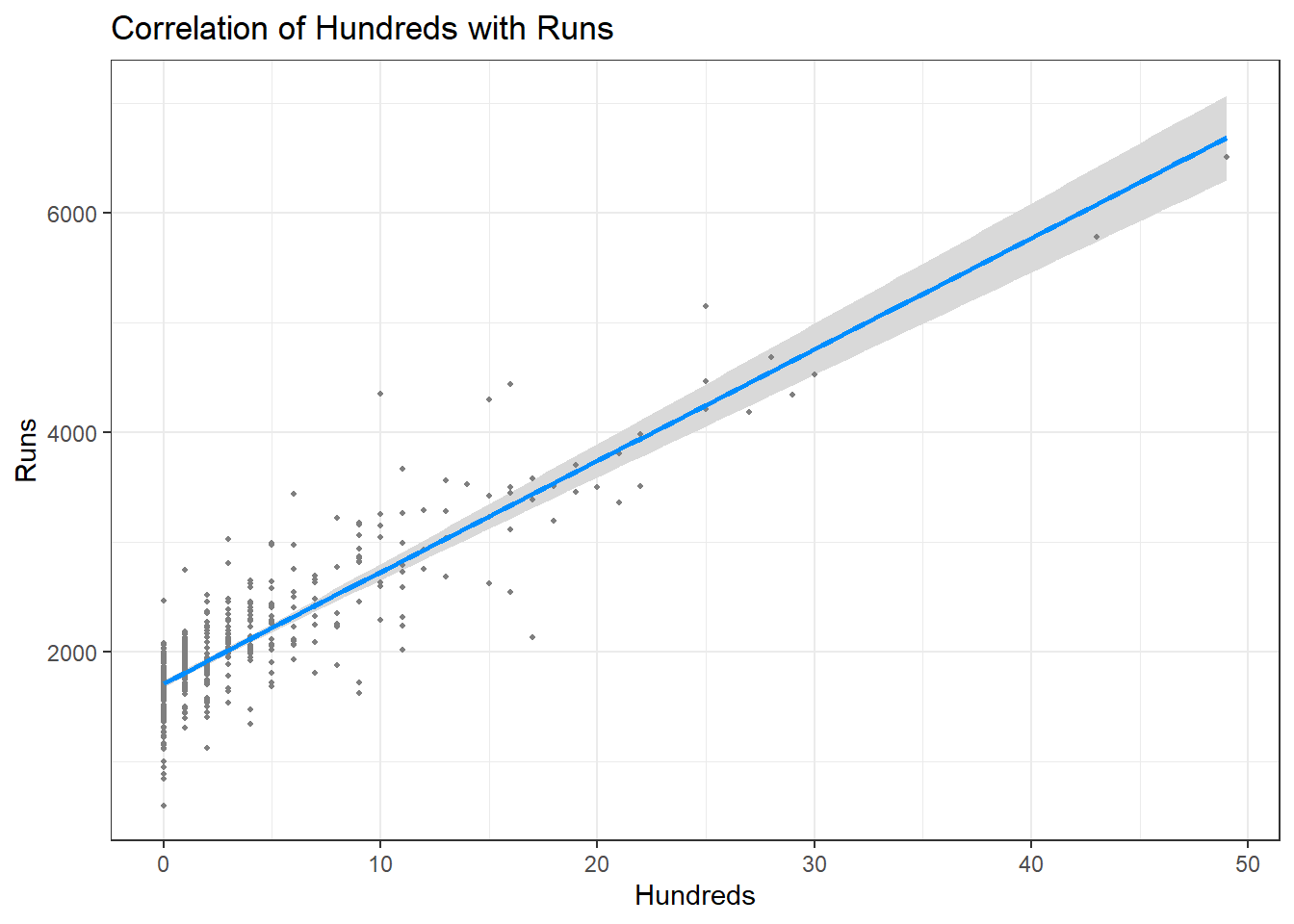
Let’s look at how runs are correlated to other factors
##
## Call:
## lm(formula = Runs ~ Innings + BallsFaced + Hundreds, data = cric_data)
##
## Residuals:
##      Min       1Q   Median       3Q      Max
## -1303.49  -155.72     5.36   166.06  1625.60
##
## Coefficients:
##               Estimate Std. Error t value Pr(>|t|)
## (Intercept) -114.41857   24.92813   -4.59 5.63e-06 ***
## Innings        9.02883    0.49150   18.37  < 2e-16 ***
## BallsFaced     0.45232    0.01359   33.29  < 2e-16 ***
## Hundreds     101.53671    4.16172   24.40  < 2e-16 ***
## ---
## Signif. codes:  0 '***' 0.001 '**' 0.01 '*' 0.05 '.' 0.1 ' ' 1
##
## Residual standard error: 316 on 496 degrees of freedom
## Multiple R-squared:  0.9858, Adjusted R-squared:  0.9857
## F-statistic: 1.147e+04 on 3 and 496 DF,  p-value: < 2.2e-16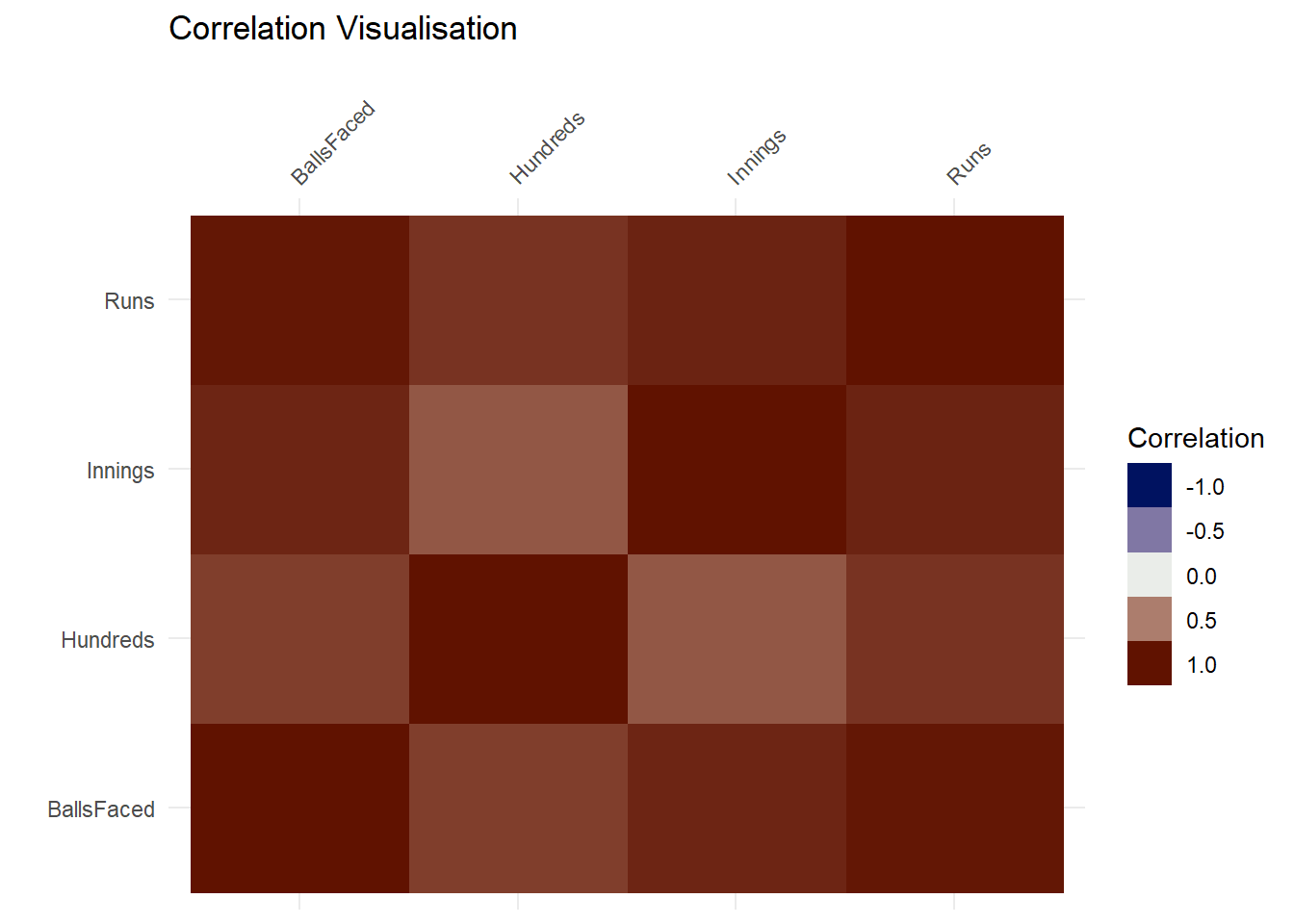
Conclusion -
The table “Data” has the initial dataset. The table “DerivedData” has the derived columns consisting of averages and strike rates.
From the Plot Comparison, we can view averages and strike rates of some of the best players in those terms. This gives us a clear picture as to who is more suitable for which format of the game. It is clear that players who are listed in both the top averages and top strike rates are most desirable for selection.
The Interactive Plot depicts number of centuries scored by some of the top players around the globe. We have considered a minimum of 15 centuries for this analysis so that only the top players are considered.
Runs scored are positively correlated with number of innings played, balls faced, and the number of centuries scored which is pretty obvious. The more balls faced, the more innings played, the more hundreds scored, greater the chances of having more runs. The above figures show a linear model for the same.
From the analysis made it is clear that -
After comparing the Average and Strike Rates of players we can decide which player is more suitable for what format of the game.
T20 Format - High Strike Rate desirable.
ODI Format - A mix of both good Average and Strike Rate desirable.
TEST Format - High Average desirable.
These two factors along with the data on the number of centuries by that particular player makes it a clear choice for the selectors to pick the best players for the respective teams around the globe.
References -
Wickham et al., (2019). Welcome to the tidyverse. Journal of Open Source Software, 4(43), 1686, https://doi.org/10.21105/joss.01686
Alboukadel Kassambara (2020). ggpubr: ‘ggplot2’ Based Publication Ready Plots. R package version 0.4.0. https://CRAN.R-project.org/package=ggpubr
H. Wickham. ggplot2: Elegant Graphics for Data Analysis. Springer-Verlag New York, 2016.
C. Sievert. Interactive Web-Based Data Visualization with R, plotly, and shiny. Chapman and Hall/CRC Florida, 2020.
Yihui Xie (2015) Dynamic Documents with R and knitr. 2nd edition. Chapman and Hall/CRC. ISBN 978-1498716963
Hao Zhu (2019). kableExtra: Construct Complex Table with ‘kable’ and Pipe Syntax. R package version 1.1.0. https://CRAN.R-project.org/package=kableExtra
VideoGames Data

Introduction -
Having played tons of games on PC and Playstation2 as a kid, it was a moment of nostalgia as I found a Kaggle dataset on Video Game Sales. I couldn’t wait to get a hands on overview of this data which has over 15000 observations and sales for most of the games on all platforms. Note that this data is all about the number of copies sold and not about the revenue generated through sales. After all, its not always about money and this is an effort to analyze the popularity of games through number of copies sold! All values are in millions of copies sold. Let’s dive in and check out which game, publisher, and platforms were most popular among gaming fans!
- We first load the libraries required for our analysis.
#loading libraries
library(tidyverse)
library(visdat)
library(kableExtra)
library(ggpubr)
We now read our data into R environment from a source file
The raw data in the form of csv looks as follows.
#reading video games sales data from csv file
vgsales <- read.csv("Data/vgsales.csv")
#displaying dimensions of data and sample observations
glimpse(vgsales)
## Rows: 16,598
## Columns: 11
## $ Rank <int> 1, 2, 3, 4, 5, 6, 7, 8, 9, 10, 11, 12, 13, 14, 15, 16, 17~
## $ Name <chr> "Wii Sports", "Super Mario Bros.", "Mario Kart Wii", "Wii~
## $ Platform <chr> "Wii", "NES", "Wii", "Wii", "GB", "GB", "DS", "Wii", "Wii~
## $ Year <chr> "2006", "1985", "2008", "2009", "1996", "1989", "2006", "~
## $ Genre <chr> "Sports", "Platform", "Racing", "Sports", "Role-Playing",~
## $ Publisher <chr> "Nintendo", "Nintendo", "Nintendo", "Nintendo", "Nintendo~
## $ NA_Sales <dbl> 41.49, 29.08, 15.85, 15.75, 11.27, 23.20, 11.38, 14.03, 1~
## $ EU_Sales <dbl> 29.02, 3.58, 12.88, 11.01, 8.89, 2.26, 9.23, 9.20, 7.06, ~
## $ JP_Sales <dbl> 3.77, 6.81, 3.79, 3.28, 10.22, 4.22, 6.50, 2.93, 4.70, 0.~
## $ Other_Sales <dbl> 8.46, 0.77, 3.31, 2.96, 1.00, 0.58, 2.90, 2.85, 2.26, 0.4~
## $ Global_Sales <dbl> 82.74, 40.24, 35.82, 33.00, 31.37, 30.26, 30.01, 29.02, 2~Initial Data Analysis -
Initial Data Analysis is a process which helps one get a feel of the data in question. This helps us have an overview of the data and gives insights about potential Exlporatory Data Analyis (EDA).
Initial data analysis is the process of data inspection steps to be carried out after the research plan and data collection have been finished but before formal statistical analyses. The purpose is to minimize the risk of incorrect or misleading results. Link for more info
IDA can be divided into 3 main steps:
- Data cleaning is the identification of inconsistencies in the data and the resolution of any such issues.
- Data screening is the description of the data properties.
- Documentation and reporting preserve the information for the later statistical analysis and models.
visdat
- The visdat package in R helps us get a visual overview of the data in the form of plots. The vis_dat() function helps us get a glimpse of the data types for all variables in our dataset.
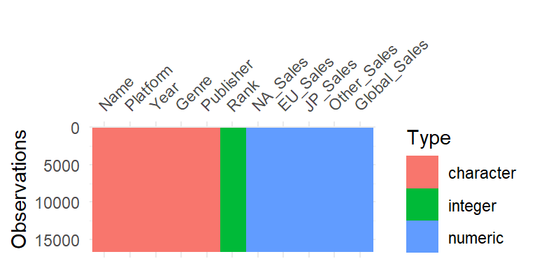
Visulaization of Data Types of the data
- We can observe that there are only three Types of data in our dataset viz, character, integer, and numeric. This makes it pretty straightforward and simple to conduct analysis.
vismiss
- The vis_miss() function give an overall visual of the missing data in our data set.
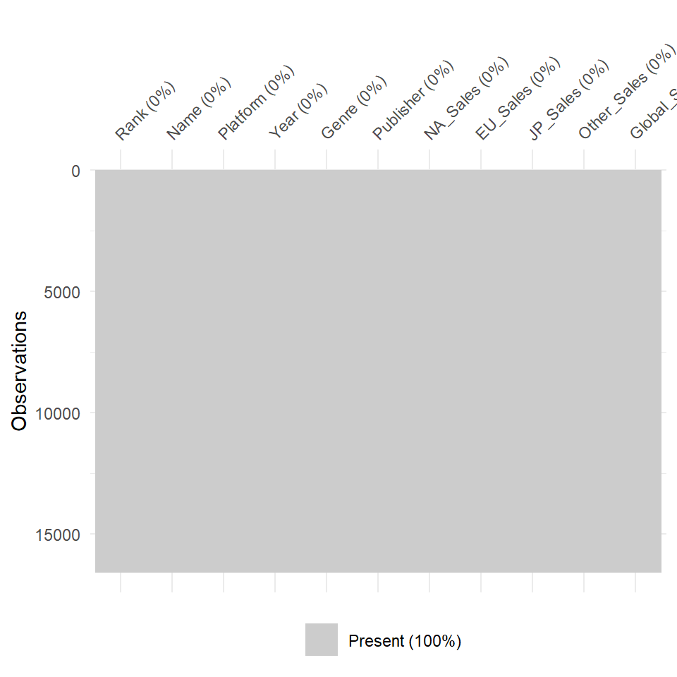
Missing Values Plot
- We can observe that there is no missing values in our data. Present 100% indicates the same. This means we do not have to deal with missing values.
viscor
- The vis_cor() function gives us a visual plot of the correlation between variables in our dataset. An important thing to note here is that it takes only numeric variables. We have already established this, thanks to vis_dat(). So we select only the numeric columns for this function.
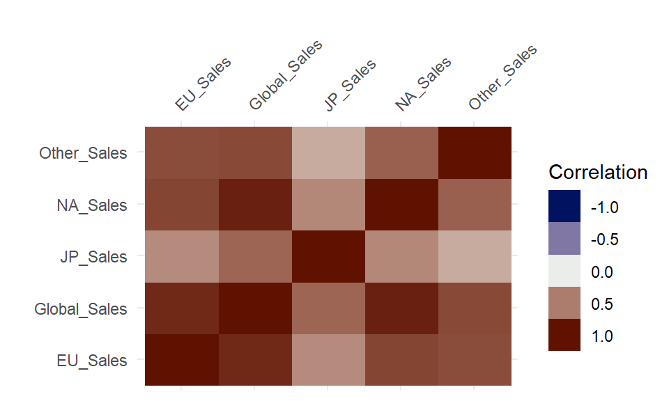
Correlation Plot for variables
- The above figure shows correlation as a range between +1.0 and -1.0 for the different variables.
gathercor
- The gather_cor() function gives us the exact values for the same instead of a range.
row_1 row_2 value Global_Sales NA_Sales 0.9410474 Global_Sales EU_Sales 0.9028358 Global_Sales JP_Sales 0.6118155 Global_Sales Other_Sales 0.7483308 Global_Sales Global_Sales 1.0000000
- The above table shows the exact correlations between the variables in our dataset. This sample table is filtered to show the correlation between Global Sales and Sales in each major locations of the world.
Exploratory Data Analysis -
- In statistics, exploratory data analysis is an approach to analyzing data sets to summarize their main characteristics, often with visual methods. A statistical model can be used or not, but primarily EDA is for seeing what the data can tell us beyond the formal modeling or hypothesis testing task (Wikipedia)
Regional Sales -
As the data has regional sales, this was the first question I could think of. What regions drove most of the global sales?
Let us consider the Correlation between sales in different regions and global sales as mentioned in the previous table. We plot with Regional Sales on x-axis and Global Sales on y-axis and check how each regional sales drive global sales.
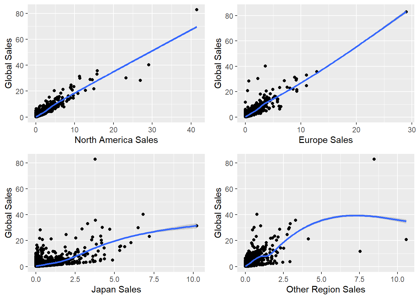
Smoothened curves for Regional Sales and Global Sales
The above plot is a smoothened curve of all the observations and how the tend to change.
The following correlation displays the above table as a plot with all the exact values.
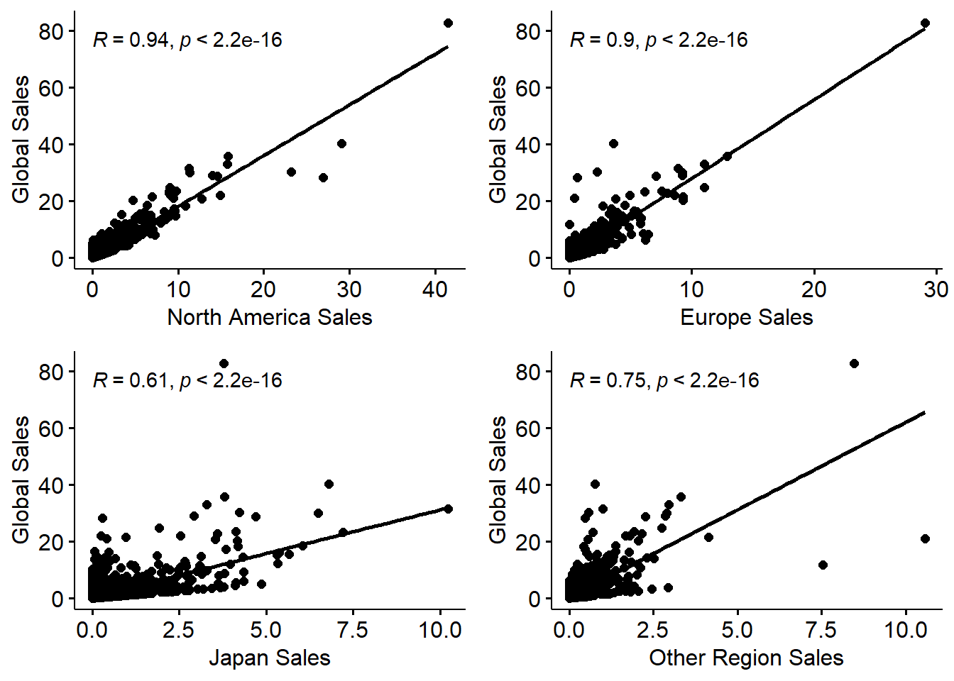
A plot of Correlation between Regional Sales and Global Sales
- We can observe that most of the global sales share is from North America and Europe. Other regions of the world has a lesser share and Japan has the least share of global sales.
Famous Gaming Franchises -
It’s time to compare some of my favorite franchises from my childhood! Which franchise was more popular and on which platform?
Let us consider some of the most famous game franchises and check what franchise sold most on what gaming platform. The considered franchises are Grand Theft Auto, FIFA, Pokemon, Mario, Need for Speed, and Call of Duty. These are the ones I could think of instantaneously.
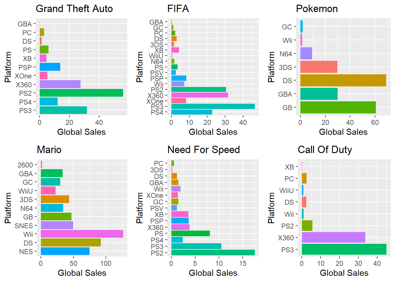
All Time Global Sales (millions)
The above barplot displays global sales on x-axis and platform of game on y-axis. We can get an overview of which franchise of games was sold on what platforms and also about the number of copies sold in millions. This can be compared side-by-side and it clearly shows which game was most popular on what platform.
Notice that the scales are different for each franchise and Mario has sold the most with more than 100 million copies while Need For Speed has sold a little over 15 million only.
In terms of revenue and profits generated, this might not hold good. A cheaper videogame sold in more numbers might still generate less revenue than an expensive videogame sold in lesser numbers. Something to keep in mind! Also the cost of the games definitely affect the number of copies sold.
UbiSoft Franchises -
The following graph shows a dot plot of two popular game franchises of UbiSoft namely, Assassin’s Creed and Prince of Persia. It displays global sales on x-axis and game title on the y-axis. The different colors of dots account to the type of platform the game belonged to.
Prince of Persia (PoP) was one of my most favorite gaming franchise as a kid and I remember having played it for days together, endlessly, during my vacations. There was a time when the PoP games saw a decline over Assassin’s Creed. I wanted to know why! And thus, this comparison.
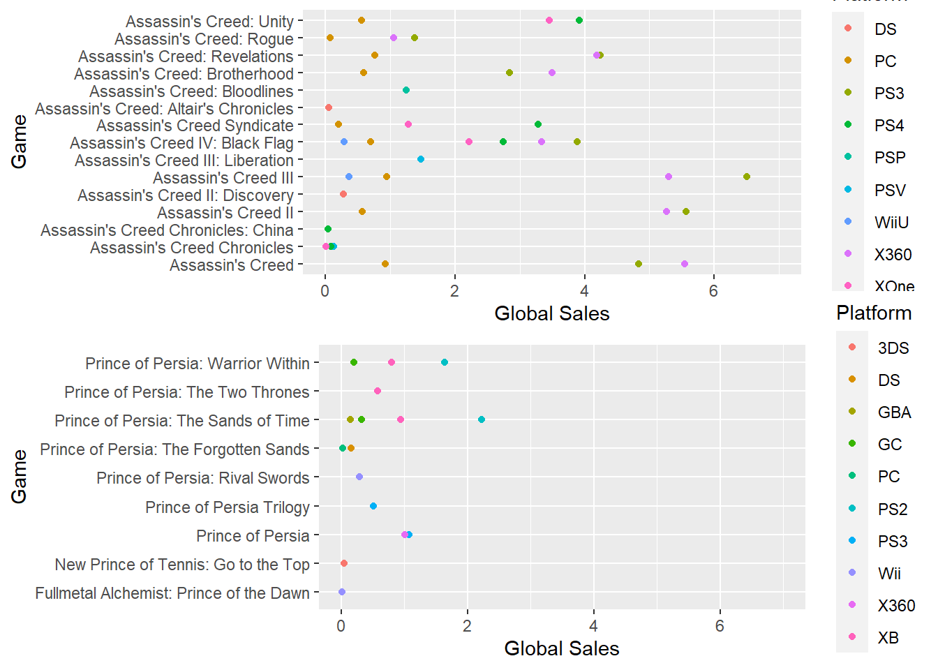
Assassin’s Creed and Prince of Persia Sales (millions)
We can observe that there were lesser PoP titles released compared to AC titles. Also, only two games from the PoP franchise crossed sales of 1.5 million. On the other hand, AC has sold more than 2 million copies of most of their titles.
This might explain why there are lesser games in PoP franchise compared to AC. UbiSoft slowly shifted their focus on the franchise that was more popular among gaming fans.
Turns out after all, it’s all about the money for the game producers… Fair enough from a business point of view. But I would’ve loved to have more PoP releases!
Conclusion -
This is just the start of answering questions about the data. There can be numerous questions asked and appropriate analysis conducted with suitable visual representations that can effectively answer the questions.
Dig deep and find out answers to the most burning questions you have in mind, if you’re a gaming enthusiast.
References -
Wickham et al., (2019). Welcome to the tidyverse. Journal of Open Source Software, 4(43), 1686, https://doi.org/10.21105/joss.01686
Tierney N (2017). “visdat: Visualising Whole Data Frames.” JOSS, 2(16), 355. doi: 10.21105/joss.00355 (URL: https://doi.org/10.21105/joss.00355), <URL: http://dx.doi.org/10.21105/joss.00355>.
Hao Zhu (2019). kableExtra: Construct Complex Table with ‘kable’ and Pipe Syntax. R package version 1.1.0. https://CRAN.R-project.org/package=kableExtra
Alboukadel Kassambara (2020). ggpubr: ‘ggplot2’ Based Publication Ready Plots. R package version 0.4.0. https://CRAN.R-project.org/package=ggpubr
IMDb Data

Introduction -
This analysis is all about finding insights about Movies from the IMDb Movie dataset from Kaggle. It was part of my assignment task at Monash during semester 1 and this is a tweaked version because I learn from my mistakes and get better over time! We could choose a dataset of our own, ask our own questions and answer them through analysis. The most important part of this assignment was Collaboration and Reproducibility. This was a group task that was divided into 4 sets of questions. Mine were as listed below -
Movie Grosses and Popularity Analysis -
- The questions of interest are as follows:
What is the Budget and USA Gross for Avenger and Spider-Man movie franchises?
What is the Number of user reviews and critic reviews for the same, implying their popularity?
What is the gross of the most popular movies of all-time?
So let’s dive in and try to answer these questions!
The raw data in the form of csv looks as follows.
Initial Data Analysis -
## Rows: 81,273
## Columns: 22
## $ imdb_title_id         <chr> "tt0000574", "tt0001892", "tt0002101", "tt000213~
## $ title                 <chr> "The Story of the Kelly Gang", "Den sorte drøm"~
## $ original_title        <chr> "The Story of the Kelly Gang", "Den sorte drøm"~
## $ year                  <int> 1906, 1911, 1912, 1911, 1912, 1919, 1913, 1912, ~
## $ date_published        <chr> "1906-12-26", "1911-08-19", "1912-11-13", "1911-~
## $ genre                 <chr> "Biography, Crime, Drama", "Drama", "Drama, Hist~
## $ duration              <int> 70, 53, 100, 68, 60, 85, 120, 120, 55, 121, 54, ~
## $ country               <chr> "Australia", "Germany, Denmark", "USA", "Italy",~
## $ language              <chr> "", "", "English", "Italian", "English", "German~
## $ director              <chr> "Charles Tait", "Urban Gad", "Charles L. Gaskill~
## $ writer                <chr> "Charles Tait", "Urban Gad, Gebhard Schätzler-P~
## $ production_company    <chr> "J. and N. Tait", "Fotorama", "Helen Gardner Pic~
## $ actors                <chr> "Elizabeth Tait, John Tait, Norman Campbell, Bel~
## $ description           <chr> "True story of notorious Australian outlaw Ned K~
## $ avg_vote              <dbl> 6.1, 5.9, 5.2, 7.0, 5.7, 6.8, 6.2, 6.7, 5.5, 6.7~
## $ votes                 <int> 537, 171, 420, 2019, 438, 709, 241, 187, 211, 31~
## $ budget                <chr> "$ 2250", "", "$ 45000", "", "", "", "ITL 45000"~
## $ usa_gross_income      <chr> "", "", "", "", "", "", "", "", "", "", "", "", ~
## $ worlwide_gross_income <chr> "", "", "", "", "", "", "", "", "", "", "", "", ~
## $ metascore             <dbl> NA, NA, NA, NA, NA, NA, NA, NA, NA, NA, NA, NA, ~
## $ reviews_from_users    <dbl> 7, 4, 24, 28, 12, 11, 6, 3, 7, 9, 9, 16, 8, 2, 6~
## $ reviews_from_critics <dbl> 7, 2, 3, 14, 5, 9, 4, 1, 1, 9, 29, 7, 22, 2, 17,~- The above output shows us a sample of the dataset along with its dimensions.
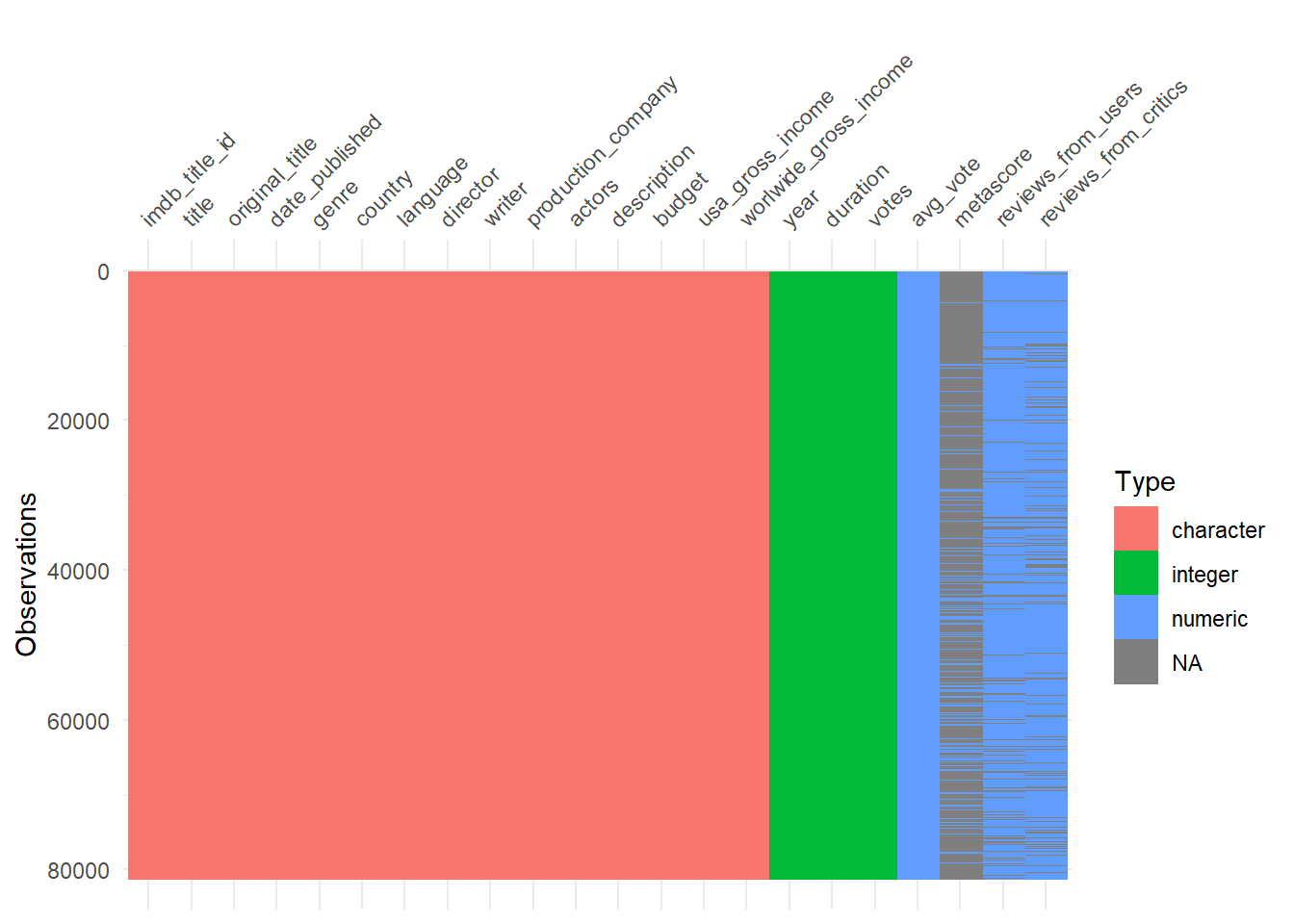
A viz of Data Types and Missing Values for IDA
Data Cleaning -
First, we clean the names of the columns and rename them in more presentable manner.
Next, we prepare the data required to answer our questions of interest and divide the data into two subsets. Our columns of interest are
Budget,USA_Gross,User_Reviews, andCritic_Reviews. We make sure we filter out values from these columns that are missing/NA in the columns.Tidyverse is used to clean the data and kableExtra is used to display tables.
| Title | Budget | USA_Gross |
|---|---|---|
| Das Cabinet des Dr. Caligari | $ 18000 | $ 8811 |
| The Four Horsemen of the Apocalypse | $ 800000 | $ 9183673 |
| Metropolis | DEM 6000000 | $ 1236166 |
| City Lights | $ 1500000 | $ 19181 |
| Modern Times | $ 1500000 | $ 163577 |
| Snow White and the Seven Dwarfs | $ 1499000 | $ 184925486 |
| Gone with the Wind | $ 3977000 | $ 200852579 |
| Mr. Smith Goes to Washington | $ 1900000 | $ 144738 |
| La règle du jeu | FRF 5500500 | $ 273641 |
| The Wizard of Oz | $ 2777000 | $ 24790250 |
- The above table shows a sample of the gross data used for the analysis. The main columns needed for Gross analysis are
Title,Budget, andUSA_Gross.
| Title | User_Reviews | Critic_Reviews |
|---|---|---|
| The Story of the Kelly Gang | 7 | 7 |
| Den sorte drøm | 4 | 2 |
| Cleopatra | 24 | 3 |
| L’Inferno | 28 | 14 |
| From the Manger to the Cross; or, Jesus of Nazareth | 12 | 5 |
| Madame DuBarry | 11 | 9 |
| Quo Vadis? | 6 | 4 |
| Independenta Romaniei | 3 | 1 |
| Richard III | 7 | 1 |
| Atlantis | 9 | 9 |
- The above table shows a sample of the review data used for the analysis. The main columns needed for Gross analysis are
Title,User_Reviews, andCritic_Reviews.
Exploratory Data Analysis -
Using the table contents, we plot data for a particular movie franchise. The franchises selected for this analysis are Avengers and Spider-Man. We display plots to analyze how much the franchise spent for the movie and how much it grossed.
Also a plot for the user reviews and critic reviews are displayed to see which were the most popular among all the movies in the franchise. We also plot the same for all the movies in the dataset.
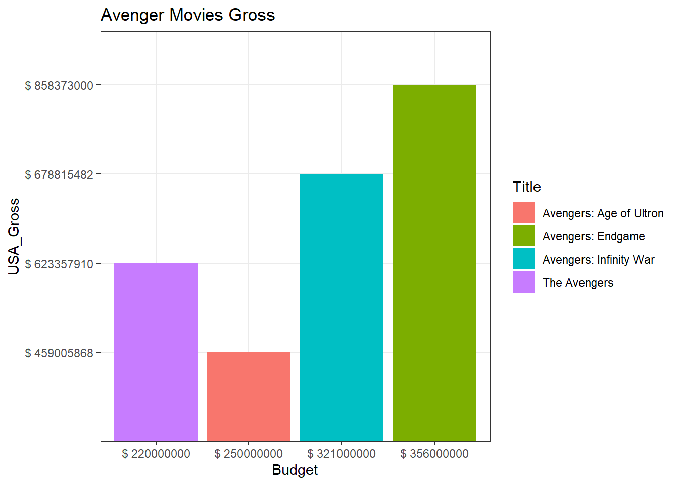
Avengers Budget v/s Gross
- From the plot above, it can be seen that all Avenger movies grossed more than the amount spent. Avengers: Age of Ultron grossed relatively lesser than the other movies. Endgame was the highest grossing Avenger movie.
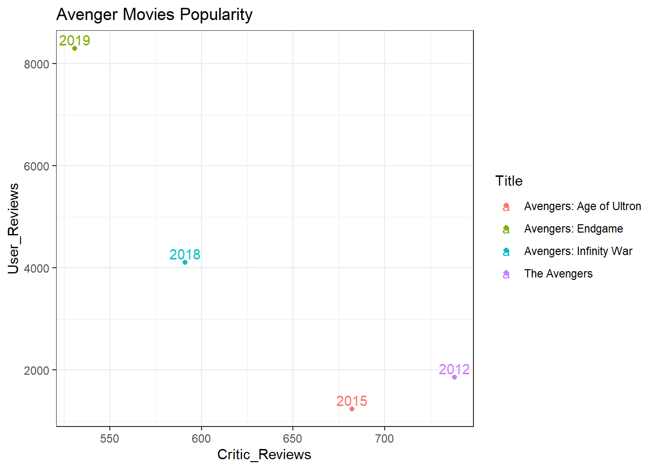
Avengers Popularity
The plot above displays how many reviews was given by users and critics. This can be a measure of how much the movies were talked about.
The year tags show the timeline. It is evident that the first avenger movie in 2012 attracted the attention of critics with a high number of critic reviews. As time passed by, the movies become more popular among users which shows an increse in the fanbase till 2019. The only exception to this is a dip in user reviews for Age of Ultron which justifies why it grossed lesser than other movies.
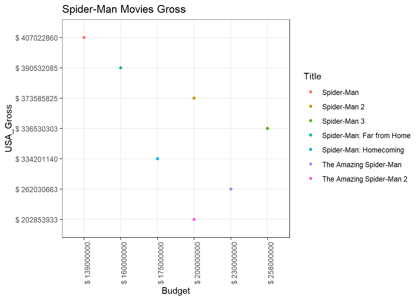
Spider-Man Budget v/s Gross
- The plot above shows the budget and gross of Spider-Man movies. Spider-Man grossed the highest and the sequels Spider-Man 2 and Spider-Man 3 grossed lesser showing a decline in the gross. The Amazing Spider-Man seems to have grossed better than its sequel The Amazing Spider-Man 2. These movies has grossed far less than the first 3 movies. The Homecoming and Far from Home movies seem to have made a great comeback in terms of its gross compared to the fourth and fifth movies. Far from Home has grossed more and spent less which makes it the second best Spider-Man movie after the first ever one in the franchise.
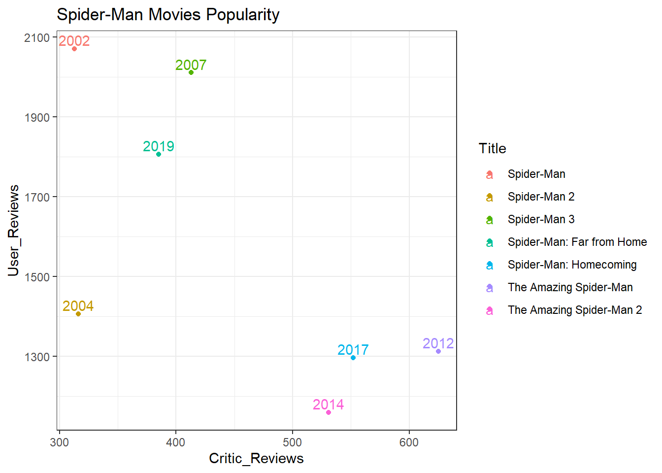
Spider-Man Popularity
- The plot above shows a graph for the number of reviews by critics and users over a period of time named by the years for each points. The first ever movie was most talked about by both fans and users in 2002. We see a dip in user reviews for 2004 and the movie in 2007 was a little better but the first ever was the best recieved. The fourth and fifth movies in 2012 and 2014 was talked about most by critics but never really kicked off among fans. This justifies its low grosses. The final sixth and seventh movies in 2017 and 2019 have made a great comeback after this dip and the latest one during 2019 has managed to almost equal the fanbase like it was when the franchise started.
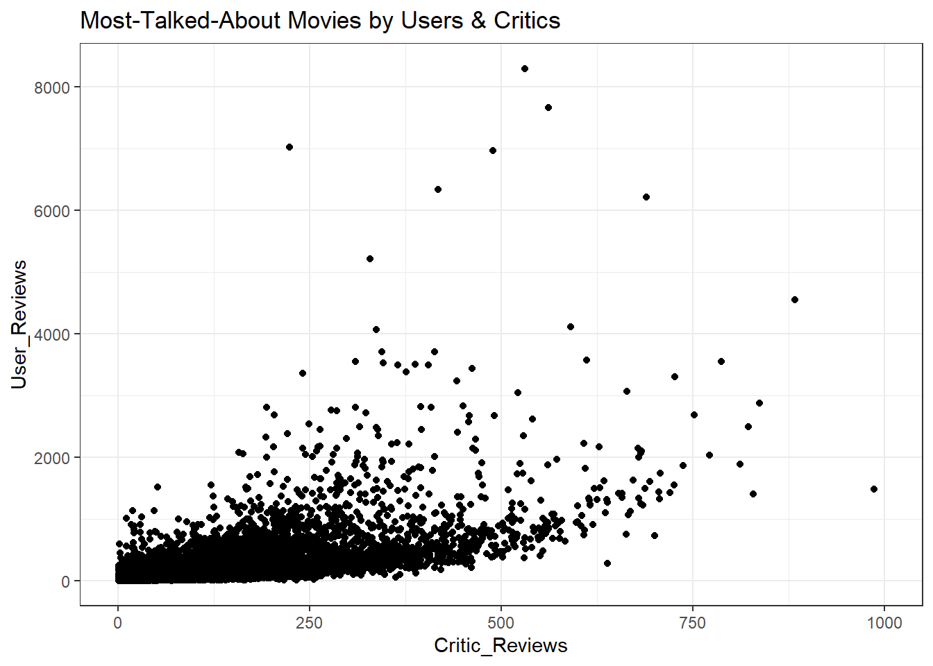
All-time Popularity
- The plot above has a list of all movies in our dataset. The black cluster at the left bottom are the movies that have a low number of reviews by both users and critics. These are the least popular movies. Let’s remove them by filtering them.
We pick some of the movies from this interactive plot and check whether they grossed more than their budget.
The outliers are clearly visible in this plot with Endgame being the most popular among fans around the globe. This plot is used to pick the most popular movies i.e, outliers, to compare the budget and gross.
It is not necessary for a movie to be good, to be most talked about. So the next plot serves as a verification to confirm if the movie was talked about because it was good, or bad.
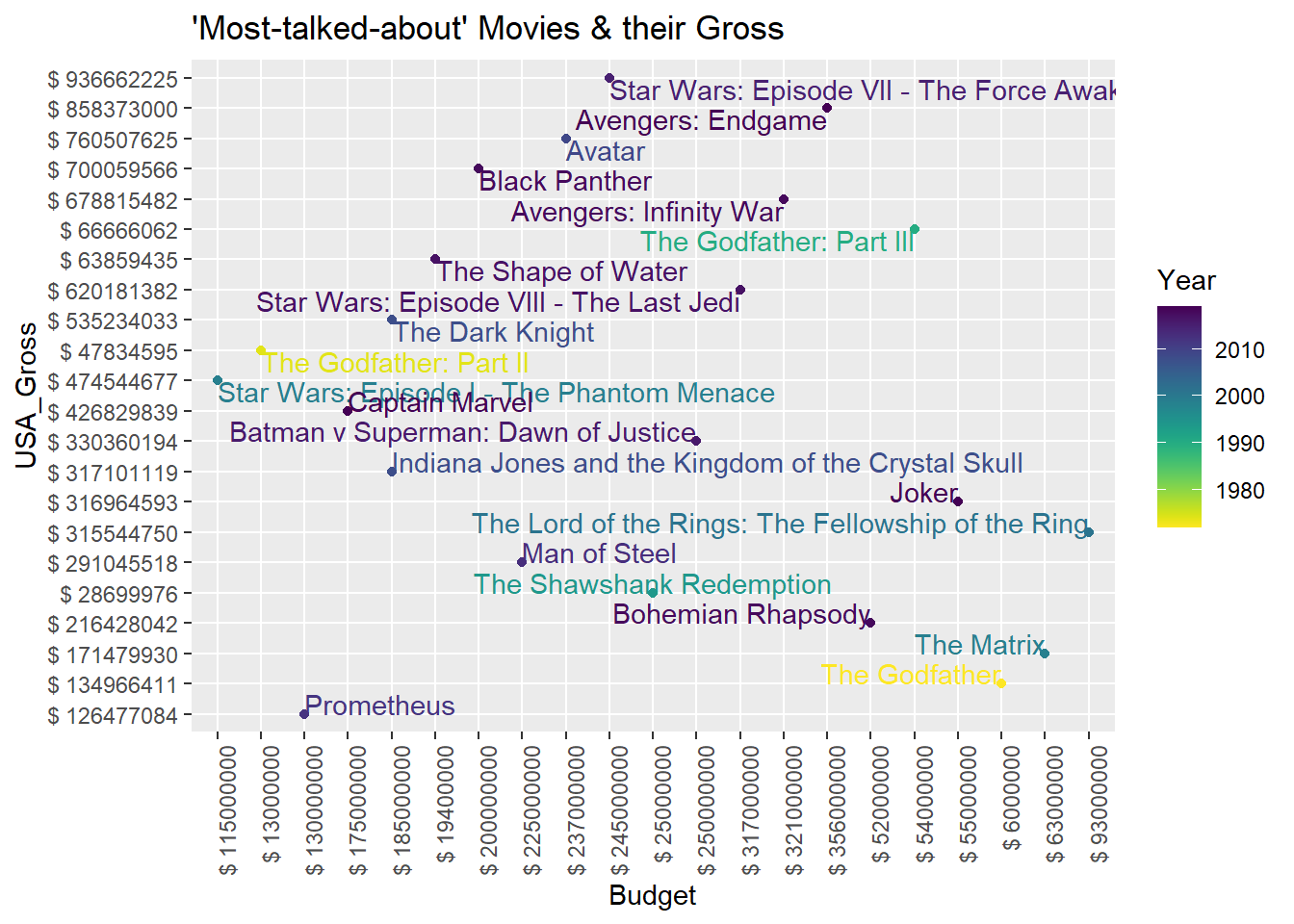
Some all-time Popular Movies and their Gross
- The plot above shows the budget and gross of the most popular movies from over a century. We can compare the production cost, which is the budget, and the gross to ensure that it was most talked about because it was good. This plot also has information about the decade it was released in. This was to ensure there was no bias between the movies since currency value is always changing. The values are discrete and shows how much was spent and how much was grossed for that time. The gradient is given to year using viridis.
Conclusion -
- In conclusion, we can see a general trend that a movie that is most talked about by the users or fans has grossed the most amount of money compared to lesser popular movies. The number of reviews by users can generally be used to predict if it was a box office hit.
References -
Wickham et al., (2019). Welcome to the tidyverse. Journal of Open Source Software, 4(43), 1686, https://doi.org/10.21105/joss.01686
Tierney N (2017). “visdat: Visualising Whole Data Frames.” JOSS, 2(16), 355. doi: 10.21105/joss.00355 (URL: https://doi.org/10.21105/joss.00355), <URL: http://dx.doi.org/10.21105/joss.00355>
Hao Zhu (2019). kableExtra: Construct Complex Table with ‘kable’ and Pipe Syntax. R package version 1.1.0. https://CRAN.R-project.org/package=kableExtra
C. Sievert. Interactive Web-Based Data Visualization with R, plotly, and shiny. Chapman and Hall/CRC Florida, 2020
Simon Garnier (2018). viridis: Default Color Maps from ‘matplotlib’. R package version 0.5.1. https://CRAN.R-project.org/package=viridis
Spotify Data

Introduction -
Question of Interest - What exactly makes artists stand out even when there are artists doing the same kind of music? What is the Unique Selling Point (USP) of a few particular selected artists?
Data Source -
- The data of this report is part of the tidytuesday chanllenge, which comes from Spotify via the spotifyr package.
Data Table -
Let’s explore how the artists are popular and why exactly they are popular. This involves analyzing common audio features in the songs of the top artists. Each audio feature is a measure of the attribute from a scale of 0 to 1 with 1.0 being the best measure.
We choose the following artists who are regarded as one of the best in their genre:
- Taylor Swift - Pop
- Eminem - Rap
- AC/DC - Rock
- Shakira - Latin
- Usher - R & B
- David Guetta - EDM
A sample of the top songs by popularity for the selected artists.
Analysis -
Unique Features of Artists
- We select Danceability, Speechiness , Energy and Valence as our audio features since these best describe the genres we have selected.
Taylor Swift (Pop Artist) Audio Features
- First up, let’s see what Taylor’s pop songs are like.
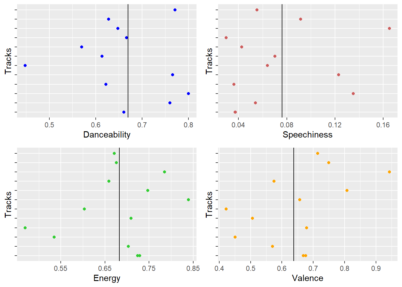
Taylor Swift Audio Features
- Danceability and valence are the strongest suits for Taylor Swift. Her songs are easy to dance to and are mostly positive. Keeping in mind that most of her songs are about her ex-lovers, it is surprising to see that the valence is positive. The choice of words used by Swift is mostly positive even if the song is about a topic that is generally negative. Thus, we can say Taylor Swift’s songs are danceable and she resonates most with an audience that love pop songs.
Eminem (Rap Artist) Audio Features
- Next up, it’s Eminem’s rap prowess!
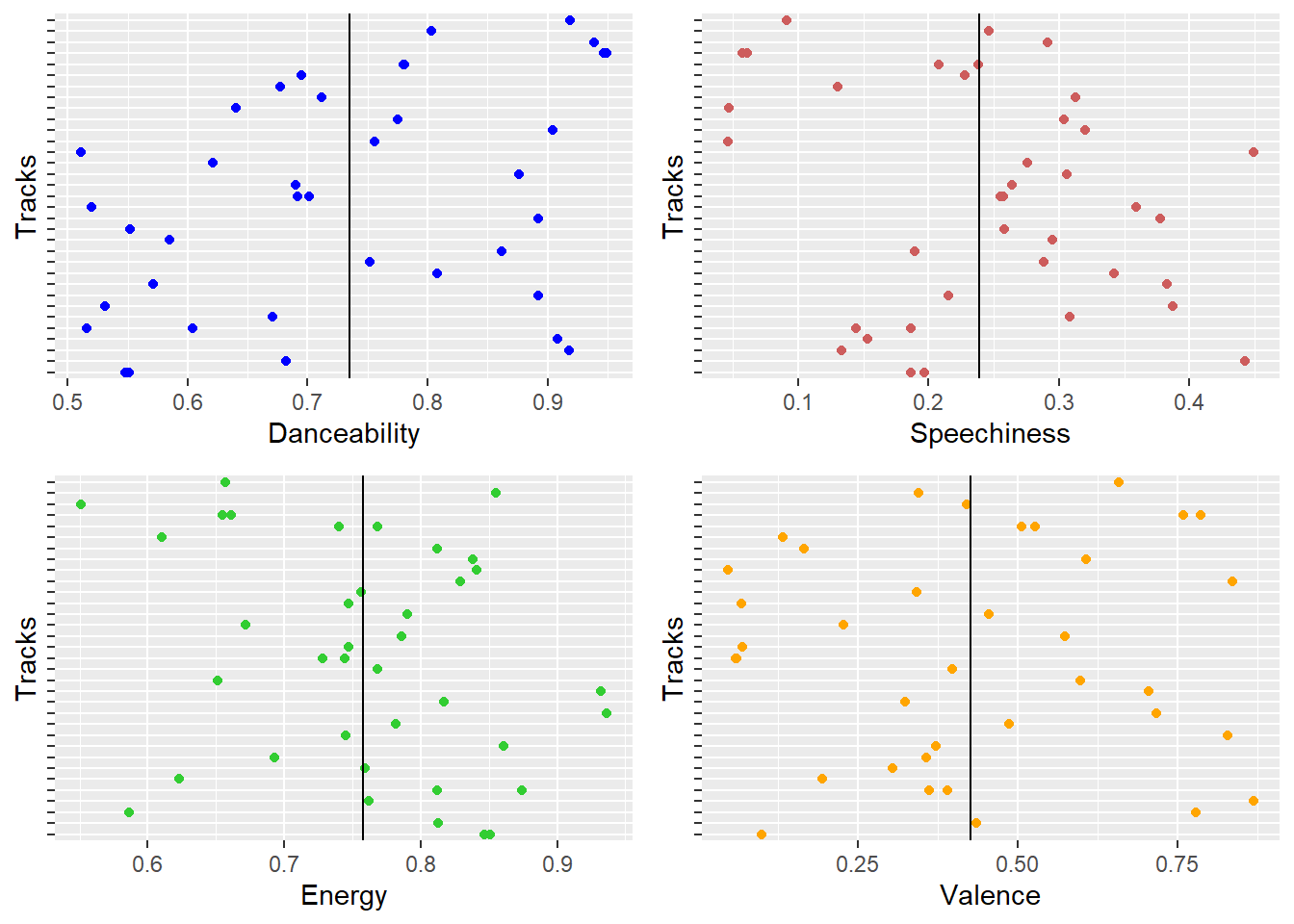
Eminem Audio Features
- Eminem’s songs have a high value in general for danceabilty, energy, and also speechiness which as obvious characteristic for a rapper. The valence for Eminem’s songs are negative and thus goes out to show that Eminem usually has negative words in his songs. This doesn’t affect the popularity of his songs, at this is his strongest suit. His audeince love the content of his lyrics even though they are negative. Maybe this is because he is honest about his life and that resonates among his audience.
AC/DC (Rock Artist) Audio Features
- Next, it’s AC/DC’s rocking songs!
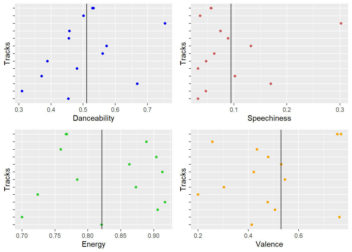
AC/DC Audio Features
- We can evidently observe that AC/DC is best known for the energy they bring in with their songs. Rock songs are usually more energetic and this observation is a proof of it. Even though they lack valence and danceability, they’re a popular artist known for the energy they bring in!
Shakira (Latin Artist) Audio Features
- Let’s look at Shakira’s Latin songs!
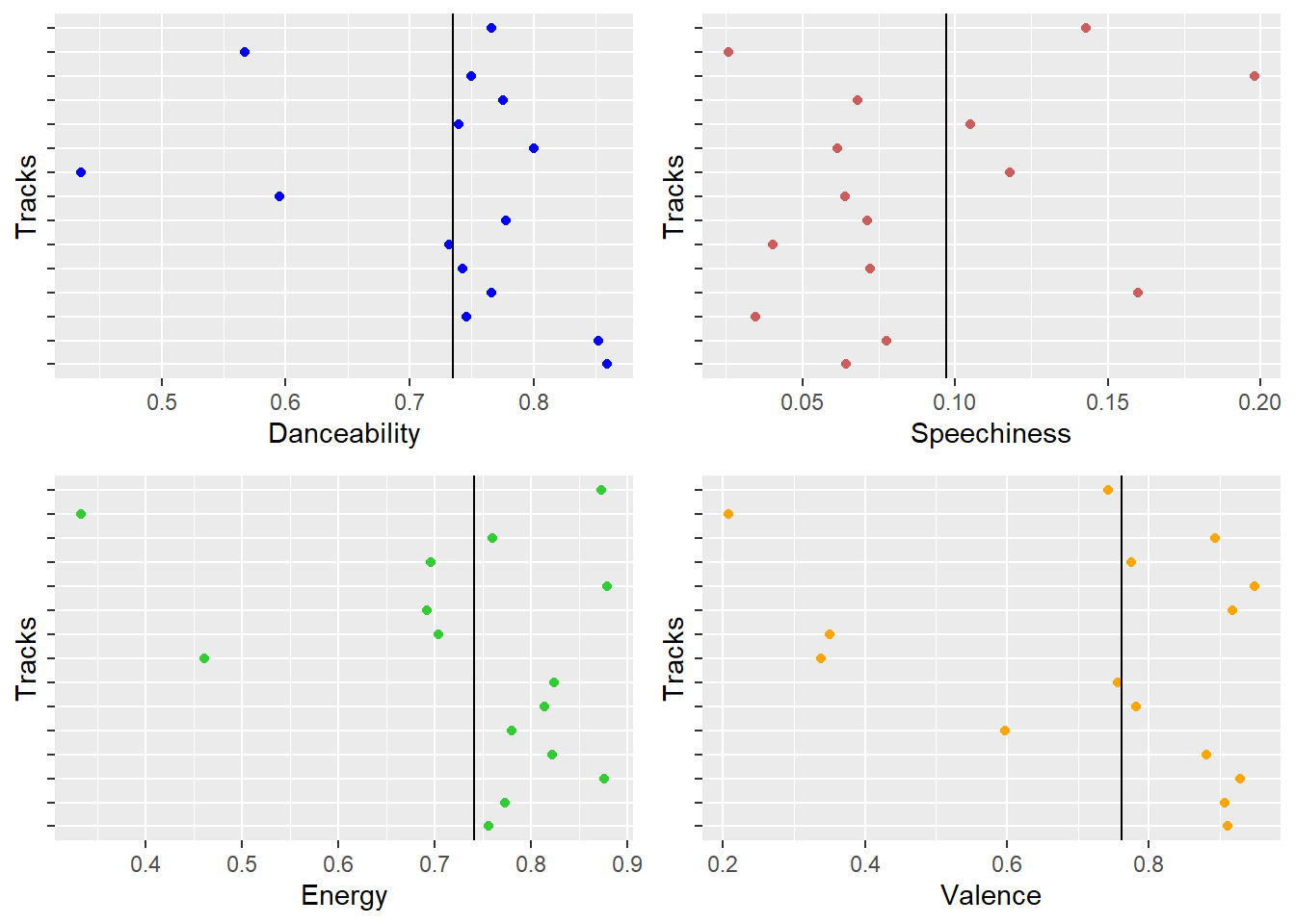
Shakira Audio Features
- Shakira’s songs have good mix of danceabilty, energy, and also mostly composed of positive valence value. This is a sweet spot in terms of audio features and there are no surprises that it makes people dance to the tunes without their knowledge! She is one of the most loved Latin and Pop singers of the modern era.
Usher (R&B Artist) Audio Features
- Let’s look at Usher’s Rythm and Bass!
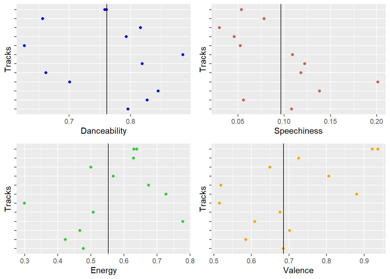
Usher Audio Features
- Usher’s songs are generally slow and melodious and this is justified from the low energy observed in the plot. Danceabilty is his strongest feature and his songs tend to be more positive as well. This is the kind of music that’s enjoyed by people who love melody and rhythmic music.
David Guetta (EDM Artist) Audio Features
- Finally, David’s Electronic Dance Music!
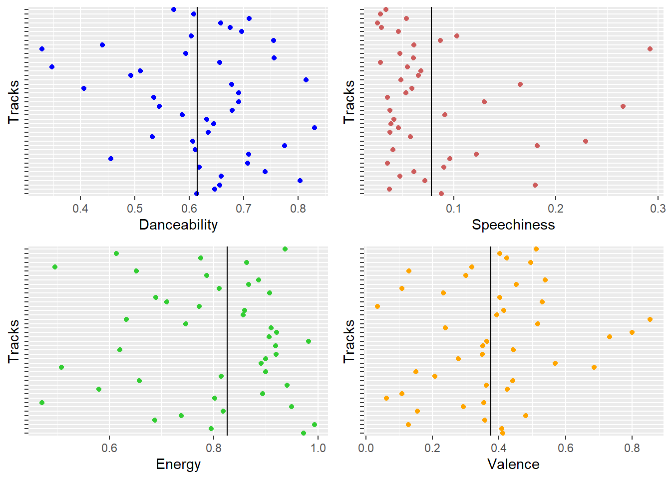
David Guetta Audio Features
- David Gueatta, a DJ is best known for the kind of energy he brings in with his songs. His sings are failry danceable as well as energetic. This makes David’s songs popular even though his valence is poor with mostly negative lyrical words.
Mean Values for the Audio Features are as follows -
The following interactive plots show the mean audio feature values for each artist. The best and worst feature for each artist and their genre is easily perceived through these plots.
This comparison doesn’t mean to say that the least value in each feature defines lesser popularity. All these artists are popular but the aim is to find what feature is most prominent in their songs.
Danceabilty -
- Taylor Swift - 0.6701429
- Eminem - 0.7346154
- AC/DC - 0.51084
- Shakira - 0.7347
- Usher - 0.7614706
- David Guetta - 0.61415
Danceability Mean Values for each Genre
From the plot above we can observe that Usher songs are most danceable, followed by Shakira and Eminem with same values of danceabilty. This overlapping is not obvious and you might want to zoom in on the green line or look at the values mentioned above. ACDC being a rock artist is least danceable.
Speechiness -
- Taylor Swift - 0.07605
- Eminem - 0.2390026
- AC/DC - 0.094764
- Shakira - 0.09703
- Usher - 0.0963118
- David Guetta - 0.078215
Speechiness Mean Values for each Genre
An obvious observation in the plot above for speechiness is that of Eminem’s rap songs which beats other artists in this feature hands down. Most of the other artists tend to remain in a close range far less speechier than Eminem’s Rap songs as expected.
Energy -
- Taylor Swift - 0.6827143
- Eminem - 0.7578462
- AC/DC - 0.82136
- Shakira - 0.7417
- Usher - 0.5531176
- David Guetta - 0.8260667
Energy Mean Values for each Genre
The plot above shows that David Guetta songs bring in the most energy closely followed by ACDC. EDMs and Rock songs are an obvious energy boosters! On the other hand, Usher songs are least energitic and this shows his music is usually melodious and rhythmic.
Valence/Positivity -
- Taylor Swift - 0.6375
- Eminem - 0.4266256
- AC/DC - 0.53016
- Shakira - 0.76085
- Usher - 0.6858235
- David Guetta - 0.3748767
Valence Mean Values for each Genre
When it comes to valence/postivity in the lyrical content, figure above shows that Shakira has the most poitive songs followed by Usher and Taylore Swift. Eminem and David Guetta tend to have negative lyrical content in their songs. This only makes them more popular and they’re not any less popular for this fact.
Conclusion -
In conclusion, we can observe that each artist has their own strengths in terms of audio features and are popular for those strengths. Each artist brings in something unique to the listeners and have a particular group of audience and not everyone like all genres in general. Thus, it is all about expressing yourself in music rather than trying to make them in a certain way. Authenticity and honesty are the pivotal factors that decide the popularity of an artist.
References -
Wickham et al., (2019). Welcome to the tidyverse. Journal of Open Source Software, 4(43), 1686, https://doi.org/10.21105/joss.01686
C. Sievert. Interactive Web-Based Data Visualization with R, plotly, and shiny. Chapman and Hall/CRC Florida, 2020
Baptiste Auguie (2017). gridExtra: Miscellaneous Functions for “Grid” Graphics. R package version 2.3. https://CRAN.R-project.org/package=gridExtra
Yihui Xie, Joe Cheng and Xianying Tan (2020). DT: A Wrapper of the JavaScript Library ‘DataTables’. R package version 0.15. https://CRAN.R-project.org/package=DT
Universities Data
Introduction -
Choosing between Universities is something we all go through at some or the other point in our lives. Why do you select a certain University over others? Is it because it is reputed? Is it the rank of the University? Is it the Quality of education and faculty? Or just because your friend is joining that same Institution? I hope its not that last option that you prioritize first, haha!
Having joined Monash University in Feb 2020, I’m always asked questions about my experience about the same. This is something I myself did before joining because it’s a major decision in one’s life and we need to know about our options thoroughly and transparently from someone who is actually walking the path we intend to take. I thought this Data Story would help future students and also help me analyze my own decisions in life. Why exactly did I choose Monash? Here’s my story at Monash and I would like to back it up with facts since I specialize in Business Analytics!
University ranking is a measurable outcome of multiple factors that are considered to evaluate the standard of education, faculty, resources, and infrastructure. Every year, Universities are ranked by different organizations around the world like CWUR, Times Higher Education, Quacquarelli Symmonds (QS) and many others. We are using a dataset that contains rankings of the world universities as maintained by QS.

Quacquarelli Symmonds (QS) is a British think-tank company specializing in the analysis of higher education institutions throughout the world. It uses 6 factors for their ranking framework wiz. Academic Reputation, Employer Reputation, Faculty to Student Ratio, Number of Citations per Faculty, International Faculty, and International Students. Another feature included in this data was Classification (which is not used for ranking) which included the institution’s size, subject range, research intensity, age, and status.
This Data Exploration Project is an effort to answer some questions around the analysis of higher education institutions such as the following –
What factors other than rank is more desirable when deciding the quality of a University? In other words, how do Universities compare in terms of the 6 factors in QS factor classification?
Which Universities top in each of the specific factors?
Is there a correlation between different classification factors like Country, Age of the University, Reputation of the University, Size and International Student Numbers?
Data Description -
Kaggle link for dataset - https://www.kaggle.com/divyansh22/qs-world-university-rankings
It is a Tabular Data: 1K rows x 22 columns. It has simple text in the form of “.csv”
For the purpose of our analysis, we make use of only the top 100 Universities of the world as it seems to have rich data and people are usually more likely to compare among the top 100.
Data Checking -
Data checking is the process of scrutinizing the data before using it for analysis. Data can be checked both simply in the text form like in MS Excel or using advanced visual methods in R.
Some packages in R are very useful to check the overall data and its types in each row and column.
Some of the manual cleaning was done on MS Excel before transformations in R.
A glimpse of the Raw Data is as follows –
- We read the cleaned dataset into “our/R” envirnoment as follows (pun intended!):
#reading the data
Uni2020 <- read.csv(here::here("Data/2020-QS-World-University-Rankings.csv"))- A glimpse at the dataset shows that all the columns are not in a way it would be useful for mathematical operations. So we covert the data-types to make the columns operation-friendly using the code below.
#datatype tranformation
TopUni2020 <- Uni2020 %>% select(-Rank.in.2019) %>% mutate(
                   SIZE = as.factor(SIZE),
                   FOCUS = as.factor(FOCUS),
                   RESEARCH.INTENSITY = as.factor(RESEARCH.INTENSITY),
                   AGE = as.factor(AGE),
                   STATUS = as.factor(STATUS),
                   AcademicSCORE = as.double(AcademicSCORE),
                   EmpSCORE = as.double(EmpSCORE),
                   RatioSCORE = as.double(RatioSCORE),
                   CiteSCORE = as.double(CiteSCORE),
                   IntFacSCORE = as.double(IntFacSCORE),
                   IntStuSCORE = as.double(IntStuSCORE),
                   AcademicRANK = as.integer(AcademicRANK),
                   EmpRANK = as.integer(EmpRANK),
                   RatioRANK = as.integer(RatioRANK),
                   CiteRANK = as.integer(CiteRANK),
                   IntFacRANK = as.integer(IntFacRANK),
                   IntStuRANK = as.integer(IntStuRANK),
Overall.Score = as.double(Overall.Score))- The above code creates a new data frame “TopUni2020” which has the data in the desirable form. The following visualization shows that we have 6 factors divided into Rank and Scores with Rank being an integer and Score being a numeric/double value with a decimal point. The classification factors are converted to factors.
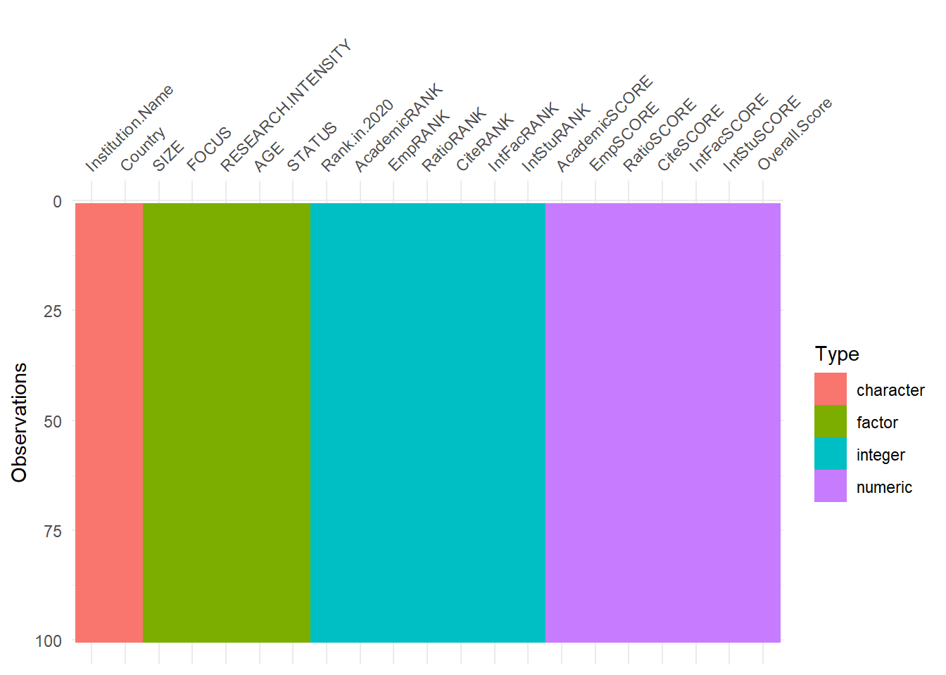
Visualizing the transformed data-types of the columns
The list of Universities in the QS dataset considered with Rank and Name of University is as follows -
My Experience at Monash -
Having learned the skill of analyzing raw data and turning them into useful insights for decision making, this was one of the best topics to choose. This serves as a helpful guide to students and also help me showcase my skills, both at once! This felt like a creative mini data story that I wanted to create not just to showcase my skills, but also with an intention to help people!
Monash has a diverse and multicultural community which helps in developing multicultural competence and a strong employer reputation. These were the two factors I was looking for in selecting a University for my higher education. The next strongest factor of Monash is its quality of education. These three factors were the main reason for my choice of University.
As a Business Analyctics student, I have learnt Data Wrangling, Cleaning, Visualizing and Insightful reporting, all of which is covered in this data story! I’d have to say I’m enjoying the coursework thoroughly and learning a lot despite the teaching being online due to COVID-19. I couldn’t have spent my 2020 better and this was one of the most productive years of my life! Yes, it’s completely opposite to what the entire world might think of 2020 as in the future, haha!
Before we dive into answering the questions, let us look at where Monash University stands.
The important classification factors are as follows -
Size - XL: Extra Large (>30,000 students) L: Large (>=12,000 students) M: Medium (>=5,000 students) S: Small (<5000)
Research Intensity - VH: Very High HI: High MD: Medium LO: Low
Institute Age - 5: Historic (>100 years old) 4: Mature (50-100 years old) 3: Established (25-50 years old) 2: Young (10-25) 1: New (<10 years old)
        Institution Name - Monash University
                    Rank - 58
                 Country - Australia

                Classification Factors
                    Size - XL
     Reasearch Intensity - VH
                     Age - 4

                6 Factor Scores on 100
     Academic Reputation - 88
     Employer Reputation - 91.9
Faculty to Student Ratio - 17.1
   Citations per Faculty - 64.2
   International Faculty - 100
  International Students - 99.9
Monash is ranked 58 in the world according to QS World University Rankings.
Located in Melbourne, Australia, it has a total size of over 60,000 (XL) and is the largest University in Australia.
It is 62 years old as of 2020 and ranges in the Mature(4) University list.
Employer Reputation, International Faculty, and International Students are its strongest factors.
Data Exploration -
- Let’s get back to answering our three main questions now!
1. What factors other than rank is more desirable when deciding the quality of a University? How do Universities compare in terms of the 6 factors in QS factor classification?
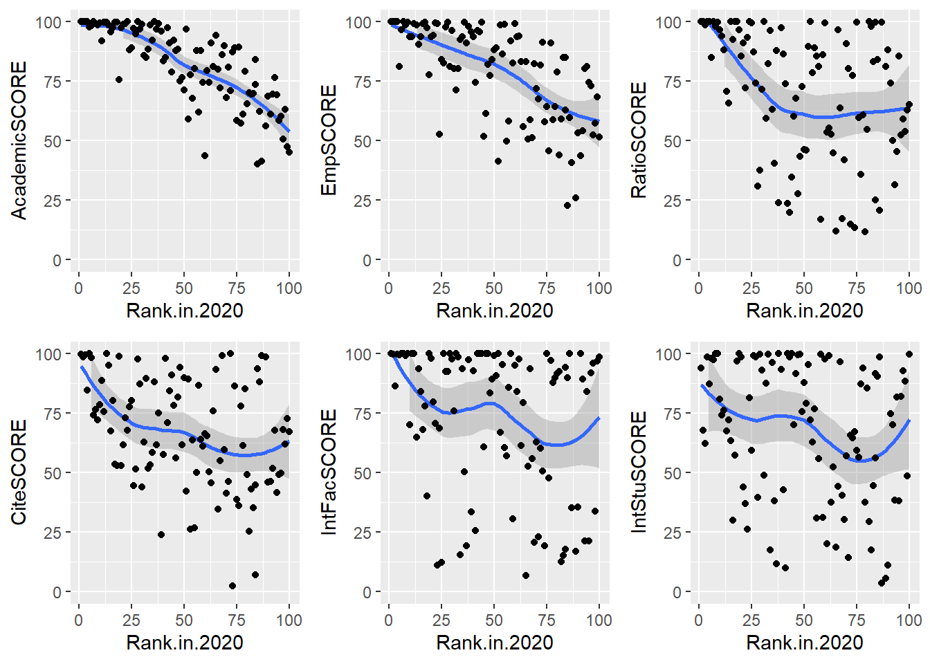
Correlation between Rank of the University and 6 factors
From the figure above, Academic Reputation and Employer Reputation Scores have a strong correlation as the Rank value increases from 1-100. This means that better the University rank, better is the Academic Quality and Employers seek graduates from top universities in general.
Faculty to Student Ratio and Citations per Faculty are similar after the 35th Rank and shows lesser correlation.
International Faculty and Student Scores are not correlated with rank and show bimodal distribution with the increase in rank value.
Thus, we can say that Academic Reputation and Employer Reputation are the factors other than rank that decides the quality of an institution in general. The following table verifies the correlation of factor with Rank.
| Factor | CorrelationWithRank |
|---|---|
| Rank.in.2020 | 1.0000000 |
| AcademicRANK | 0.7776026 |
| EmpRANK | 0.6018111 |
| RatioRANK | 0.3535604 |
| CiteRANK | 0.3583584 |
| IntFacRANK | 0.2985079 |
2. Which Universities top in each of the specific factors?
- We consider the Universities that have a Score of 100/100 in each factor. These are interactive plots that give the Rank, Name, and Overall score of the particular University when hovered over.
- The figure shows the Universities that are best at Academic Reputation in the QS World Rankings. We can observe that University of Tokyo, UCB, and UCLA which are not in the top 10 ranks have the best Academic Reputation. Harvard, MIT, Stanford, Cambridge, and Oxford which are among the top universities make it into this list which was expected.
- The figure shows the Universities that are best at Employer Reputation in the QS World Rankings. We can observe that only five universities have a score of 100 in this factor. Harvard, MIT, Stanford, Cambridge, and Oxford, all of which are in the top ten have made it into this list. This shows that employers mostly seek students from the topmost universities.
- The figure shows the Universities that are best at Faculty to Student Ratio in the QS World Rankings. We can see that Universities ranked at 31st, 53rd, and 81st have made it into this list. This means to say that the universities in this list have a greater number of faculty in comparison to the number of students in that university. We can observe that some of the universities ranked lower also have ample number of faculty per student.
- The figure shows the Universities that are best at Citations per Faculty in the QS World Rankings. We can observe that only 3 universities in the QS rankings have a score of 100 in this factor. Caltech, Georgia Tech, and Princeton universities have the most citations per faculty. This means to say that the faculty in these universities have the greatest number of research papers and citable work cited under their names.
- The figure shows the Universities that are best in the number of International Faculty in the QS World Rankings. There is a long list of universities that have a score of 100 under this factor. This goes to show that these universities are multicultural and have faculty from different countries from all around the globe.
The figure shows the Universities that are best in the number of International Students in the QS World Rankings. Only 6 universities in the data have made it to this list with a score of 100 in the factor. This goes out to show that these universities are diverse and multicultural in their student population and accept students from a broad array of backgrounds and cultures.
The top universities in each factor are listed above and this answers our question as to which is best in what factor. We can make a choice based on the kind of environment we’re looking for in a university and the factor that matters most to us.
These plots verify our previous conclusion that Academic Reputation and Employer Reputation have a strong correlation with the rank of the University compared to the other factors with Overall Score ranging above 85 at least!
3. Is there a correlation between different classification factors like Country, Age of the University, Reputation of the University, Size and International Student Numbers?
- Distribution of Top 100 Universities in each country.
Country-wise Frequency Distribution of the Top 100 Universities in QS World Rankings.
It is evident from the above figure that US/UK have the greatest number of universities in the Top 100 rankings worldwide with 29 and 18 universities respectively. Australia has the third highest number of Universities in the Top 100 with 7 and the rest of the countries in the list has 6 or lesser universities in the Top 100. This plot was built using Tableau.
Is there a relationship between age of the university and its employer reputation?
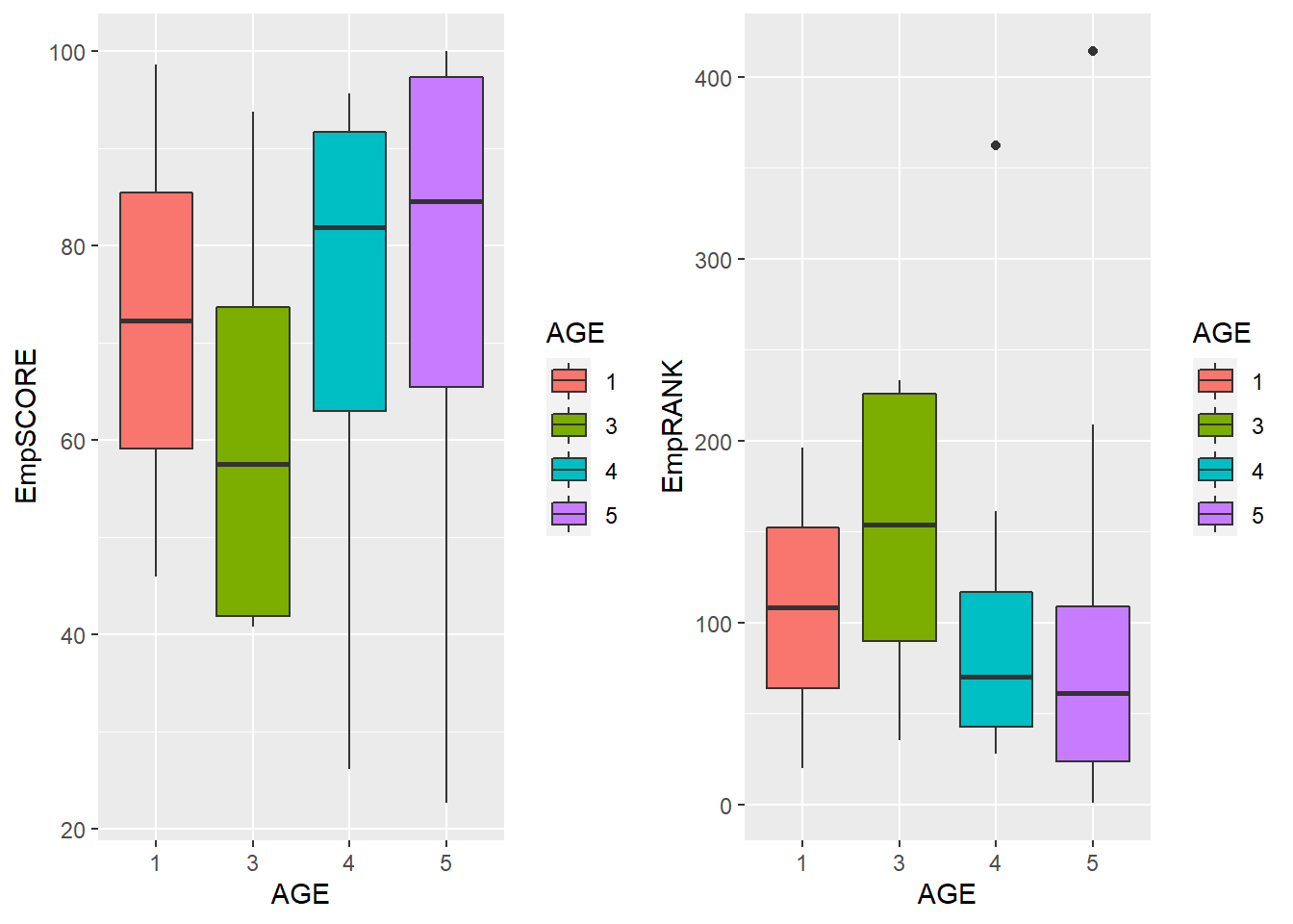
Age versus Employer Reputation of Universities
        5 = Greater than 100 years old (Historic Universities)
     4 = 50-100 years old (Mature Universities)
     3 = 25-50 years old (Established Universities)
     1 and 2 = Less than 25 years old (Young Universities)
We can see that generally the historic and mature universities have better employer reputation. A higher SCORE and lower RANK is the desirable reading which is mostly found in the older universities. Thus, employer reputation generally increases with the age of the university.
Is there a relationship between institution size and number of international students?
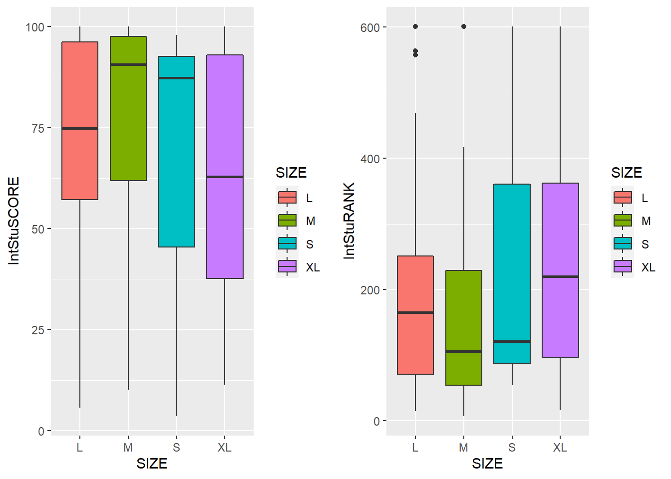
Size versus International Student Scores and Rank
                   XL = Greater than 30,000
                 L = Greater than 12,000
                 M = Greater than  5,000
S = Lesser than 5,000- We can observe that the Small (S) and Medium (M) sized universities have the greatest diversity among students with a greater number of international students compared to Large (L) and Extra Large (XL) sized universities. They have a desirable reading of higher SCORE and lower RANK values. Thus, a higher number of students count does not mean that there will be more diversity in the student population.
Conclusion -
From the Data Exploration and Visualization conducted in the previous section, we can conclude that –
Academic Reputation and Employer Reputation are the factors other than rank that decides the quality of an institution in general. A high ranked University is generally good in Academic and Employer Reputation factors.
Each University has its own factor of strength. It is not necessary for the Top Universities to have strength in all factors. There is a different list of Top Universities for each category of factors. Individuals need to assess what factors matter most to them and make a choice of institution.
US, UK, and Australia have the greatest number of Universities in the Top 100 QS list.
Employer reputation generally increases with the age of the university. Next time someone says University Rank doesn’t matter for employment, just smile and do whatever you were doing anyways! Also, some of the young institutions have a better employer reputation than the established ones. This shows the quality of Young institutions is good in general.
Size of the university does not indicate its diversity. Smaller and Medium sized Universities have more International Students in comparison with Large and Extra-Large Universities.
Hope this gives a comprehensive overview to all the young and aspiring students who are looking forward to pursue higher education for their career! Share this with someone you think will benefit from!
References -
- Software Used –
Microsoft Corporation. (2018). Microsoft Excel. Retrieved from https://office.microsoft.com/excel
RStudio Team. (2015). RStudio: Integrated Development Environment for R. Boston, MA. Retrieved from http://www.rstudio.com/
Tableau (Version 2020.2) [Windows]. Chabot, C., Stolte, C., Beers, A., & Hanrahan, P. (2020). Mountain View, California: Salesforce. Retrieved from https://www.tableau.com/
- R Packages –
Wickham et al., (2019). Welcome to the tidyverse. Journal of Open Source Software, 4(43), 1686, https://doi.org/10.21105/joss.01686
Kirill Müller (2017). here: A Simpler Way to Find Your Files. R package version 0.1. https://CRAN.R-project.org/package=here
Tierney N (2017). “visdat: Visualising Whole Data Frames.” JOSS, 2(16), 355. doi: 10.21105/joss.00355 (URL: https://doi.org/10.21105/joss.00355)
H. Wickham. ggplot2: Elegant Graphics for Data Analysis. Springer-Verlag New York, 2016.
Alboukadel Kassambara (2020). ggpubr: ‘ggplot2’ Based Publication. Ready Plots. R package version 0.4.0. https://CRAN.R-project.org/package=ggpubr
Yihui Xie, Joe Cheng and Xianying Tan (2020). DT: A Wrapper of the JavaScript Library ‘DataTables’. R package version 0.15. https://CRAN.R-project.org/package=DT
Simon Garnier (2018). viridis: Default Color Maps from ‘matplotlib’. R package version 0.5.1. https://CRAN.R-project.org/package=viridis
Simon Urbanek (2013). png: Read and write PNG images. R package version 0.1-7. https://CRAN.R-project.org/package=png
Hao Zhu (2019). kableExtra: Construct Complex Table with ‘kable’ and Pipe Syntax. R package version 1.1.0. https://CRAN.R-project.org/package=kableExtra
Jobs Data

Introduction -
Seek is a popular job listing website in Australia where most of the jobs are posted. As a data science aficionado, this was one of the most important topics of interest. Not only is this data fun to play with, but the insights from this data can be useful in real-life to propel our careers in the field of Data Science and Business Analytics. This data consists of postings related to data science only. I have some questions on mind and I’m sure I’ll have more questions answered which I didn’t even try to ask. Let’s dive in and get to know what the scope of Data Science looks like in Australia!
Questions - The data focuses on Data Science related jobs only and the questions framed are thus limited to Data Science jobs in Australia only. We can use a data set with other job profiles as well to extend the scope of analysis if that’s the focus. For now, this one’s all about “Data”… Science only (pun intended!)
1. What are the most sought after skills for a Data Scientist?
2. What locations have the most number of Data Scientist job postings?
3. What is the scope of part-time/full-time jobs for a Data Scientist?
The analysis is not limited to these questions only. These are the questions I have in mind and are most commonly useful for others to know, as well! We extend the analysis to find any new insights and findings related to these queries through exploratory analysis.
- This data is taken from Kaggle: Seek Data Science Job Listing (Australia)
The following data table shows the Variables in the data and their Descriptions -
We deselect the columns
desktopAdTemplateandmobileAdTemplatefrom the data as it is too bulky and not necessary for our analysis.The skill columns are not displayed in the above table. Each skill with a value 1 means that skill was posted for the role and 0 means that skill was not posted for the role.
The following instance shows a sample data value -
Let us have a visual look at the data -
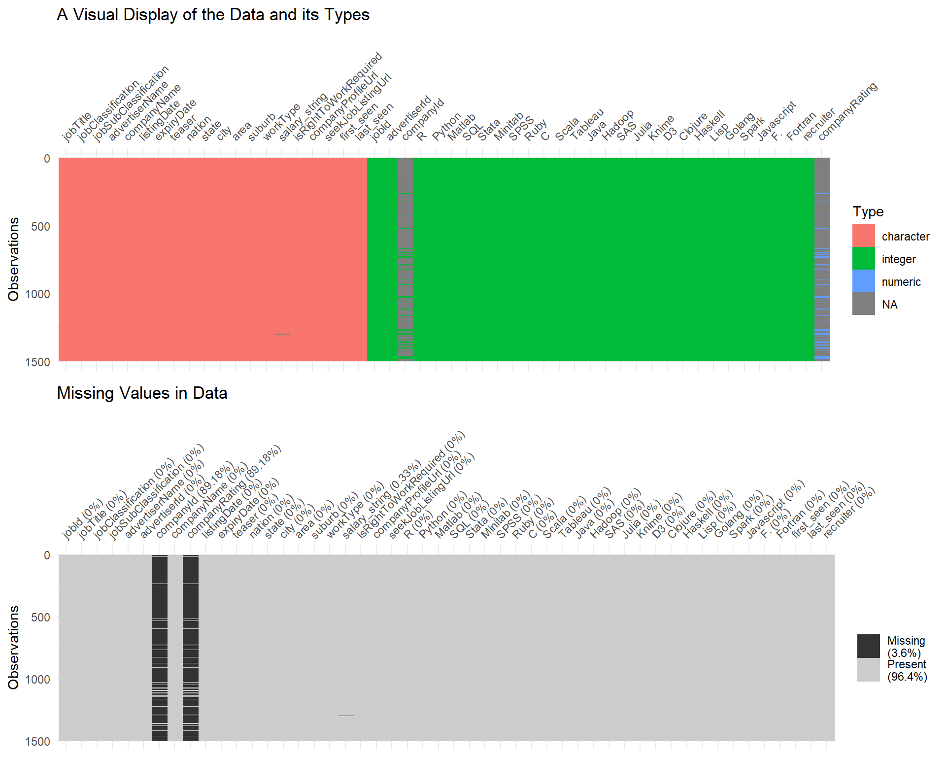
Visual Overview of Data
From the upper plot in the above figure, it is clear that there are almost 1500 observations and the data-types in the data are character, integer, and numeric. We can observe that the columns
companyIdandcompanyRatinghave missing values in them. To know what percentage of the data is missing, we have the lower plot in the figure that describes missing data.It is evident that there is 3.6% missing values in the data from the 2 aforementioned columns. There isn’t a lot of missing data otherwise. For the purpose of simplicity, we deselect these two columns as well since they are of less use with most of the values missing.
Analysis and Findings -
1. What are the most sought after skills for a Data Scientist?
We compare the different skills in the data set to determine what skills are most important for a data scientist. A value of 1 denotes that the skill is necessary otherwise, 0 on the x-axis. The y-axis describes the count of postings for 1/0. Let’s have a look at the scope of most common Data Science skills such as R, Python, SQL, and Tableau.
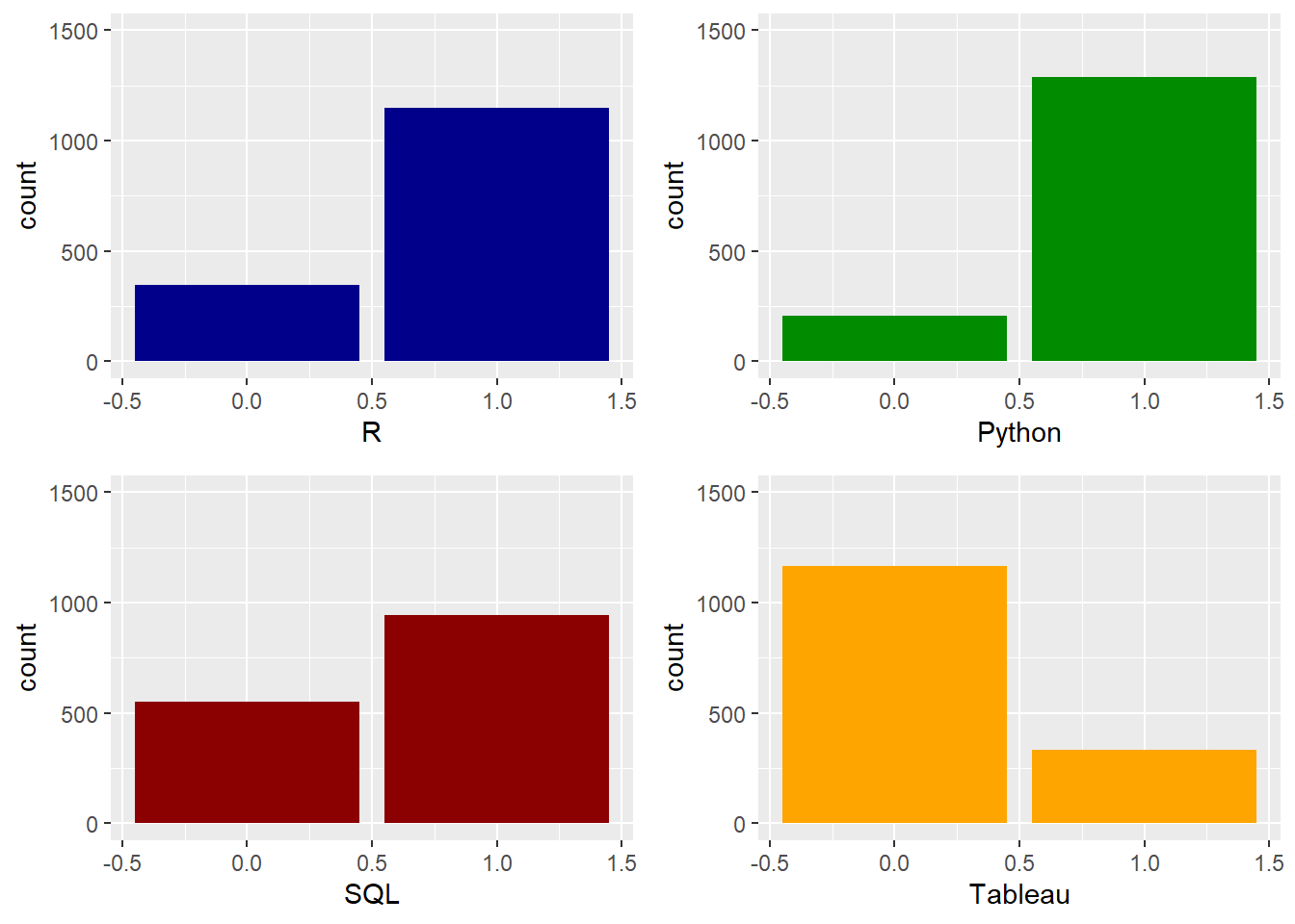
Counts of postings for R, Python, SQL, and Tableau Skills
- R, Python, and SQL are the most in demand skills for a data scientist.
Now, let’s have a look at the lesser popular skills and technologies for Data Science.
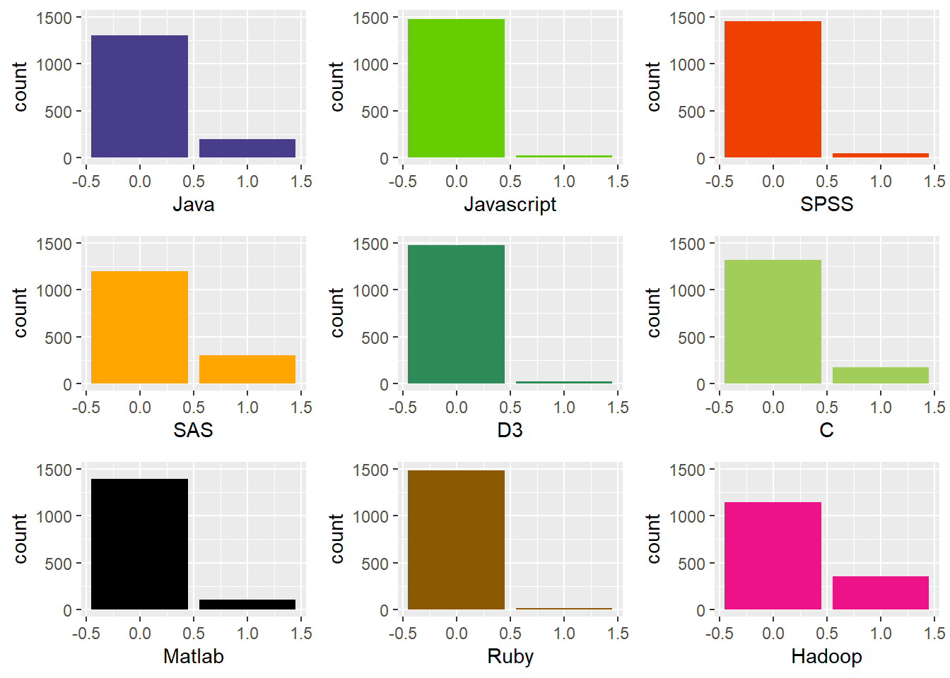
Counts of postings for Other Skills
- It is evident that these skills are not particularly needed for data science. More than 65% of the data science job postings do not need these skills.
2. What locations have the most number of Data Scientist job postings?
Let’s break down the data into locations and check where data scientists are more in demand. Click on one of the states on the list to DESELECT a state and focus on the ones you’re interested in.
- We can observe from the above interactive plot that Sydney has the highest number of postings for the data scientist role with 690 followed by Melbourne with 393 postings. ACT, Brisbane, and Perth have between 100-125 postings. Adelaide has 53 postings and the rest of the locations have less than 10 postings.
Let’s have a closer look at Sydney and Melbourne and check what suburbs have these jobs posted. Click on one of the cities on the list to DESELECT a city and focus on the ones you’re interested in.
The first column shows the count of suburbs that have an empty string value in the data set. We can consider this as “other” suburbs. There are 38 suburbs in Melbourne and 82 suburbs in Sydney for this category of unnamed/other suburbs.
We can observe that most of the data scientist roles are in the CBD and Inner Suburbs both in Sydney and Melbourne with 208 and 130 postings respectively.
3. What is the scope of part-time/full-time jobs for a Data Scientist?
We break down the jobs based on the work type described in the postings. Click on one of the work types on the list to DESELECT it and focus on the ones you’re interested in.
- We can observe that out of 1500 postings, 1070 are Full Time, 414 are Contract/Temporary, 9 are Part Time, and 4 are Casual/Vacation.
As mentioned in the introduction, there are some new questions that popped up after a closer look at the variables and what can be deduced from them. Here are the additions to the questions I initially had on mind.
4. What are the industry classifications for Data Scientist roles?
Now, we have a glimpse at what industries mostly hire data scientists. This is an interactive plot that can be clicked and explored!
- We can observe that ‘Information & Communication Technology’ and ‘Science & Technology’ have the highest number of data scientist roles which is pretty obvious. The various colors within the Industry specify the sub-classifications within the industry.
A word cloud is a easy to perceive method to understand what key words are occuring most commonly. So we plot a word cloud that displays the commonly occuring Sub Classifications in the Industries.
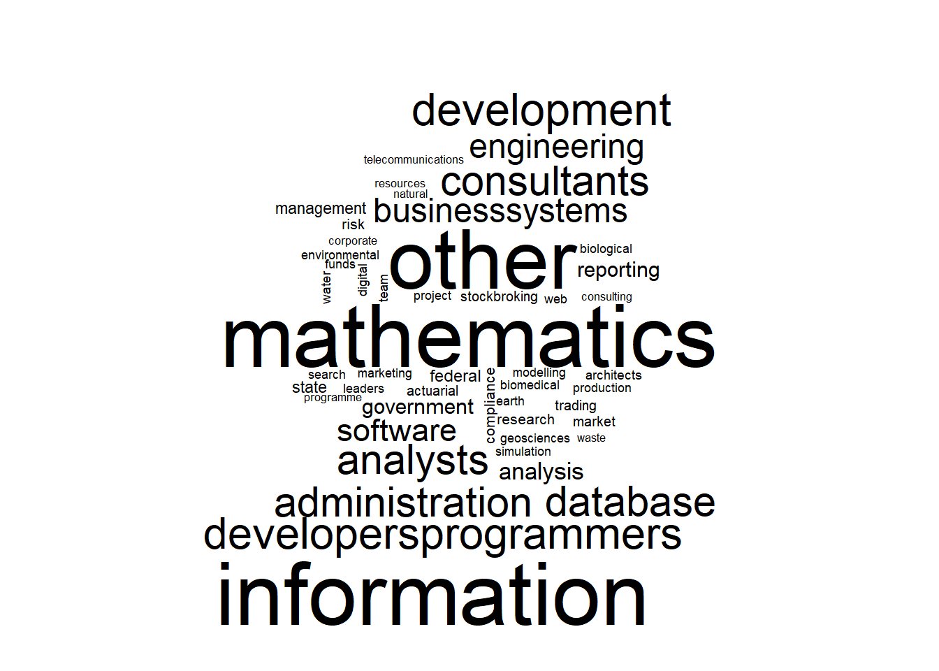
- It is evident that ‘mathematics’, ‘statistics’, ‘sciences’, ‘developers’, ‘programmers’, ‘analysts’, ‘database’, ‘development’, etc have most frequency in the job postings data.
5. What are the different job titles posted?
Most occuring Job Title Key Words -
This gives us an overview of the most frequently used keywords in these job postings. Since this data focuses on the role of a Data Scientist, these two words are bound to have way bigger frequency than the other words.
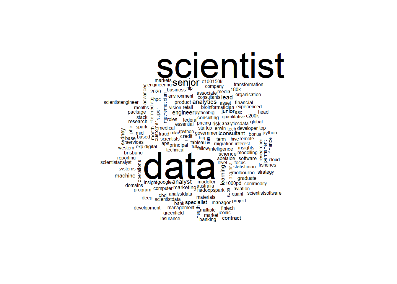
- We can observe that ‘data’ and ‘scientist’ are the most occuring key words and this was presumed with common sense. The word ‘senior’ seems to occur more often as well. Other words like ‘analytics’, ‘analyst’, ‘engineer’, ‘specialist’, ‘consultant’ etc have also appeared.
Conclusion -
R, Python, SQL are the most sought after skills for a Data Scientist role. Other tools and technologies are job specific and are not as sought after as R, Python, and SQL.
New South Wales and Victoria, specifically, Sydney and Melbourne have most of the Data Scientist job openings with most of the postings clustered around the CBD & Inner Suburb areas.
Data Scientist roles are mostly Full Time. Some of the roles are Contract/Temporary. There are very few Casual/Part Time/Vacation opportunities for the role of a Data Scientist. This shows that the job requires high level skills and isn’t suitable for Casual/Part Time jobs.
The ICT & Science & Tech are the industries that mostly hire Data Scientists. Most of the other sub classifications of industry or sector come under these two main industries.
Data Science roles usually require a Senior Executive with some amount of previous experience. The word cloud with ‘senior’ verifies this fact.
Data Science is an intensive field that drives businesses and this requires expert and highly skilled individuals who are knowledgable in Statistics, Maths, Science & Technology. Other similar roles like Data Analyst, Business Analyst, Business Intelligence might have similar trends in some aspects but the skills needed for the jobs might vary depending on the particular role.
References -
Wickham et al., (2019). Welcome to the tidyverse. Journal of Open Source Software, 4(43), 1686, https://doi.org/10.21105/joss.01686
Tierney N (2017). “visdat: Visualising Whole Data Frames.” JOSS, 2(16), 355. doi:10.21105/joss.00355 (URL: https://doi.org/10.21105/joss.00355), http://dx.doi.org/10.21105/joss.00355
Yihui Xie, Joe Cheng and Xianying Tan (2020). DT: A Wrapper of the JavaScript Library ‘DataTables’. R package version 0.15. https://CRAN.R-project.org/package=DT
Ian Fellows (2018). wordcloud: Word Clouds. R package version 2.6. https://CRAN.R-project.org/package=wordcloud
Alboukadel Kassambara (2020). ggpubr: ‘ggplot2’ Based Publication Ready Plots. R package version 0.4.0. https://CRAN.R-project.org/package=ggpubr
C. Sievert. Interactive Web-Based Data Visualization with R, plotly, and shiny. Chapman and Hall/CRC Florida, 2020
Copyright © 2024 Rahul Bharadwaj Mysore Venkatesh
rahulbharadwaj97@gmail.com