MyGigsters - Data Futures Project
Rahul Bharadwaj Mysore Venkatesh
10/11/2021
MyGigsters is an extremely passion-driven startup that aims to build the largest, safest and financially secure gig community in Australia with the ultimate toolkit through a mobile app for delivery drivers to maximise earnings, save money, and be safer on road. The goal is to work with publicly available data to build data visualisations that can enhance the already existing features to inform or provide more insights on the potential areas where food delivery orders can be expected in Melbourne. Analysis is conducted on business finance data from users and compared with publicly available data to find opportunities to earn/save more with the help of patterns and insights on the mobile application for gigsters. This project serves as a market research for building the user community and recognise potential useful features for the mobile app. Tools and technologies to be used include R programming and MS Excel.
Keywords: Startup, Gig Community, Safety, Financial Security, Drivers’ Toolkit
Background & Motivation
Role of the Student: Data Analyst Intern at MyGigsters (Private Git Repository Link)
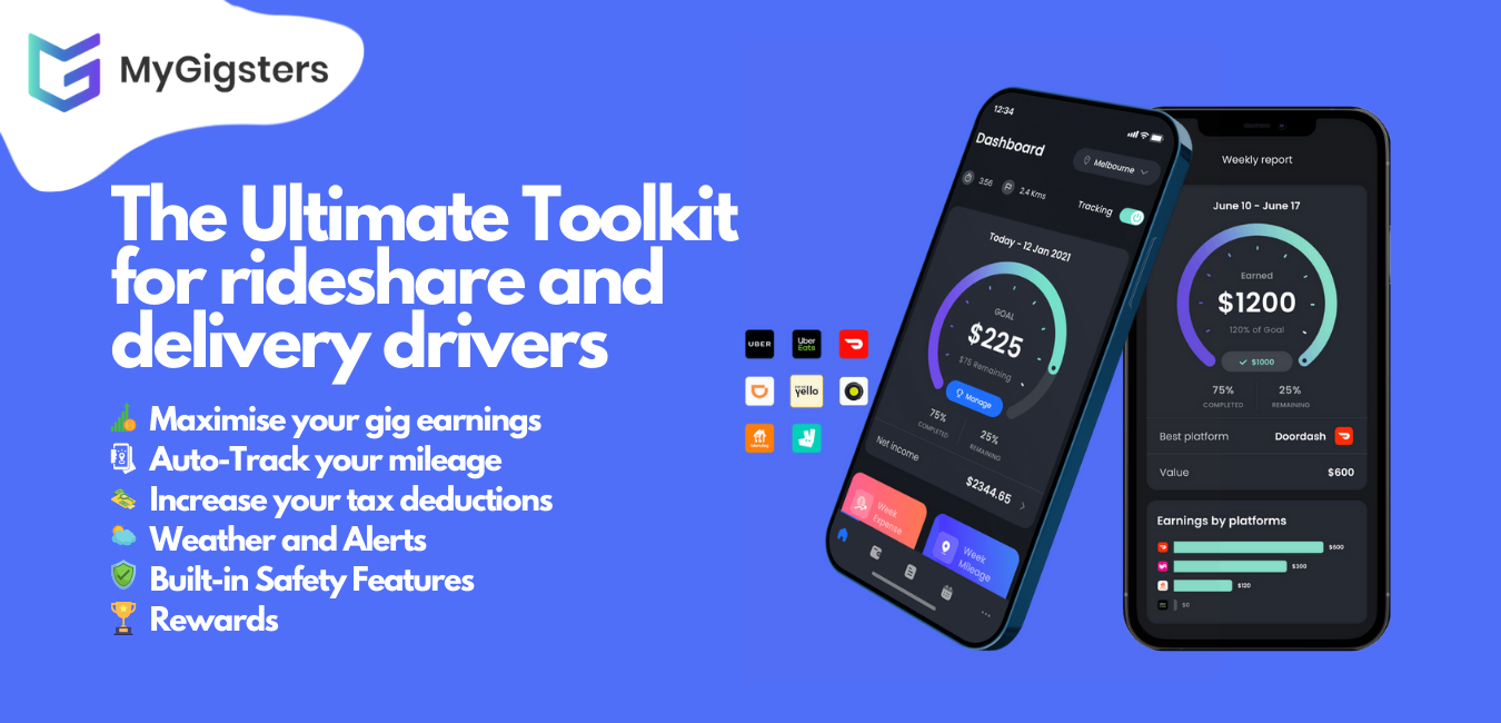
MyGigsters aims to empower the gig worker community by providing a holistic tool kit through a mobile application for both Android and iOS users. With features like automatic mileage tracking, income and expense tracker, the user can save money on their tax. The user has the opportunity to maximise their earnings across all the platforms they drive for; Uber, DoorDash, Didi, Deliveroo, Ola, EASI, Menulog, Sherpa, and more. The app also assists the user to file taxes as well at a cost which is less than 60% of the market value.
Currently the mobile applications has the following features and functionality:
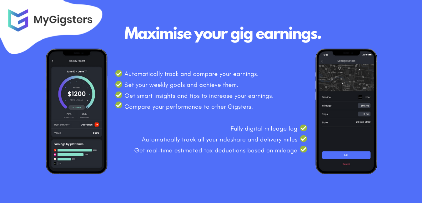
Know your actual income and expense across all platforms: Using the automatic income and expense sync, you can finally see how much money actually lands in your pocket minus all the expenses and deductions across all the platforms you work for.
Automatic Mileage Tracking: With the click of a button, you can automatically track your mileage. This will help you save on tax and calculate your costs to reclaim business expenses after paying your taxes.
Tax Lodging: Get ASIC compliant tax report based on your income and expense report that can be used to easily file taxes. This helps the user save time in preparing the report with just a click of a button.
The next step towards improving the features include data based insights for the user community along with their own personal data and tracking.
Proposed addition to the functionality of the mobile application:
- Data based insights: Which platform is paying you higher? What time of the day should you work to maximise earning? How are your earnings/savings compared to others in the same age group, same gender category, economic status, region, and income range? How does weather increase/decrease customer demand?
Data Project Scope: Tasks and Objectives
A high-level overview of steps and objectives to achieve the goal
Identify and collect publicly available data, perform data cleaning/wrangling, and data exploration using R programming and MS Excel to device user-friendly and insightful data visualisations. These visuals and dashboards in the form of a report will be the basis on which the mobile application development team can implement the planned new features and functionality.
Aid design of user-friendly dashboards on a mobile app through research and development on the Data Futures Project that aims to enhance user earnings by at least $150/month and aims to build a targeted demographic community.
Collaborate in an Agile working environment to brainstorm ideas and spearheaded the choice of tools and technology, planning, and implementation of the project resulting in enhanced app features.
Data to be used include
- Population Data
- Income & Expenditure Data
- Age Distribution Data
- Jobs & Gender Data
- Social-economic Status Data
- Weather Data
- Cafes & Restaurants Data
Project Management Tool: Notion - Datasets and Overview
Methodology & Data Collection
The primary source of data for this project is publicly available data on Australian Bureau of Statistics (ABS). Data from this source is updated annually and is credible as it is provided by the Australian Government. Other paid data sources will be considered based on the on-going needs and demands of the project in the future.
- The data is downloaded from ABS, initially cleaned to make it suitable and readable as a tibble in R environment after simple cleaning on MS Excel. The data is also converted into suitable data-types through Excel as it is easier than coding in R. Most of the data planned to be used except weather data are available from this source and is linked above on Notion page used for managing this project.
The next source of data seeks to understand climate sensor data from Melbourne City Council. The datasets contain measurements obtained from November 2019 up until now, on things like humidity, temperature, and rainfall from different locations around the city. It includes Locations of the Sensors and Sensor Readings. We observe weather related insights from this. Cafes and Restaurants data is also obtained from the same website through public URL.
Data is used directly from a public URL and it is read into R environment for exploratory analysis. All necessary data cleaning and preparations are done as required for the specific visualisation.
Finally, all the data is then visualised to provide a comprehensive market research and other patterns in finances and weather to help the mobile development team in recognising the addition of new and possible functionality for the app. Insights, patterns, and results are explained within the subsections after the visualisations are presented.
Data Exploration & Visialisation, Discussions, and Results
There are 10 major sources of data collected as part of the research for the project. They include:
- Population Data
- Household Income & Expenditure Data
- Gender Data
- Age & Wages Data
- Jobs Data
- Australian Finance & Wealth Data
- Lending & Loan Data
- Socio-economic Data
- Weather Data
- Cafes & Restaurants Data
Each of these datasets are analysed and visualised to recognise patterns and insights that can be incorporated later in the app to make the app more useful for the users. Some datasets are combined to make more useful multi-faceted dashboards or visualisations as required.
Population Data
We first observe the population data nationwide to check the scope of gig work and the overall economy in general.
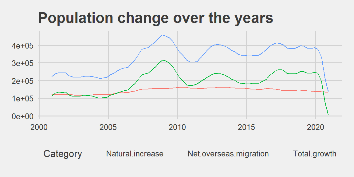
Population Change over the years 2000-2020
We can observe that the total growth is heavily influenced by net overseas migration than natural increase. This shows that Australia has a rich and diverse population from overseas and a vibrant gig work community. It can be safely assumed as most internationals residing in Australia might be doing gig work for a living. This validates the purpose of an application to safeguard their interests and there is a community that can benefit from the startup idea.
Overall Population saw an increase from 2005 to around 2009 after which there was a decline. This might be due to the recession in 2008.
There was a steady increase around 2013. The years 2015-2017 saw an increase after which we can observe stagnation before it fell drastically due to the pandemic and closure of borders.
Next we explore the migration data by each state to recognise and target the states that require this service the most.
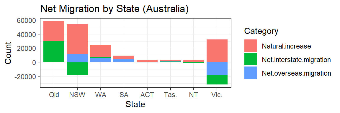
Net Migration by State/Region
We can observe that Victoria’s overseas migration has drastically decreased. This might be due to the closure of borders since March 2020 that prevented most students from entering Australia. Since Victoria boasts the most vibrant student community, it was hit the hardest in education sector. Click here for article that backs up this assumption.
The above visual also tells us that NSW, VIC, and QLD have the highest population and serves as major target markets for the marketing of the mobile application.
The extent of net overseas migration tells us which locations in Australia are best for building a community. It can be safely assumed that the international community is the most probable user for the mobile application that work part time along with their study or other work.
Income & Expenditure Data
Next, we explore the average income and expenditure patterns in different states.
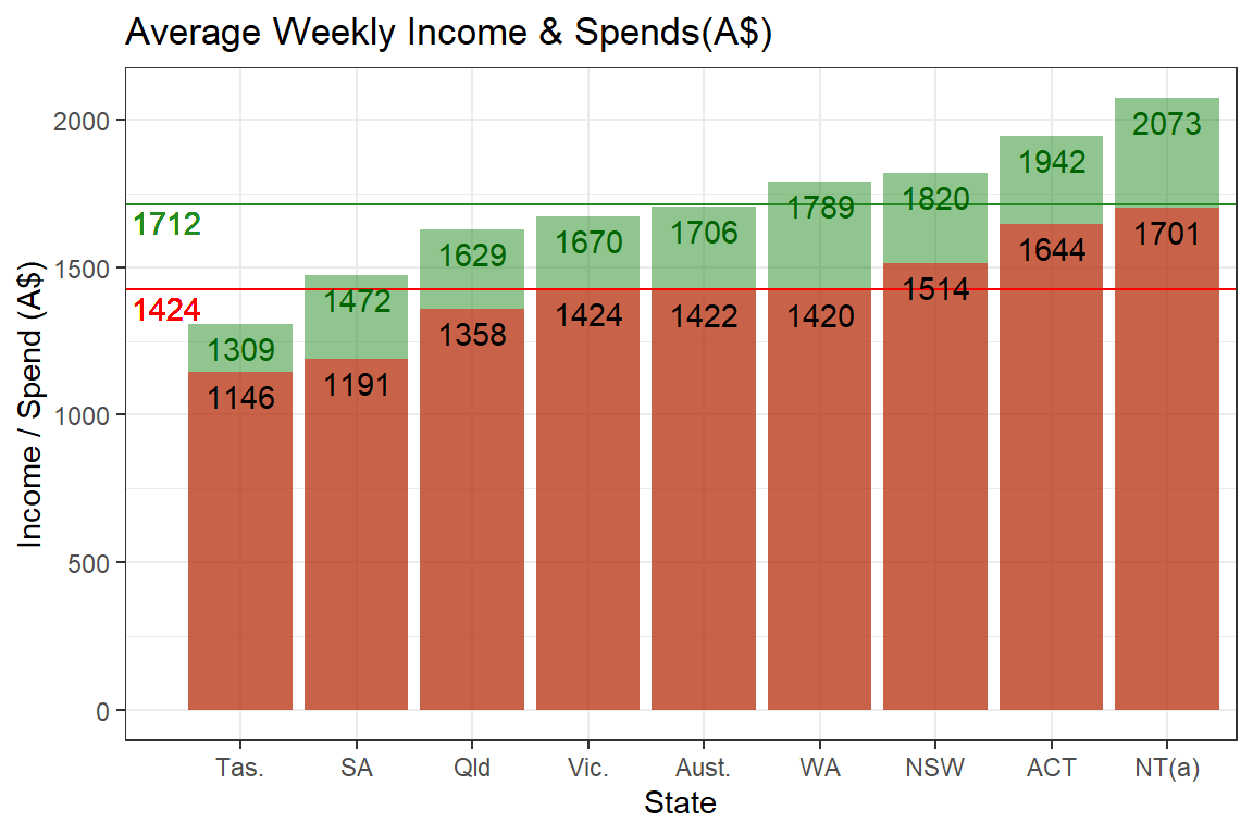
Average Weekly Financial Data
The green bars indicate the average earnings, and the red bars show the average expenditure in each state. The nationwide average income per week is AUD 1712 and average expenditure per week is AUD 1424. Other states and territories can be compared against this. This data can be used to provide insights to users on how they fare against the average. This gives insights to users whether they are saving or spending more than the average person in their region.
All states and territories see more income than spending. Thus, on an average, everyone is saving some amount of money each week.
Tasmania has the lowest stats while Northern Territory has the highest and the middle observation is the national average exactly in between the extremes. States and regions can be targeted using this information. NOTE: The data is for full time workers, assume lesser to target community.
We calculate the average savings from this data by doing simple math: Income - Expenditure and visualise it as follows.
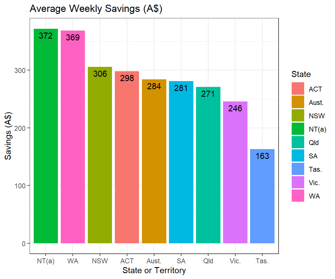
Average Weekly Savings
This bar plot shows the average weekly savings a person makes in Australia. The mean weekly savings is AUD 284 right in the middle, the highest is Northern Territory with a savings of AUD 372 and the lowest happens to be Tasmania with a savings of AUD 163.
This graph shows the average savings per week for an individual and it largely depends on the cost of living and other expenses in each region.
But this serves as a benchmark to tell users in each region how their savings fair against the average person in the same region.
NT, WA, NSW, ACT have the highest savings on an average per person. The other regions have lesser but nevertheless still have positive savings figures. NOTE: The data is for full time workers, assume lesser to target community.
We now dig deeper to check the categories of expenditure in Melbourne.
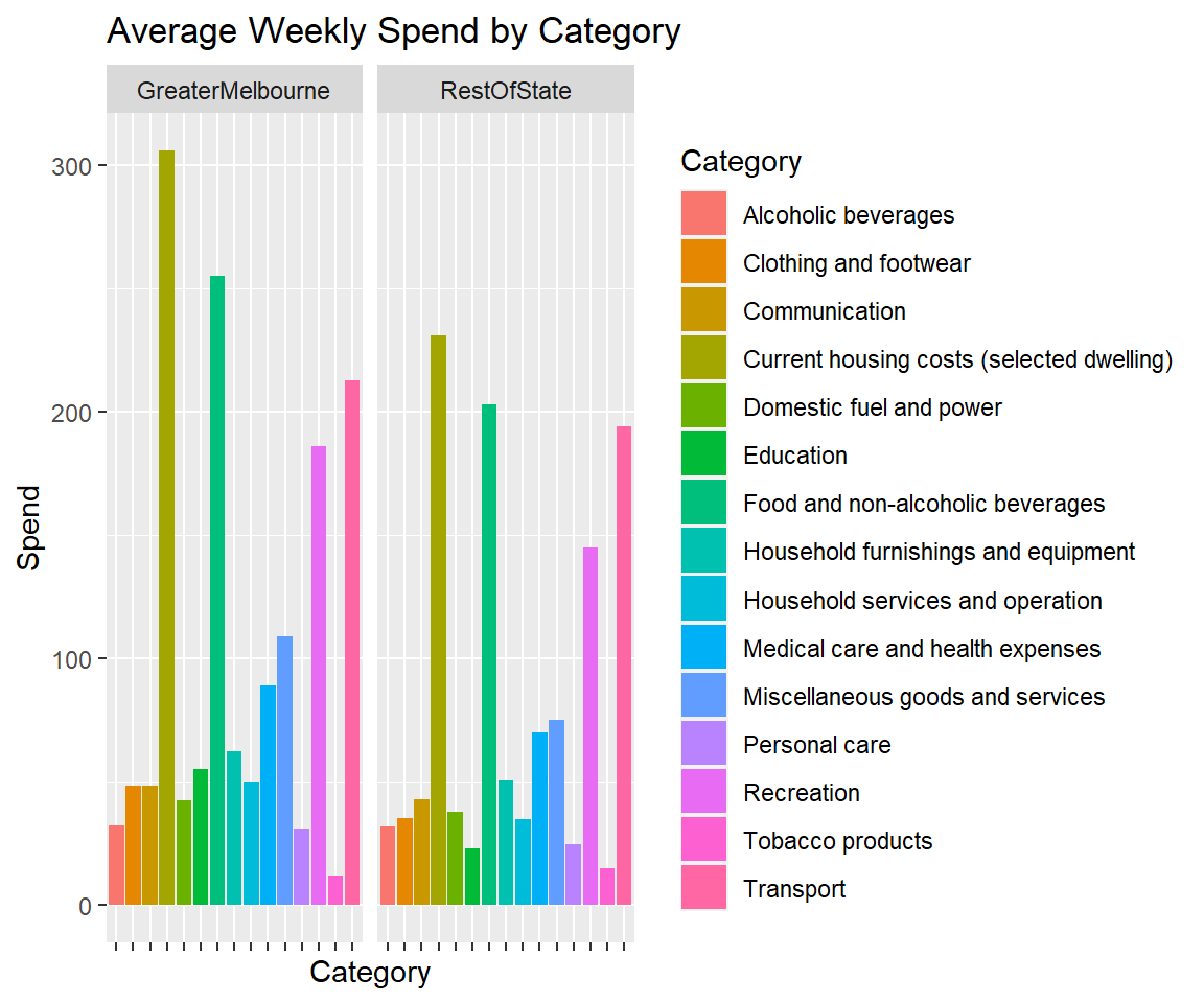
Spending by Expenditure Categories
The above bar plot indicates the average weekly spending on each category of expenditure. This helps the user in checking where spending is mostly going as their bank accounts with expenditure patterns are linked to the app.
It is evident from the above graph that housing has the highest expenditure followed by food, transport, recreation, and miscellaneous goods and services, in that order.
These insights can be incorporated in the app to track the expenditure patterns of the user and recognise potential categories of spend where they can save more.
This visual serves as a precursor in checking the expenditure by the top spend categories among different income ranges of the society.
Now let’s check how these expenditures are made in each Income Range for the Top 3 expense categories: Housing, Food, and Transport.
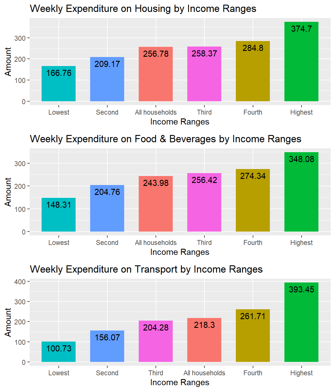
Top 3 Expenses by Income Ranges
We can observe a steady increase in expenditure on different categories of spends but the highest quintile shows a drastic increase in spending patterns. This is because the highest quintile has a drastic increase in their average weekly earnings as well.
Age Data
The visual below shows the patterns in average weekly earnings by age groups.
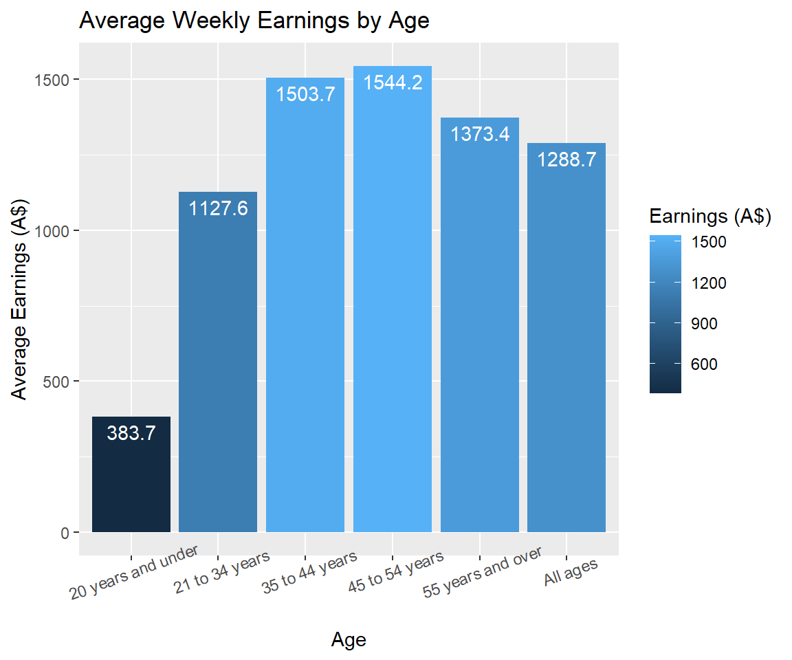
Average Weekly Financial Data by Age
This bar plot shows how much each age category or ranges earns on an average per week.
We can observe that 45-55 age group has the highest earnings and 35-55 age group have more earnings in general. This again points out that our target group is 20-35 age group based on the income levels for gig workers.
These insights can be implemented within the app to give personalised comparisons based on the age of the user. This gives a better understanding and many facets to compare the users’ stats with others within the community.
We can further dig deeper to see what age groups spend how much for each of the top 3 expenditure categories.
NOTE: The data is for full time workers, assume lesser to target community.
Let’s check how these expenditures are made in each Age Range for the Top 3 expense categories: Housing, Food, and Transport.
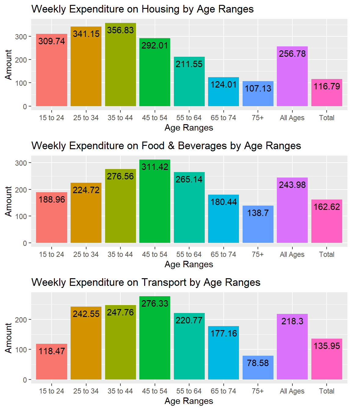
Top 3 Expenses by Age
This further deepens the understanding of the user as to where the cash flow is happening and cut costs for particular spending categories. It directs the user as to which exact categories of spends are going overboard and has potential to save. The user can also check what each age range spends the most money on and how they fair against this data.
Let’s check the overall income and expenditure by age ranges.
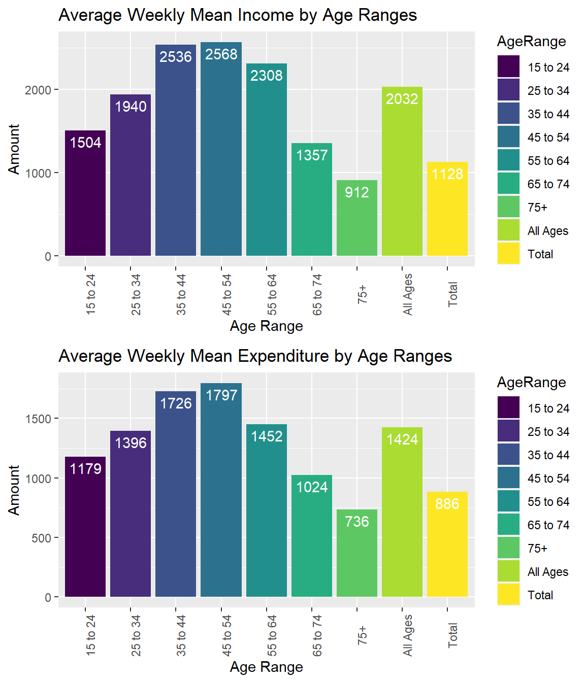
Average Weekly Financial Data by Age
These plots give an overall picture of the average weekly incomes and expenditures of the average person based on age.
These plots are similar to the ones explained previously and this can be integrated as an overall stat that can be further broken down into particular categories mentioned earlier. NOTE: The data is for full time workers, assume lesser to target community.
Jobs Data by Gender
Jobs data by gender is analysed and explored to check patterns in creating a demographic for the marketing of the app.
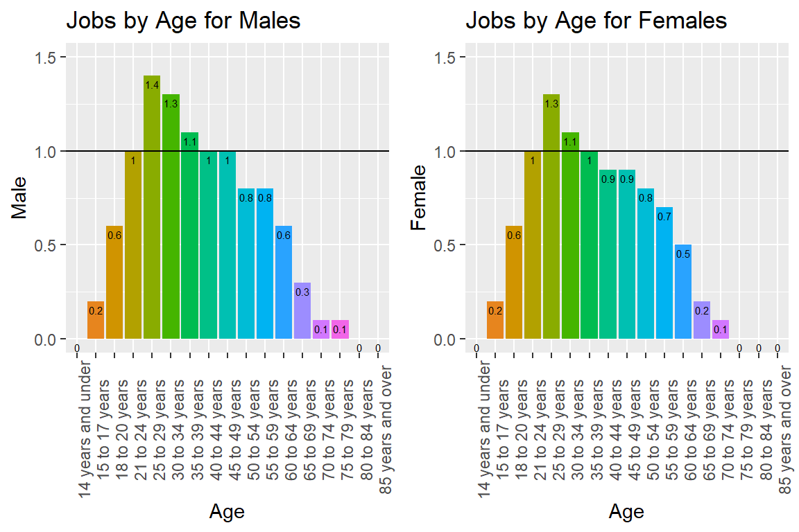
Average Number of Jobs by Age
The following observations can be made by this exploration:
There are some age groups that predominantly have more than one job on an average. We can vaguely assume that someone with more than one job has a side hustle or gig work as well. This assumption is backed up by the visuals that show age groups in the 20s to have this pattern.
While men have more than one job in their 20s, women tend to have more than one job only in their early 20s. This points to the demographics that we need to target and the type of marketing content needed to build a community for the mobile app.
Finding more patterns in income and spending for targeted demographics will boost the user community numbers while also providing them incentives and enabling safer and better lives for gig workers.
NOTE: Insights are a safe assumption and not 100% accurate.
We also analyse part time and full time categories by gender to see patterns for gig workers.
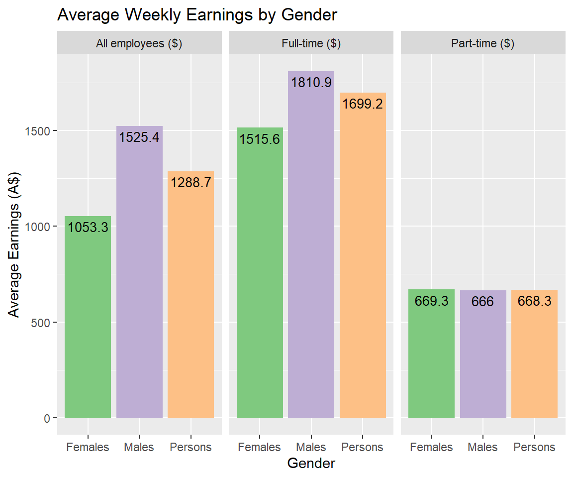
Average Weekly Financial Data by Gender and Type of Work
This plot shows that gig workers in general have the same income levels independent of their gender. This tells us that we need to target all genders equally.
It can be implemented to give gender specific stats and also based on the number of hours the user is working. Based on the number of hours they have worked, they can assess if what they’re earning is competitive and worth their time.
The goal is to make the dashboards and notifications as personalised as possible with these new found statistics.
NOTE: Not all part time workers are gig workers. Gig work is a subset of part time workers. This has to be kept in mind while making any assumptions. The best income range to target is ~ AUD 600 of average weekly income.
Socio-economic Data
It is more useful to check the income and expenditure data for different quintiles of income.
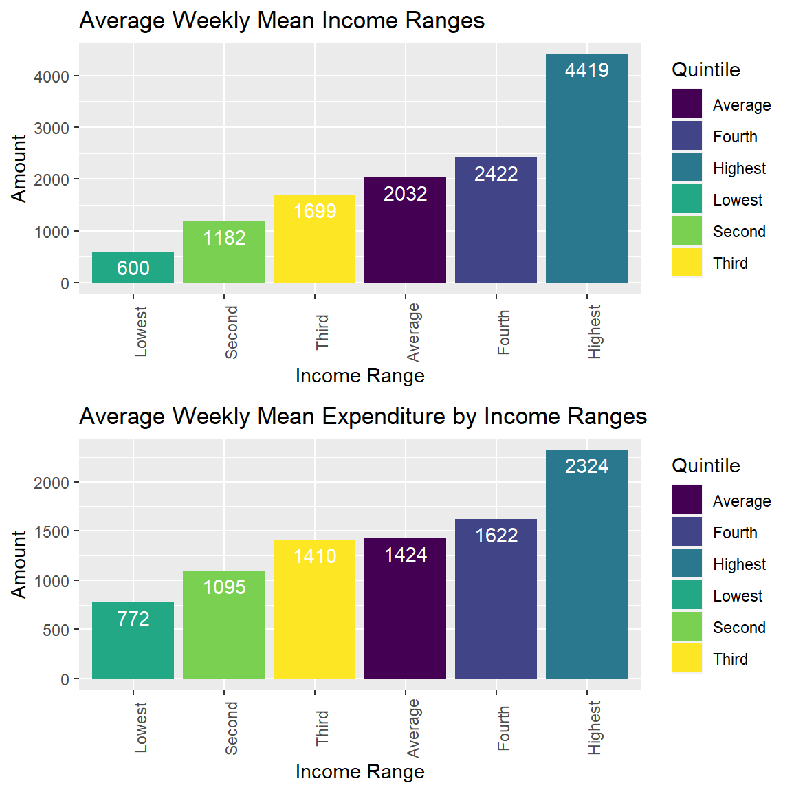
Average Weekly Financial Data by Socio-economic Status
We can assess the quintile in which our user community falls as they link their bank accounts to the mobile app and this makes sure accurate comparison is shown for potential savings in the same socio-economic status of the society. It is not fair comparing the user against national average for all earning levels which is less accurate.
This provides a more accurate comparison of financial statistics like savings, income, earnings, and more based on the same level of income ranges. This helps the user get more accurate and personalised dashboards that is fairly compared within a diverse range of users.
Cafes & Restaurants Data
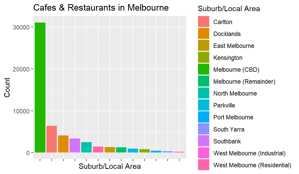
Number of Cafes and Restaurants in Melbourne
- It is evident from the above plot that most of the cafes and restaurants are situated in CBD, Carlton and Docklands.
| Var1 | Freq |
|---|---|
| Carlton | 6363 |
| Docklands | 4109 |
| East Melbourne | 1336 |
| Kensington | 795 |
| Melbourne (CBD) | 31085 |
| Melbourne (Remainder) | 1238 |
| North Melbourne | 2512 |
| Parkville | 953 |
| Port Melbourne | 445 |
| South Yarra | 294 |
| Southbank | 3341 |
| West Melbourne (Industrial) | 176 |
| West Melbourne (Residential) | 1405 |
- The above table reflects the same with the maximum cafes in CBD, Carlton and Docklands. We can safely assume that most cafes and restaurants are concentrated in these places. In the following section, we analyse the weather in CBD, Carlton and Docklands area that can help future analysis.
Weather Data
The below map shows the locations of the sensors in key areas of Melbourne. The cloud icon represents the locations of the sensors in the map.
The above map shows that the sensors’ in this data set are located in Melbourne CBD in key areas and we can observe many sensors in the same street closely situated.
The goal of this analysis is to observe if there are significant changes in temperature and rainfall so that this knowledge can later be extended to ordering patterns to find correlations between them.
The table below describes all the sensors’ exact locations and their Site IDs that help us understand and unravel the patterns in the weather data visualizations in the subsequent sections. Their average temperatures throughout the year are also mentioned.
List of Sensors and their Locations
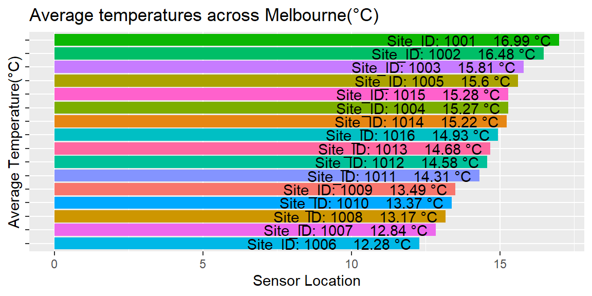
Average Temperatures across Sensor Locations
- The above plot shows the average temperatures across all sensor locations in the data set. The readings are as follows:
- 16.99° C - ID 1001 at 85 Grattan Street CARLTON VIC 3053
- 16.48° C - ID 1002 at 680-682 Swanston Street CARLTON VIC 3053
- 15.81° C - ID 1003 at 165 Pelham Street CARLTON VIC 3053
- 15.60° C - ID 1005 at Shop 2, Ground 121 Grattan Street CARLTON VIC 3053
- 15.27° C - ID 1004 at 680-682 Swanston Street CARLTON VIC 3053
- 14.77° C - ID 1015 at 185-197 Spring Street MELBOURNE VIC 3000
- 14.72° C - ID 1014 at 7 Swanston Street MELBOURNE VIC 3000
- 14.40° C - ID 1016 at 402 Lonsdale Street MELBOURNE VIC 3000
- 14.14° C - ID 1013 at 318 William Street MELBOURNE VIC 3000
- 14.06° C - ID 1012 at 112 Little Collins Street MELBOURNE VIC 3000
- 13.94° C - ID 1011 at 671-701 Flinders Street DOCKLANDS VIC 3008
- 13.23° C - ID 1009 at 252 Flinders Lane MELBOURNE VIC 3000
- 13.17° C - ID 1008 at 222-224 Flinders Street MELBOURNE VIC 3000
- 13.09° C - ID 1010 at 60 Siddeley Street DOCKLANDS VIC 3008
- 12.61° C - ID 1007 at 671-701 Flinders Street DOCKLANDS VIC 3008
- 12.28° C - ID 1006 at 60 Siddeley Street DOCKLANDS VIC 3008
- We can observe the presence of a phenomenon called ‘microclimate’ in this data. It goes out to show that Melbourne has significant difference in temperatures even across the same street at different points. This makes it difficult to find patterns in temperature and online food ordering. This analysis can be used as a point of reference for future use to compare with food delivery data.
We can also observe the temperatures at different hours of the day across each sensors.
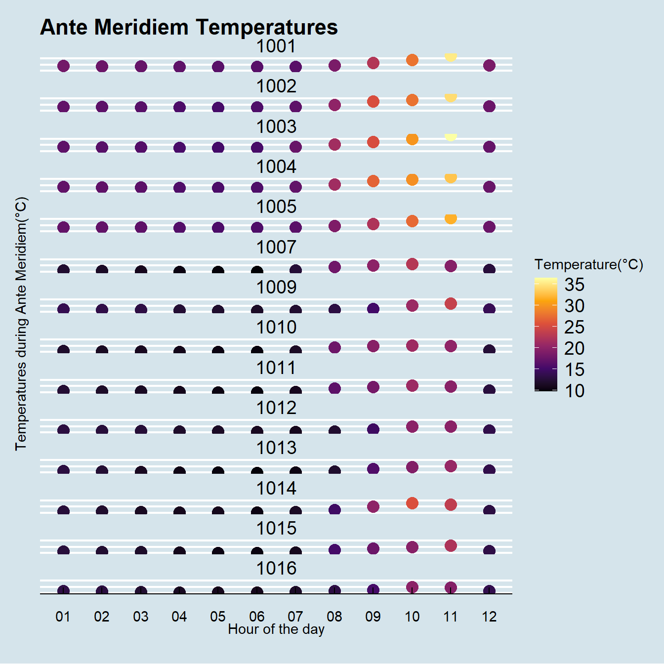
Temperatures during the night
- The above plot shows nighttime temperatures across the years 2019-2020 from 12am to 11am. We can observe that the temperature is mostly very cold from 12am to 7am after which it starts to increase. This is obvious as the sun comes up. There are locations that are relatively warmer than the others and this can be used with future analysis to check if that affects online food ordering.
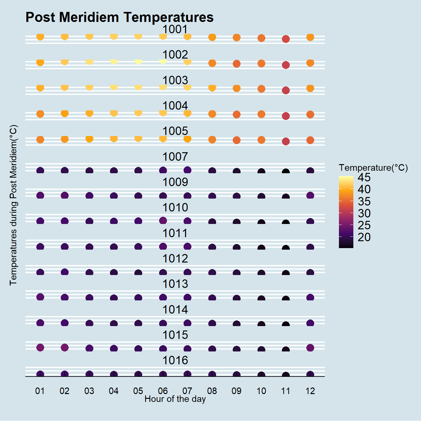
Temperatures during the day
The above plot shows daytime temperatures across the years 2019-2020 from 12pm to 11pm. We can observe clearly that there is a much larger difference in temperatures during the daytime. Some places go as high as 40° C while some places are as low as 20° C on an average even though they are all closely located. The warmer locations can be compared with cooler ones and check how it affects online food ordering in future analysis.
NOTE: We have to keep in mind the change in scale from 10-35° C during the night to 20-45° C during the day time. This is absolutely essential to make sure the color scheme is perceived correctly. Lighter the color, sunnier and warmer the temperature.
We can extend the same analysis to check rainfall throughout the period 2000-2020 on each hour of the day on an average. Similar analysis is extended to check the percentage of rainfall during the ante meridiem and post meridiem times of the day.
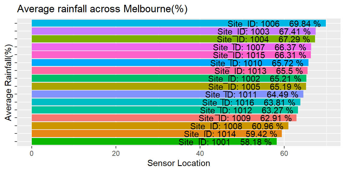
Average Rainfall across Sensor Locations
- The above plot shows the average rainfall across all sensor locations in the data set. The readings are as follows:
- 69.84 % - ID 1006 at 60 Siddeley Street DOCKLANDS VIC 3008
- 67.41 % - ID 1003 at 165 Pelham Street CARLTON VIC 3053
- 67.29 % - ID 1004 at 680-682 Swanston Street CARLTON VIC 3053
- 66.43 % - ID 1007 at 671-701 Flinders Street DOCKLANDS VIC 3008
- 66.26 % - ID 1015 at 185-197 Spring Street MELBOURNE VIC 3000
- 65.73 % - ID 1010 at 60 Siddeley Street DOCKLANDS VIC 3008
- 65.47 % - ID 1013 at 318 William Street MELBOURNE VIC 3000
- 65.21 % - ID 1002 at 680-682 Swanston Street CARLTON VIC 3053
- 65.19 % - ID 1005 at Shop 2, Ground 121 Grattan Street CARLTON VIC 3053
- 64.33 % - ID 1011 at 671-701 Flinders Street DOCKLANDS VIC 3008
- 63.78 % - ID 1016 at 402 Lonsdale Street MELBOURNE VIC 3000
- 03 % - ID 1012 at 112 Little Collins Street MELBOURNE VIC 3000
- 62.96 % - ID 1009 at 252 Flinders Lane MELBOURNE VIC 3000
- 60.96 % - ID 1008 at 222-224 Flinders Street MELBOURNE VIC 3000
- 59.32 % - ID 1014 at 7 Swanston Street MELBOURNE VIC 3000
- 58.18 % - ID 1001 at 85 Grattan Street CARLTON VIC 3053
- We can straight away observe a much lesser difference in the average values of rainfall percentages at the different locations. This makes it simpler and easier to recognise the patterns in food ordering and rainfall. Since all the locations have similar rainfall, the changes in rainfall can be accounted for the ordering patterns. The temperature shows microclimate and hence it is a better idea to link food ordering to rainfall than temperature as a parameter.
We can also observe the rainfall at different hours of the day across each sensors.
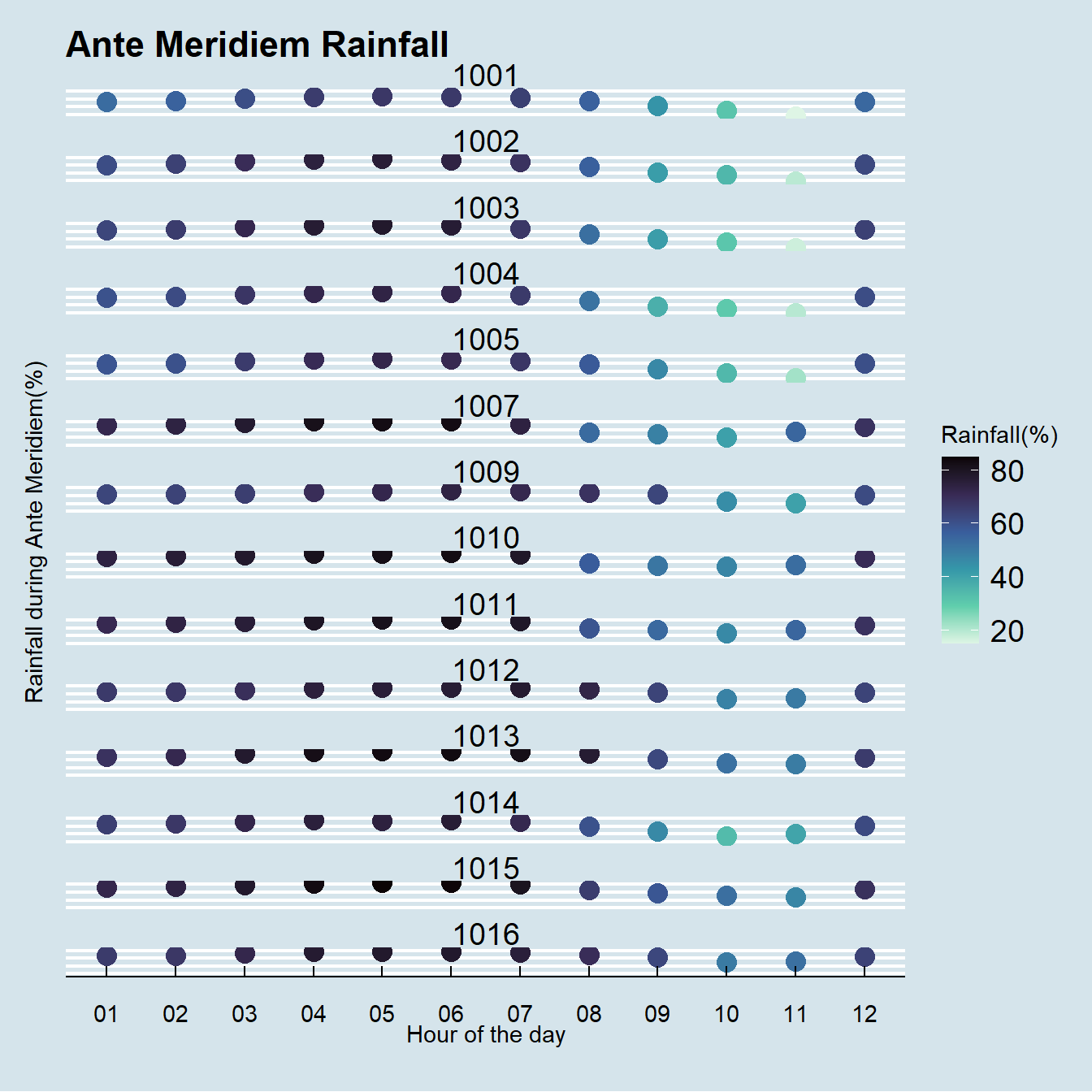
Rainfall during the night
- The above plot shows nighttime rainfall across the years 2019-2020 from 12am to 11am. We can observe that the rainfall is mostly very high from 12am to 7am after which it starts to decrease. This might be due to the sun rising around this time. All locations seem to have a similar rainfall pattern during the ante meridiem time which reinforces the findings from the average rainfall plot. Let’s observe what the post meridiem has to show.
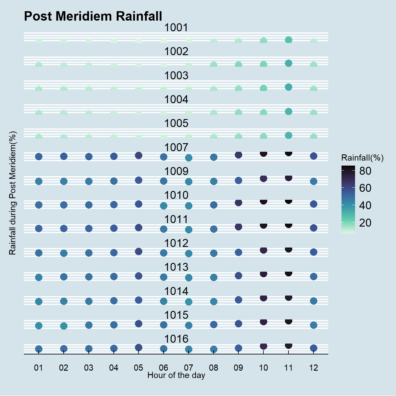
Rainfall during the day
As one could possibly suspect, the rainfall is much lower during the daytime from 12-9pm. It tends to increase after 10pm up until 6am as observed in the previous plot.
NOTE: Darker the blue shade, heavier the rainfall percentage.
The rainfall percentage shows much less variation across sensor locations. This shows that rainfall does not show a ‘microclimate’ trend and is a better way of analysing future online ordering data to compare how it affects the same. Thus, rainfall is a better parameter to link to online food ordering patterns to find insights as to how ordering is affected by weather.
Conclusions
Challenges & Limitations of the Project
Challenges
Data collection and collation was a big hurdle in the initial stages. It was challenging to find data that suits the needs of our objectives specifically. Most data sources were either paid or not very credible if free. Thus, Australian Bureau of Statistics (ABS) and Melbourne City Council were used as free publicly available data.
Data cleaning even though simple in terms of technicality, was time consuming which made it difficult just because of the sheer volume of data and number of files. Data had to be wrangled to make it suitable for reading into R environment and column names required more accurate naming schemes.
Limitations
Some assumptions made in the analysis are not completely reliable and such cases are hinted within a “NOTE” in the subsection. Some data like the average financial incomes might not be 100% accurate in the real world as it is collected from a subset of the community that might be working in the real world. There is a minor level of uncertainty in the numbers reflected.
The scope and size of the unit requirement and time constraints has limited the scope of analysis. This project serves as a great precursor that will extend to restaurant and cafe data, online food ordering data, and other paid sources of data in the future to make a more complete project.
Results
Objective 1: Identify and collect publicly available data, perform data cleaning and exploration using R programming and MS Excel to device user-friendly and insightful data visualisations.
Result Achieved: Identified and collected publicly available data, successfully cleaned/wrangled and visualised to provide insights and patterns.
Successfully explained the insights in the following aspects:
- Average income, expenditure, and savings patterns that can be compared with user.
- Financial data is faceted by age, gender, socio-economic status, region, number of jobs, and number of working hours as planned.
Objective 2: Aid design of user-friendly dashboards on a mobile app through research and development on the Data Futures Project that aims to build a targeted demographic community.
Result Achieved: Recognised the target market in terms of age, gender, income range, and region. Insights to target demographic are as follows:
- Age: ~ 20-40 years of age, mostly 20-30 years age range
- Gender: Equal importance to both genders. Specifically males between ~ 20-30 years and females between ~20- 25 years of age.
- Income Range: Target community with average monthly income of ~ AUD 600 per week.
Objective 3: Collaborate in an agile working environment to brainstorm ideas and spearheaded the choice of tools and technology, planning, and implementation of the project resulting in enhanced app features.
Results Achieved: Successfully collaborated with the team to brainstorm, communicate, plan, and execute the actions for the Data Futures Project. As the sole Data Analyst Intern, all the work was collated from scratch after finding the right data to ask the right questions for insights.
Learning Outcomes
Technical Experience Gained: Data source recognition, cleaning, exploration, planning, visualisation, and data storytelling. Tools used include R programming and Microsoft Excel.
Soft Skills Developed: Working in agile environment, planning, brainstorming, collaboration, communication, project planning, leadership, interpersonal skills, and initiation.
Future Scope
This project serves as a precursor and a starting point for a much broader objective with the use of restaurant and cafe data, online food ordering data, and much more.
The inferences drawn from this project will be used to combine more data sources to enhance the understanding of data for more advanced analytics like modelling and prediction in the future.
The goal is to use all the data insights to create new features and dashboards to make personalised notifications and insights for the end-user through the mobile application.
References & Citations
Softwares Used
Microsoft Excel, R Programming, RStudio.
R packages
tidyverse - Wickham et al., (2019). Welcome to the tidyverse. Journal of Open Source Software, 4(43), 1686, https://doi.org/10.21105/joss.01686
lubridate - Garrett Grolemund, Hadley Wickham (2011). Dates and Times Made Easy with lubridate. Journal of Statistical Software, 40(3), 1-25. URL https://www.jstatsoft.org/v40/i03/.
gridExtra - Baptiste Auguie (2017). gridExtra: Miscellaneous Functions for “Grid” Graphics. R package version 2.3. https://CRAN.R-project.org/package=gridExtra
leaflet - Joe Cheng, Bhaskar Karambelkar and Yihui Xie (2021). leaflet: Create Interactive Web Maps with the JavaScript ‘Leaflet’ Library. R package version 2.0.4.1. https://CRAN.R-project.org/package=leaflet
viridis - Simon Garnier, Noam Ross, Robert Rudis, Antônio P. Camargo, Marco Sciaini, and Cédric Scherer (2021). Rvision - Colorblind-Friendly Color Maps for R. R package version 0.6.2.
fontawesome - Richard Iannone (2021). fontawesome: Easily Work with ‘Font Awesome’ Icons. R package version 0.2.2. https://CRAN.R-project.org/package=fontawesome
ggthemes - Jeffrey B. Arnold (2021). ggthemes: Extra Themes, Scales and Geoms for ‘ggplot2’. R package version 4.2.4. https://CRAN.R-project.org/package=ggthemes
kableExtra - Hao Zhu (2021). kableExtra: Construct Complex Table with ‘kable’ and Pipe Syntax. R package version 1.3.4. https://CRAN.R-project.org/package=kableExtra
forecats - Hadley Wickham (2021). forcats: Tools for Working with Categorical Variables (Factors). R package version 0.5.1. https://CRAN.R-project.org/package=forcats
Copyright © 2024 Rahul Bharadwaj Mysore Venkatesh
rahulbharadwaj97@gmail.com